What's new

Portraits C&C pretty please!!!

JMBriggs

No longer a newbie, moving up!
Joined
Jul 26, 2011
Messages
217
Reaction score
33
Location
Washington
Can others edit my Photos
Photos OK to edit
Ok so I did these for a friend. I feel like they are a bit OOF or maybe camera shake? Most likely the latter. Also these were done with my kit lenses. So image quality isn't that good?... I would really like the harshest critique possible!!! I am not good at direction and I'm not sure how to crop subjects so if some of you experts want to give me some tips I would love you forever!

Oh, and it was pretty damn foggy too...

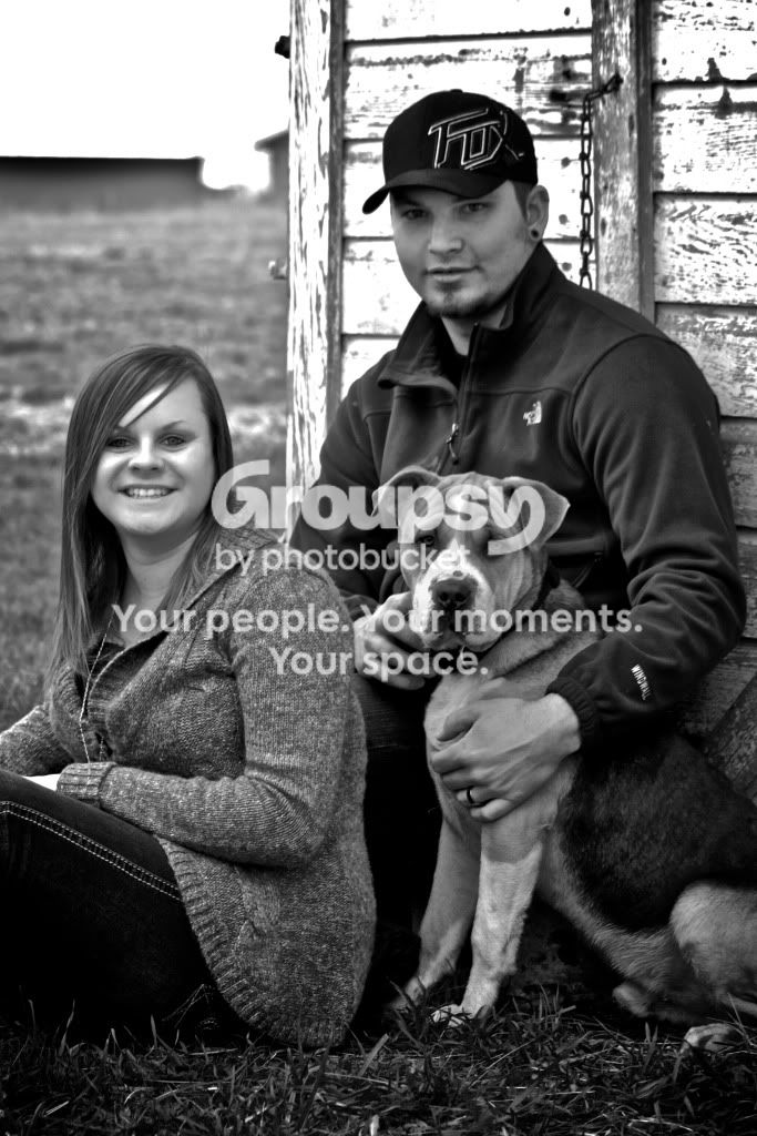
Done with Canon t1i 55-250 kit lens. ISO 400 f5.6 1/125 Post done with Aperture.
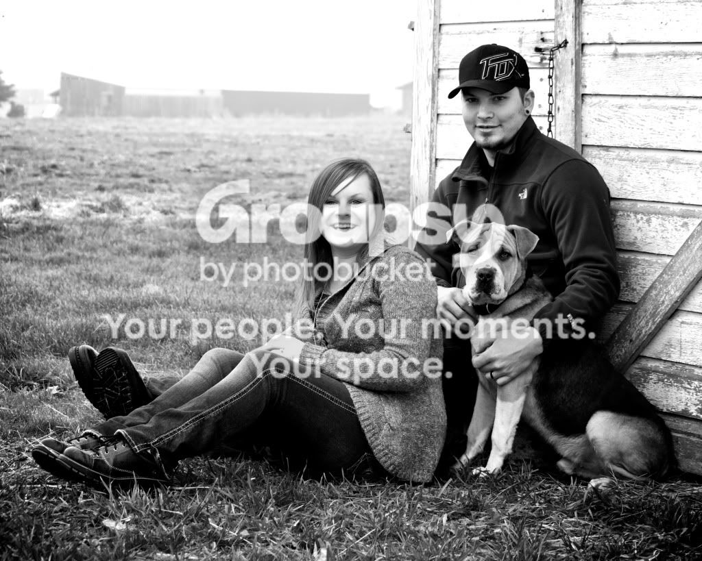
IMG_0537.jpg


ISO 400 f5.6 1/160 On this one I'm not sure about the comp... Is it too centered?
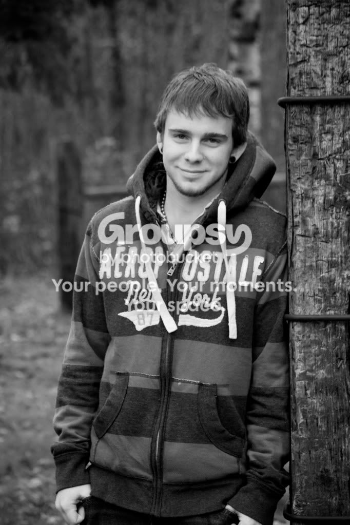
IMG_0565.jpg
 
#1. I think the composition is too loose. In other words, they don't take up enough of the image and the background being so bright, really distracts attention away from them. I'd like to see it cropped in closer, even if that means cropping off her legs and maybe even the bottom of the dog.
I'd would have liked to see them closer together. (are they a couple?) the shot doesn't seem very intimate. If I had to take a wild guess from this photo, I'd guess that he likes the dog more than her. :lol:
Pretty good exposure, except that his face/eyes are dark under that hat. If he must were a hat, get it up a bit higher or do something to get some more light under there.
I do like the B&W conversion, nice tones.

#2. I think this is a really nice shot. Well done. I would like to see a bit more light in his eyes (a catchlight), but otherwise the exposure looks good.
You cropped off the bottom, right on his hands, which is usually a big no-no. Either include them or don't. Again, really nice B&W tones.

Also these were done with my kit lenses. So image quality isn't that good?
It's a poor craftsman who blames his tools.
Sure, the kit lenses aren't top of the line, but they are still capable of pretty decent results.

Most lenses aren't at their best when used at their maximum aperture. In either of those shots, try upping the ISO one stop to 800, which would allow you to shoot at F8 instead of F5.6. That might help with the sharpness.
 
C&C per req:

1. I like the composition here, and the key elements (eyes & faces) seem sharp, but my monitor at work isn't the best... I very much like the way you've got their vertical elements (their backs) working with the wall behind, and their legs parallel to the horizon, BUT I don't like the background. I find it very distracting. As well, when people are wearing hats, I suggest either having them remove them or tilt them back, or, if that's not an option, toss a speedlight on the ground aimed up with just enough power to kill most of the brim shadow and put some life into the eyes.

2. The face is definitely soft here; not 100% sure why. Your shutter-speed and DoF should be fine for this scenario; I think (and again bear in mind, this monitor is less than stellar) you were focused on the area around the front pockets of his hoodie; they seem much sharper than his face. Aside from that, I think this is a nice image; I might try and increase the brightness just a bit, but that's about it.

There's nothing wrong with your kit lenses for these shots. In fact, if you were to shoot the images under identical conditions using my 70-200 f2.8, you would find it nearly impossible to tell the difference.

Just my $00.02 worth - your mileage may vary.

~John
 
I really like them! Only thing is the boys feet look a little odd sticking out of the girls legs.
 
........ Also these were done with my kit lenses. So image quality isn't that good?...
This excuse gets quite boring. The kit lens I had was capable of hitting some very tack sharp images with good color and contrast.

#1 - Too much space between the heads. There seems to be a disconnect between their happy expressions and their body language. Next time have them close the gap some. Also, have her sit on her left hip (closest to camera) rather than sit on her bottom, place her hand on her thigh and cross ankles. This will create a more dynamic pose. He could have raised his kness, keeping them hidden behind her and scooched forward slightly. This would prevent his feet from coming out of nowhere. Having him bend forward at the waist and placing his hand on her shoulder would help with that connection that is missing and appearing much like his feet.

The dog is great. Wouldn't change a thing.

Thanks for sharing.
 
Thank you guys. I don't have a flash yet. I am having a really hard time deciding what I need/want. This is the kind of photography I enjoy the most so if you have a suggestion on a flash I would love to hear it. I completely agree about the hands... It distracts me that they are so close to the edge and partly cut off. Like I said it was really foggy so the that is why the background is so bad imo... that and in this shot there is a building back there. Thank you for the suggestion about shooting at f8... I will definitely try that next time. But won't my picture have too much DOF that way?
 
Kundalini beat me too it. Right now her legs/thigh is way more prominent because of the pose. Posing as he suggested will not only make her appear slimmer but will them draw emphasis to her face. Only other tip I have is while she in on her hip if you get her to put her upper body a bit toward the camera. Not quite leaning if that makes sense.
 
Thank you guys. I don't have a flash yet. I am having a really hard time deciding what I need/want. This is the kind of photography I enjoy the most so if you have a suggestion on a flash I would love to hear it. I completely agree about the hands... It distracts me that they are so close to the edge and partly cut off. Like I said it was really foggy so the that is why the background is so bad imo... that and in this shot there is a building back there. Thank you for the suggestion about shooting at f8... I will definitely try that next time. But won't my picture have too much DOF that way?

DoF is not only affected by your aperture but your subject to background distance and subject to camera.
 
........ Also these were done with my kit lenses. So image quality isn't that good?...
This excuse gets quite boring. The kit lens I had was capable of hitting some very tack sharp images with good color and contrast.

#1 - Too much space between the heads. There seems to be a disconnect between their happy expressions and their body language. Next time have them close the gap some. Also, have her sit on her left hip (closest to camera) rather than sit on her bottom, place her hand on her thigh and cross ankles. This will create a more dynamic pose. He could have raised his kness, keeping them hidden behind her and scooched forward slightly. This would prevent his feet from coming out of nowhere. Having him bend forward at the waist and placing his hand on her shoulder would help with that connection that is missing and appearing much like his feet.

The dog is great. Wouldn't change a thing.

Thanks for sharing.

Thank you for the posing tips... I am so bad at direction I have a hard time communicating what I want them to do... I tried to tell him to bend his knees but he didn't get it? I'm glad you guys pointed out that they seemed distant... I knew there was just something off that I couldn't put my finger on and I think that is what it was.
 
Here is a portrait shot of the first I also took. It seemed a lot more OOF then the other. But it is the tighter crop you said you would prefer.

IMG_0534.jpg
 
I dont think this quite works. You already know its oof and the crop is not well executed. Think of this in a frame. If you were to frame this, her face is pushing right up against the edge of the frame and you have amputated her knee and hands.
 
That is a better composition for a (group) portrait. It makes the photos more about the people (and dog).
Although, your processing & exposure are not great on this one. The highlights are blown.
She's too bright, he's too dark...but the dog is just right.
 

Create an account or login to comment

You must be a member in order to leave a comment

Create account

Create an account on our community. It's easy!

Log in

Already have an account? Log in here.

New Topics

Back
Top Bottom