Portraits C&C

Sherman Banks

TPF Noob!
Joined
Feb 24, 2009
Messages
871
Reaction score
0
Location
Rain City
Can others edit my Photos
Photos OK to edit
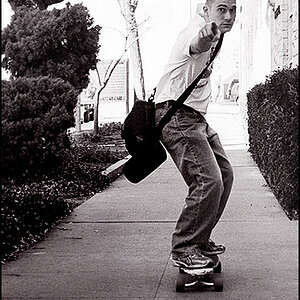
Here are a couple portraits for our weekly critique group. I've been kind of under the weather so I've just been working on some different lighting setups in my space deficient apartment (hence the headshots). Conceptually, nothing to the shots other than trying to get an exposure/style I liked. The second was just taken messing around but I kind of liked it.
Anyways, comments and critique on the photos welcome.

3544517173_3c4bd765fd_o.jpg

Exif: 50mm, F9, ISO 200, Shutter 1/200. Vivitar 285 reflected from camera left @ 1/4 power, SB600 on camera right @ 1/16 power.

3545363576_24aed10bce_o.jpg

Exif: 50mm, F9, ISO 200, Shutter 1/200. Vivitar 285 reflected from camera left @ 1/4 power, SB600 on camera right @ 1/16 power.

On another note: I found some new software that enabled me to tether my D90 to my laptop so I didn't have to stand fiddling with the camera LCD after every shot. It was quite handy to have and may suit many of you other Nikon users. Here is where I found it. I just have the 15 day trial going but it's certainly cheaper than Nikon's Capture V2 software.
 
#1) Very good exposure. Lighting looks good. I think this photo screams for some PP--maybe B&W. I can accept that part of his head is cut off, but not his right eye. He looks kind of like the character "Peter Petrelli" on the TV show "Heroes" if you've ever seen it....

#2) I love the catchlights in her eyes. I just wish she were looking at the camera, or the cat was looking at the same thing she was.

Thanks for the link on the remote capture software!! Please post a lengthy review once you've used it at length. $95 is a lot better than $180!!!!
 
I think the lighting is great! You did a nice job. I don't know ANYTHING about studio type lighting so, of course, take my words with a grain of salt. I was thinking that the side light (back light??) might be a bit bright in Pic #2 (on her neck). I see it in pic #1 as well, but it's much more subtle. I think the position of the light is nice, but just a tiny bit too bright. Of course, I 'm probably COMPLETELY off since I don't know what I'm talking about. Also, the background being white makes it hard to see where the side of the face ends and the background begins (does that make sense?). More in pic #2 because either her skin is lighter or the light is brighter on her (or she is closer to the light source?) Maybe a different color background or a more textured white wall to show some separation. Now I will let the pros come in and tear my critique apart :)

Funny, I was going to post pictures this week of more of a studio type set up I did in my garage. They pale in comparison to yours. Hmmm...now maybe I'll have to do something else ;)

Nice work. Hope you are feeling better!
 
Thanks for everyone's comments!
In regards to the framing of the first, it was purely a stylistic choice. I shoot enough shots of myself completely in the frame that I kind of like the awkwardness to a cropped head/face. I think it gives it a more candid look or like an accidental shutter trip. Obviously it is an easy fix and if I were doing commercial work, I'd probably avoid my creative liberties here. And I do now see a slight resemblance to Peter Petrelli (although after season 1 the show has bombed). As far as the B&W treatment, I tend to use that as a cop-out when I'm can't get my colors correct (I'm kind of colorblind) so I've been trying to do less B&W unless I took the shot with the intention of using it.

The second was a shot where she was in the room asking me questions about something and I told her to take my spot so I could using the software to shoot the shots. She doesn't like being in front of the camera so I usually have to do something cheesy to make her comfortable (like put a cat on her shoulder and have her do the 80's gaze into nowhere). I actually have a couple where the cat is looking up at the flash too, but they had cropping issues and other stuff making them unusable. The flash is really hot on her neck and I'd probably take it down a stop if I reshot it. The overall lightness was a style choice, all done in PP (so I could match the background to the TPF grey, :LOL:), but her skin tone kind of blended with the background beforehand and a burn would probably look out of place. Anyways, thanks again for everyone's comments/compliments, I really appreciate them.:thumbup:

PS: I figured I'd post up the OG's so you can see where I started with these.
SP1Before.jpg

BFFBefore.jpg
 
I really like the first one. I like the eye crop. To me there is still enough eye to work, any less, no. It looks like a movie poster to me also *deep voice* "In a world..." It looks like you were caught off guard.

#2 doesn't do much for me. To much white on her forehead. I think it would work better if they were both looking the same direction. The cat shows more emotion, and sadly she looks kinda vacant. Don't tell her I said that :)
 
Hey man

Nice going these are definitely some good shots.
The first is a tad on the oversharp side.
The only thing I could nit pick would be that the light is a wee bit hard.
I think you would benefit greatly from one or two softboxes.
 
Hey man

Nice going these are definitely some good shots.
The first is a tad on the oversharp side.
The only thing I could nit pick would be that the light is a wee bit hard.
I think you would benefit greatly from one or two softboxes.

Thanks alot! I am thinking that some softboxes would be a good investment but I have no idea what ones are of any quality and are a good price. Plus there is the size thing too. I'll have to do some research, but I think they're definitely next on my purchase list. As for the hard lighting, I was going for a Chase Jarvis sort of look but obviously not as good or extreme.

David: Thanks for the comments! The second was really just a shot to throw out there and fill my two for the week. As I said, it was just an impromptu thing (she's wearing her pajamas shirt) but I didn't want to post two pictures of myself up here, one is already too many.
 
good lighting. and even though i thought about going at the composition in the first... after looking at it for some time... i like it this way :D
 
Question: I want to try some high key portrait photos, does the background have to be light? I just tried my first one, that I am now using in my avatar.
 
No the background doesn't have to be light at all. If you have another flash, dial it up to a high power and aim it at the surface behind you and blow it out. In my case, I did the background through PP, but I don't really have any bare walls to shoot as a backdrop. You could also use gels to give your backdrop color, same process as above.
 
I like the first image but I wish the left eye hadn't been cut off. The second image is good too but it may have looked better if the cat hadn't been there or was looking in the same direction as the lady.
 
Thanks to everyone for the comments! I've got a new beauty dish made so hopefully I'll have some more up soon.
 

Most reactions

Back
Top