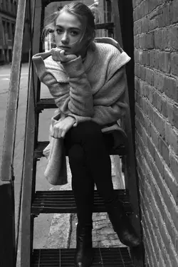
I like the first one. The crop may be a touch tight, but it works with the narrow staircase to impart a slightly claustrophobic feel to the shot. The way her fingers are folded in on both hands adds to the tension in the shot, as does her hunched pose and her crossed legs. (These aren't bad things to me for this shot, though if that's not what you were going for they are worth keeping in mind in the future.). She's making great eye contact with the camera.
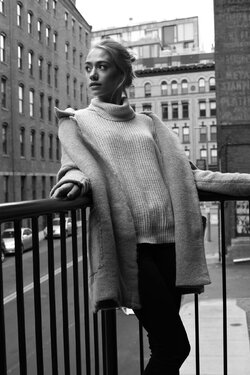
I'm not as much a fan of the other two. In the second, her pose looks unnatural and uncomfortable. I know in fashion shots this can sometimes create an interesting pose but it's not adding anything for me. Maybe that is because the large coat hanging off her shoulders is obscuring any interesting contortion to her upper body. Also look out for her arms. Her right arm (image left) is swallowed by the coat so all you see is a hand sticking out of the blob of a coat, while her left hand is cut off by the crop (and her upper arm is sticking out from the coat with no apparent connection to her body, since the upper arm to past the elbow is hidden by the coat). I'd also suggest moving her to one side of the frame or the other. This is not a shot that calls for symmetry, so putting her in the middle doesn't add any interest. I could get on board with adding space to the left (where she's looking, which would probably be the conventional advice) or to the right (where her body is facing).
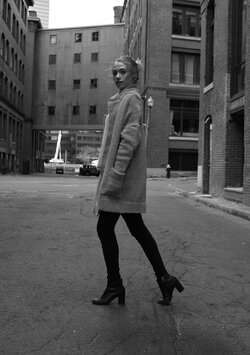
The pose on the third one also looks too forced to me. There is some attempted interest in the way her legs are posed "mid-stride" (with both knees bent), but this is counteracted by how stiff her upper body is and by having her hand in her pocket. Totally different feel to the shot if you look from the hem of the coat up versus from there down. This shot also I think would benefit from having her off center in the frame. I like that you got low to shoot from that angle. I think her looking down towards the camera works against the perspective of the shot looking up to the higher floors of the buildings around you - if she were looking level or even slightly up to play into that perspective it might have seemed more cohesive.
I agree with Rob ... I like the first one ... reminds me of a portrait I in my early days ... just out of the blue with a ladder ... she just looks like it fits there with the surroundings ... comfortable ... the others look like you forced her into the scene.

![[No title]](/data/xfmg/thumbnail/36/36303-10b1a386a9a00cf90fb7605d2d2c48c1.jpg?1619737497)

![[No title]](/data/xfmg/thumbnail/38/38263-ad5e4c9e677626ddb5b1e7cdf9ebe40e.jpg?1619738548)
![[No title]](/data/xfmg/thumbnail/32/32154-8c44f76cb4a7777142bd645c3624daac.jpg?1619735234)
