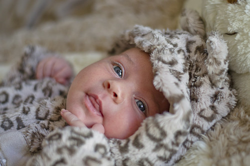
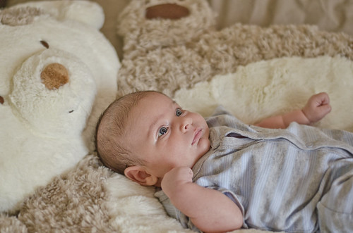
Baby shots come in three kinds, 1) look at me, I'm cute 2) look at the baby, it's so cute and 3) there's the baby looking really cuddly and soft - and cute.
The visual center of every shot must be the baby and maybe its interaction with whatever is attracting it and maybe a little of its surroundings if they add to the impression you want to convey of the baby and aren't a distraction.
I don't care much for the first two.
The first bothers me because I have a hard time looking at a eyes-open looking at me face that is at almost right angles to mine (I find myself twisting my head) and the depth of field is so shallow that too much is oof. Color and exposure are good however.
The second has a flashlight-under-the-chin-for-a-scary-face lighting thing going on and that's not flattering for a baby (or most people) and the baby is at an odd angle to the camera and there is lots of unnecessary stuff in the frame.
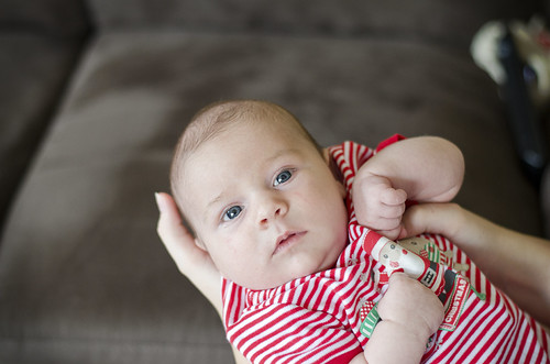
Three is I think the best of the three portraits.
The baby is engaged with the camera and people can look into its eyes and imagine they know what the baby is thinking, the sharpness and exposure are fine.
A bit too loosely framed, a bit too bright and too cold. (I would warm it up until the sclera of the eyes don't have a bluish tinge)
By framing tighter, the picture gets more interesting and there isn't all that empty space to drain away interest.
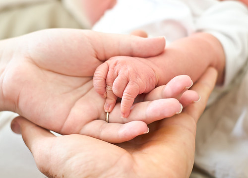
The fourth is a pretty cliched shot but parents and grandparents love it.
DOF a bit too tight (tips of baby's fingers oof) but still usable.
A bit too bright and the hand on left is way too bright, drawing my eye.
I would crop a bit, particularly to keep baby's neck from reappearing at top and drawing the eye and also to tighten up.
So burn in the hand, tone down brightness a bit and crop and it looks better to me.
Also looks good in sepia.
All in all, a very good start, I think.
Keep it up.
Lew







![[No title]](/data/xfmg/thumbnail/39/39438-1eb8b5f82b59d9d0c72ae9025778ed4c.jpg?1734173528)
![[No title]](/data/xfmg/thumbnail/39/39439-d0a6beaaf39993860b74ccbd81fdd122.jpg?1734173529)