What's new

Portraits on location, critiques welcome

julianliu

No longer a newbie, moving up!
Joined
Aug 15, 2013
Messages
413
Reaction score
75
Location
Denver, Colorado
Can others edit my Photos
Photos OK to edit
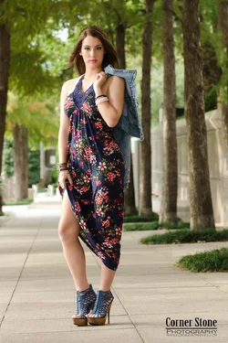
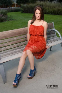
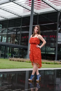
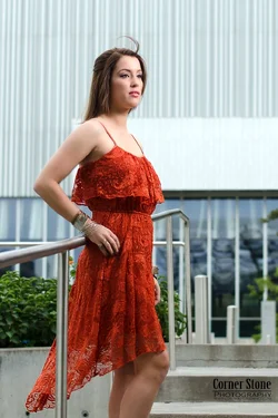
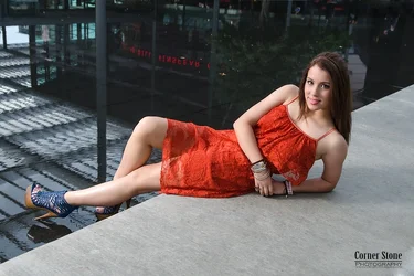
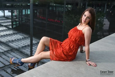
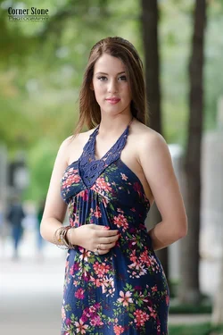
Hi, everyone, just did one portrait shoot with a high school girl at Dallas art district. It seems that place is pretty popular for photographers. I saw at least 5 photographers there during couple of hours shooting. Anyway, attached are my results. The first two used bare flashgun, the rest used strobe with small umbrella. This time I am glad to hear the model likes all the pictures, cheers! I would like to hear comments from you guys any issues with these pictures.
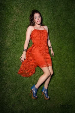
One poll question about the last two pictures, which one you like? The model likes the second last one but I like the last one. I am looking forward to hearing what you think.
By the way, the model's hand in the fifth picture is blurry due to motion, but both the model and me like the picture so we kept it.
Thanks in advance!

Julian
$Sydney 11.webp$Sydney 03.webp$Sydney 02.webp$Sydney 05.webp$Sydney 10.webp
$Sydney 09.webp
$Sydney 08.webp
 
bump for some critiques, thanks :-)
 
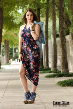
I like the second to the last one more than the last one because the line of her extended leg leads right up to her chest and shoulder, and that long, extended line makes visual sense, and gives a sense of balance. ALso, in the second to last shot, her chest is turned toward the camera, and is more of an "open" pose, while in the last one, it's kind of a "boobs skyward" cheezy pose. My favorite shot though, is the second, the one of her shown full length in the floral pattern dress, standing on the walkways with the tree trunks in the background
 
^agreed. I saw the first and was like, "nice, would like to see the whole body." Then you delivered. I like the smile and the pose in #1 but #2 is just better. All the others are okay save the second to last as Derrel said.
 
The pose in the first image looks awkward to me. The facial expression in the second image does not go with the teasing or coquette skirt lift of the second image.
 
4th there is something coming out of her head, 5th the hair can be corrected via photoshop

It may just be me but her clothing really doesn't work with her shoes.

I really like the first two images though something to consider in future is that her shoulders are really quite wide, thus would work better with more rotation of the torso to allow her to look feminine (more so)

I like your idea in the second image for her to lift the dress slightly, stopping her from looking so frozen, even though it is suggestive it is not too much so!

Enjoyable shoot! looking forward to more! :) - Doug
 
Thanks for the critiques, Derrel and Ron. now I know the second to last picture is more pleasing to most people's eye. My eyes, or my brain need that kind of education.

What I am trying to achieve in this photo shot is fashion style portrait. They are far from fashion shot but I like adding a little fashion element/feeling into the photos, which is the direction I want my style to go.
The first two images used 70-200mm shot at the long end to compress the scene, which I do like them and like you all, second one is my favorite.But I think they are typical portraits and easy to do. The rest are shot with 17-55mm at the short end. I feel like fashion shots mostly are shot with relatively short focal length, not so much compression, and need to blend the in-focus background with model well. I feel still a long way to go to capture nice fashion portraits with my short focal length lenses.

Doug, since you look forward to more, I am gonna attach another photo, not my typical shots, but I do like the results.

$Sydney 01.1.webp
 
The second one is my favorite as well.

Jake
 
Fabulous Idea with the last image attachement, her head does look slightly uncomfortable but nice image, nice vignette too!
 
No 2 is the winner for me. I would have dodged the jacket a bit to show her shape - there is a rough quick one to give you an idea.

$Sydney 03.webp
 
Fabulous Idea with the last image attachement, her head does look slightly uncomfortable but nice image, nice vignette too!

Thanks. Doug.
By the way, when I saw her shoes at first, I thought it does not match with the red dress but I think it stands out as a cool piece in the last image. Lol you do know or care clothing of your model do you?
 
No 2 is the winner for me. I would have dodged the jacket a bit to show her shape - there is a rough quick one to give you an idea. <img src="http://www.thephotoforum.com/forum/attachment.php?attachmentid=59689"/>

Good idea, I did not notice that, but it's always good to know. But I am a little concerned the jacket maybe too bright to be distracting ?
 

Create an account or login to comment

You must be a member in order to leave a comment

Create account

Create an account on our community. It's easy!

Log in

Already have an account? Log in here.

Back
Top Bottom