Nice work!
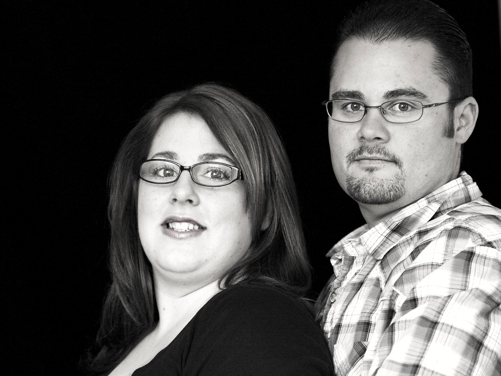
1. The mono conversion works well in this, but the highlights are a little too bright; there's a loss in her face, esp. around her cheeks and chin/teeth, as well as the whites in his shirt. Additionally, the reflections on the lenses of her glasses are partl obscuring her eyes. His on the other hand are perfect. Lastly, You've got hm looking perfectly flat and level into the camera, but she appears to be straining. Always try and have your subjects looking toward the camera; they don't have to necessarily look right down the lens, but they should both look in the same direction and they shouldn't be looking up or down.
2. This one is very well done. I think the light from camera left might be just a little too bright, but some subtle dodging/burning in post will take care of it. Again, you've got his eyes spot on. My only nit concnerning the composition is that I'd prefer to see the empty space imag left on the right side.
Overall, these are very well done. You've got a good grasp of lighting basics, and your focus is spot on. Keep it up!


