What's new

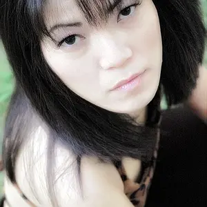
Practicing with developing from RAW. Opinions?

I like the warm tones that it had to begin with. The colors seemed to work well in that shot and added a nice mood to the image that I feel was removed from the final edit. Perhaps consider meeting halfway between your edit and the original photo, or even leaning more towards the original shot and reducing your color and contrast adjustments by about 80%.

Are you working with a display that has been calibrated using a device such as a Datacolor Spyder or a Colormunki?
 
I like the warm tones that it had to begin with. The colors seemed to work well in that shot and added a nice mood to the image that I feel was removed from the final edit. Perhaps consider meeting halfway between your edit and the original photo, or even leaning more towards the original shot and reducing your color and contrast adjustments by about 80%.

Are you working with a display that has been calibrated using a device such as a Datacolor Spyder or a Colormunki?

To the last part, no, I am not. Never heard of either lol
 
I like the warm tones that it had to begin with. The colors seemed to work well in that shot and added a nice mood to the image that I feel was removed from the final edit. Perhaps consider meeting halfway between your edit and the original photo, or even leaning more towards the original shot and reducing your color and contrast adjustments by about 80%.

Are you working with a display that has been calibrated using a device such as a Datacolor Spyder or a Colormunki?

To the last part, no, I am not. Never heard of either lol
This could possibly explain why the first image looks better to me. If your display isn't calibrated using a device such as what I listed, there is a good chance that the colors on your display aren't being displayed "correctly". You may see red as pink, blue as purple, and green as yellow. Calibrating your display will allow you to more accurately make color and contrast adjustments to your images, and will also make sure that when you print your photos they will match what you see on your display.
 
I like the warm tones that it had to begin with. The colors seemed to work well in that shot and added a nice mood to the image that I feel was removed from the final edit. Perhaps consider meeting halfway between your edit and the original photo, or even leaning more towards the original shot and reducing your color and contrast adjustments by about 80%.

Are you working with a display that has been calibrated using a device such as a Datacolor Spyder or a Colormunki?

To the last part, no, I am not. Never heard of either lol
This could possibly explain why the first image looks better to me. If your display isn't calibrated using a device such as what I listed, there is a good chance that the colors on your display aren't being displayed "correctly". You may see red as pink, blue as purple, and green as yellow. Calibrating your display will allow you to more accurately make color and contrast adjustments to your images, and will also make sure that when you print your photos they will match what you see on your display.

I will definitely look into it!
 

Create an account or login to comment

You must be a member in order to leave a comment

Create account

Create an account on our community. It's easy!

Log in

Already have an account? Log in here.

Back
Top Bottom