What's new

Preparing for the journey into the unknown..

tirediron

Watch the Birdy!
Staff member
Joined
Jul 8, 2005
Messages
45,715
Reaction score
14,785
Location
Victoria, BC
Can others edit my Photos
Photos OK to edit
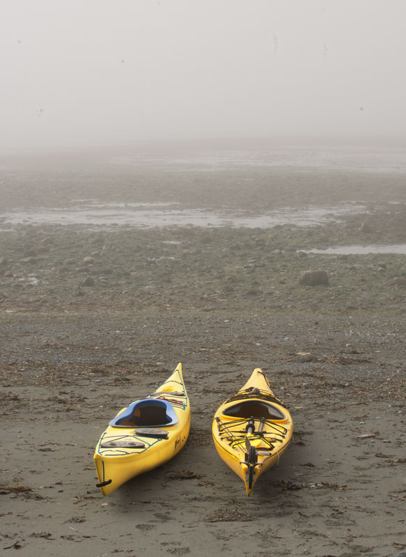
This is apparently one of those images that looked a lot better in my mind than "on paper"... A local kayak club was preparing for an outing as I was waiting to shoot an event for the paper, and I grabbed a few. I really liked the look of the fog and the emptiness of the image, but it didn't translate quite the way I wanted. As always, suggestions, critique and comments all welcome.
Kayaks.jpg
 
A difficult one mate. I agree that it doesn't quite work as it is. I do wonder what it would look like with a desaturated look in the sand. The only thing I could think of here that may have made a difference is to go with the more modern look of shooting very close with an ultrawide so that the yellow and the lines of the kayaks really dominate the frame and the mid-ground is minimised though it's not a look everyone likes. Also looks like a few dust spots in the fog.

Ultimatley though fog is really difficult to shoot with, as the subtle pearlecent luminance and fine tonal values just seem to get lost in photos. Some things are just better IRL.
 
no place to go,
washed ashore

yup, hard but I like the contrast of the yellow kayaks to the grayness and lack of water.
conveys a concept of waiting for the future or lost.
 
I normally look at the image before I read what the photo description is. In this case after I saw the image, I thought, wow, nice job showing the fog and I get a sense of going on a journey in to the un-known as the title suggests. I was surprised to read that you didn't quite think that this works, because it works to me.

Are those sensor spots? If so, obviously I would take those out, but other than that, I get it and like it.
 
I think this one needs to be MORE hazy and less-saturated up-close, on the beach and kayaks, and even more obscured on the background areas. This is a case of where lowered clarity, into the negative values zone, might also help. I think the issue is the perception of fog/haze/ocean/saltwater/marine area distance doesn't translate directly on a SOOC type of image, and some additional aerial perspective is needed.

For those who have not seen the photographic term aerial perspective, it means haze due to distance. I think more aerial perspective might make this shot work better, since aerial perspective immediately conveys "distance"; achieving more of a sense of distance and of more-dense fogginess could be done in a number of different ways.
 
  • Thread Starter 🔹
  • Moderator 🛠️
  • #6
A difficult one mate. I agree that it doesn't quite work as it is. I do wonder what it would look like with a desaturated look in the sand. The only thing I could think of here that may have made a difference is to go with the more modern look of shooting very close with an ultrawide so that the yellow and the lines of the kayaks really dominate the frame and the mid-ground is minimised though it's not a look everyone likes. Also looks like a few dust spots in the fog.

Ultimatley though fog is really difficult to shoot with, as the subtle pearlecent luminance and fine tonal values just seem to get lost in photos. Some things are just better IRL.
Thanks Pete; good thoughts.

no place to go,
washed ashore

yup, hard but I like the contrast of the yellow kayaks to the grayness and lack of water.
conveys a concept of waiting for the future or lost.
Thanks!

I normally look at the image before I read what the photo description is. In this case after I saw the image, I thought, wow, nice job showing the fog and I get a sense of going on a journey in to the un-known as the title suggests. I was surprised to read that you didn't quite think that this works, because it works to me.

Are those sensor spots? If so, obviously I would take those out, but other than that, I get it and like it.
Thanks Parker; I'm glad it worked; and yeah, sensor dust. I hadn't really decided where this image was going, so it's not "finished:.
I think this one needs to be MORE hazy and less-saturated up-close, on the beach and kayaks, and even more obscured on the background areas. This is a case of where lowered clarity, into the negative values zone, might also help. I think the issue is the perception of fog/haze/ocean/saltwater/marine area distance doesn't translate directly on a SOOC type of image, and some additional aerial perspective is needed.

For those who have not seen the photographic term aerial perspective, it means haze due to distance. I think more aerial perspective might make this shot work better, since aerial perspective immediately conveys "distance"; achieving more of a sense of distance and of more-dense fogginess could be done in a number of different ways.
Thanks Derrel - very insightful. I think you're on to something.
 
I kind of like the image for what it's worth but take that with a grain of salt as I am a few fries short of a happy meal.

I experience that a lot, where I pre-vision something and the render doesn't match what the right side of my brain is seeing. Kind of like drawing your family members... you can draw every stranger with exact details, then try to draw your Mom and she looks like Milton Berle because your emotions get in the way of the detail. I learned to overcome this in drawing but it took practice and discipline. Now the BIG BUT.... is this the same thing in photography and what is happening to you with this image? @Derrel may be onto something, man he is a wealth of knowledge.
 
I really like the concept and composition. Though some might find it blasphemous I'm curious if this might not be an ideal place for selective color? Separate and emphasize the yellow glow of the Kayaks, and use a gray/blue fog filter as a gradient from the top down to add more depth to the emptiness beyond.
 
I like the shot but agree that if the kayaks were a little more hazy it may work a bit better.
 
Only 10 sensor dust spots at small aperture...eh...better than I often do! Clone tool beats the heck of out Spottone dyes and a paint brush with 15-20 camelhair fibers in it!
 
The kayaks are too prominent ... too yellow ... too not matching/belonging with the rest of the foggy image. The kayaks are just resting there, the viewer doesn't know if they going in or out or what. You haven't told the story of "Preparing for the journey into the unknown..". You have most/all of the elements but they weren't pieced together into the story you wish to tell. If there were paddles, supplies, explorers the story you see could have been told. Without the title ... the story would simply have been two yellow kayaks on the beach. I would have shot wide and close ... maybe even low, very low, with a broad, hazy, horizontal format ... and I definitely would have included people. This story is about "people" preparing for the unknown ... so where are the people? People silhouetted in the fog, carrying the kayaks into the surf ... people peering into the fog of the unknown ... people ... well, people matching the title. I think going B&W would de-emphasize the yellow and possibly emphasized the haze more ... possibly more integration/graduation of background grayness with foreground b&w-ness.
 
  • Thread Starter 🔹
  • Moderator 🛠️
  • #12
I kind of like the image for what it's worth but take that with a grain of salt as I am a few fries short of a happy meal.

I experience that a lot, where I pre-vision something and the render doesn't match what the right side of my brain is seeing. Kind of like drawing your family members... you can draw every stranger with exact details, then try to draw your Mom and she looks like Milton Berle because your emotions get in the way of the detail. I learned to overcome this in drawing but it took practice and discipline. Now the BIG BUT.... is this the same thing in photography and what is happening to you with this image? @Derrel may be onto something, man he is a wealth of knowledge.
You mean Mom didn't look like Milton Berle? :o

I really like the concept and composition. Though some might find it blasphemous I'm curious if this might not be an ideal place for selective color? Separate and emphasize the yellow glow of the Kayaks, and use a gray/blue fog filter as a gradient from the top down to add more depth to the emptiness beyond.
Believe it or not, I tried that... wasn't a fan.

I like the shot but agree that if the kayaks were a little more hazy it may work a bit better.
Yeah, unfortunately the fog wasn't cooperating.

Only 10 sensor dust spots at small aperture...eh...better than I often do! Clone tool beats the heck of out Spottone dyes and a paint brush with 15-20 camelhair fibers in it!
I've had the camera four years, never cleaned the sensor with anything more than the built-in 'shaker'... I guess I should actually do it right.

The kayaks are too prominent ... too yellow ... too not matching/belonging with the rest of the foggy image. The kayaks are just resting there, the viewer doesn't know if they going in or out or what. You haven't told the story of "Preparing for the journey into the unknown..". You have most/all of the elements but they weren't pieced together into the story you wish to tell. If there were paddles, supplies, explorers the story you see could have been told. Without the title ... the story would simply have been two yellow kayaks on the beach. I would have shot wide and close ... maybe even low, very low, with a broad, hazy, horizontal format ... and I definitely would have included people. This story is about "people" preparing for the unknown ... so where are the people? People silhouetted in the fog, carrying the kayaks into the surf ... people peering into the fog of the unknown ... people ... well, people matching the title. I think going B&W would de-emphasize the yellow and possibly emphasized the haze more ... possibly more integration/graduation of background grayness with foreground b&w-ness.
Interesting; I actually have a whole bunch of images with people, supplies, etc... but I didn't process them for exactly the opposite reason; I thought they took away from the whole 'unknown'. My thinking was that the less there was, the greater the unknown, but you may be right. I'll have to revisit the rest of the images and see what I can see.
 
You may/most likely have a photo story here ... the above being part/the opening paragraph of the bigger story.
 
Believe it or not, I tried that... wasn't a fan.

To each his own, but this is along the line I was thinking. The overall photo seems to "bright" for the mood, but they are the focal point. In preparation for an early morning trip with the darkness and fog still on the horizon, as the fog lifts to reveal the kayaks at ready with a little grain to soften the color saturation.

kayak edit-1.webp
 
Last edited:
  • Thread Starter 🔹
  • Moderator 🛠️
  • #15
You may/most likely have a photo story here ... the above being part/the opening paragraph of the bigger story.
Interesting... I honestly hadn't thought about it in that context; the main reason I even took the first image, let alone the rest was because the assignment was so painfully boring I needed to do something, and you can only eat so many free hot dogs at 10.00am!

Believe it or not, I tried that... wasn't a fan.

To each his own, but this is along the line I was thinking. The overall photo seems to "bright" for the mood, but they are the focal point. In preparation for an early morning trip with the darkness and fog still on the horizon, as the fog lifts to reveal the kayaks at ready with a little grain to soften the color saturation.

View attachment 140653
Not sure about the grain, but overall, I really like the look. I guess I need to revisit this one.
 

Create an account or login to comment

You must be a member in order to leave a comment

Create account

Create an account on our community. It's easy!

Log in

Already have an account? Log in here.

New Topics

Back
Top Bottom