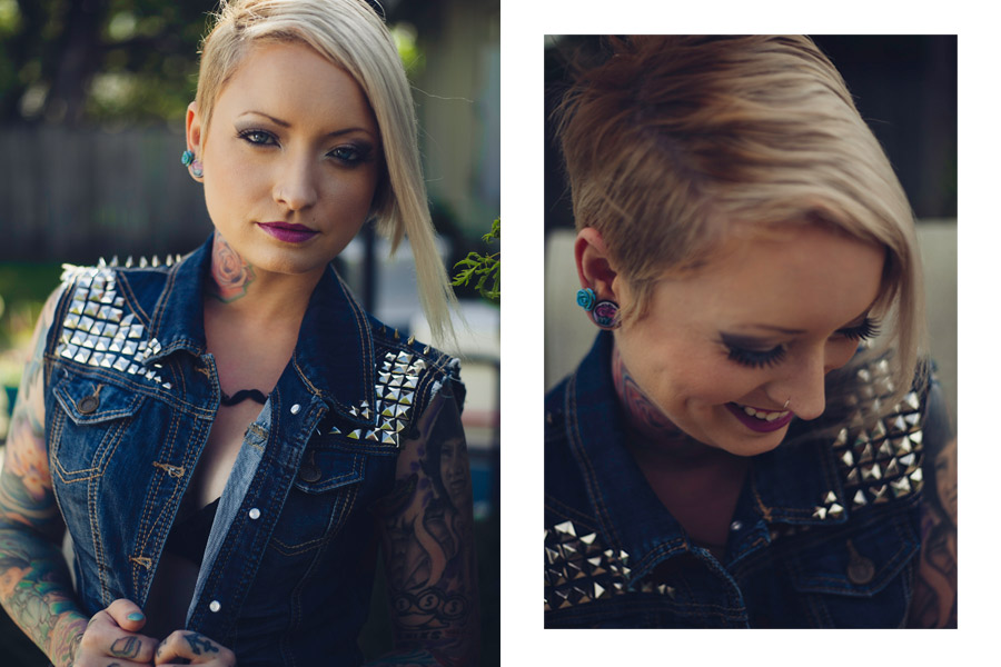
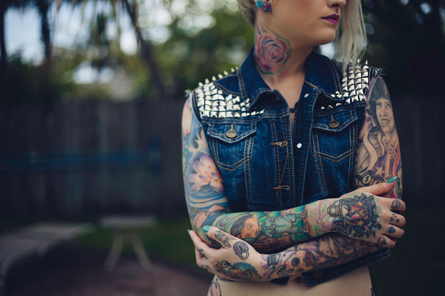
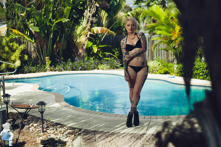
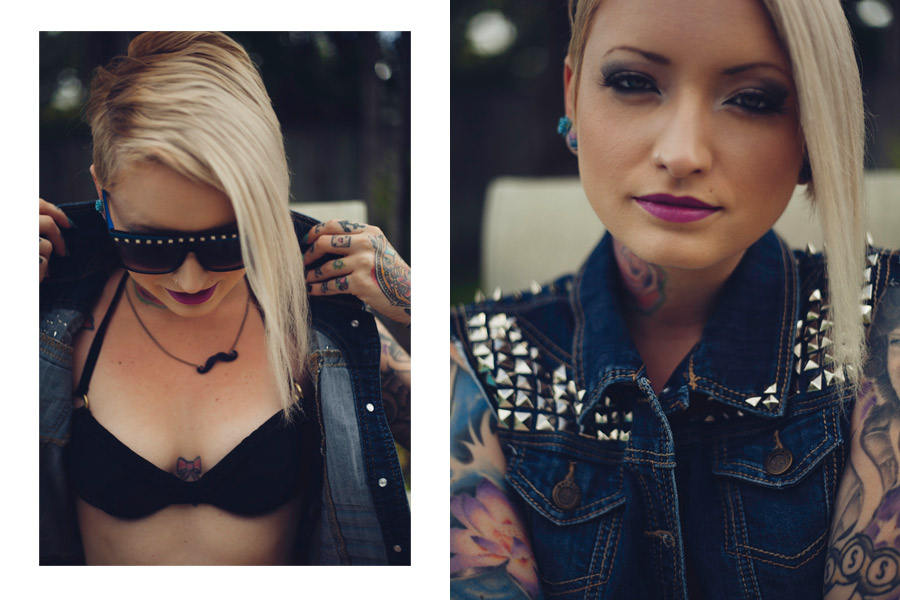
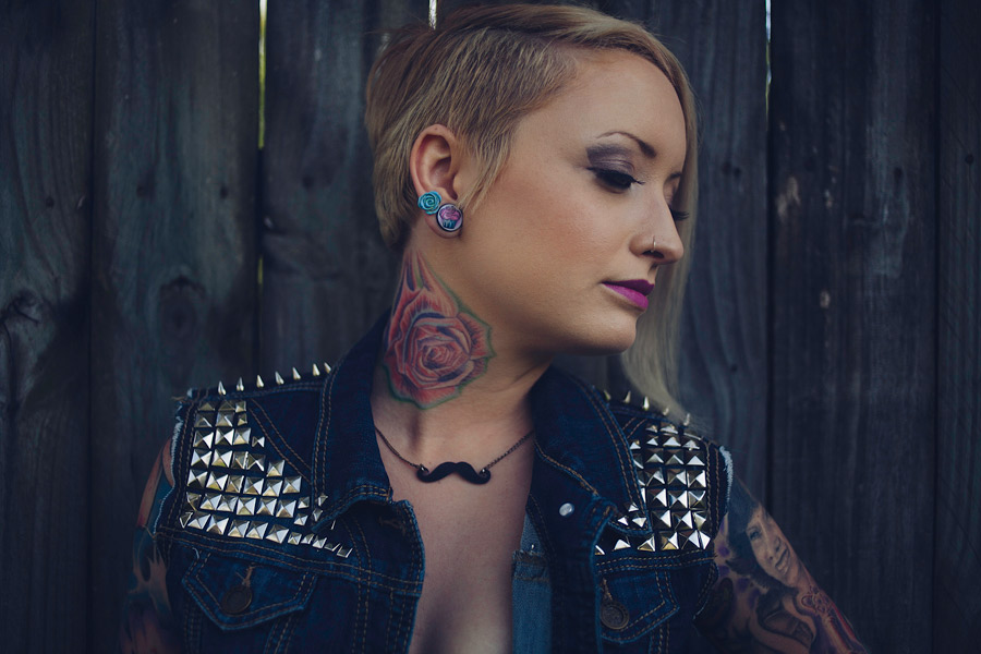
Most of these have a grey look caused by being shot on an overcast day, or in shade. Her ink seems muted in all of them. I feel like adding a bit of contrast and saturation could make the ink stand out more, if you can't re-shoot and push more light on to her skin in the first place.
Her poses are all fairly closed in, arms folded, legs crossed. She looks uncomfortable, and, worse, she's not flaunting her ink.
Find some pieces that she wants to emphasize. Find some more wanton, open, dynamic poses (think tension, think twist, think leaning, bending turning, reaching, stretching) that will really bring those pieces front and center to the camera. Now pour light all over her -- you're still interested in lighting her pretty well, but it's all about the ink, so don't be afraid to put her in full sun, and fill shadows aggressively with flash or reflectors. Now post process to make the colors really pop. Get in close -- don't lose her in the frame like the first shot here, and don't give us tight crops like the last couple, give us all of the girl, or most of the girl, sexy and warm, but not too much else.


 more on the fanpage. http://facebook.com/miamiphotog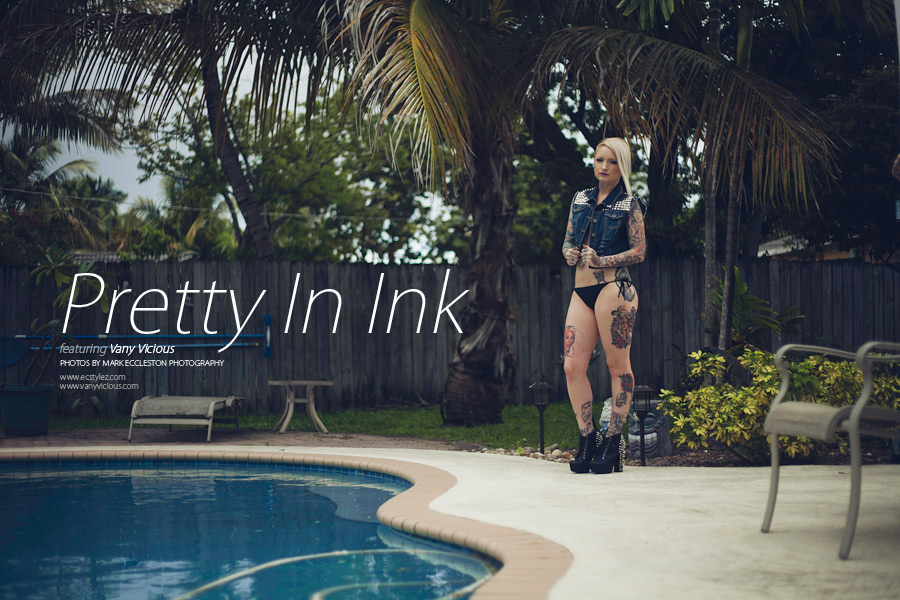


![[No title]](/data/xfmg/thumbnail/36/36657-3774cdd7ebbafa5ccac2741386b9949a.jpg?1734169171)
![[No title]](/data/xfmg/thumbnail/38/38736-5bc266b035e23faf5ad942bdd97466a8.jpg?1734172601)

![[No title]](/data/xfmg/thumbnail/36/36660-bd2cdec38aac6e50675fa36657307cba.jpg?1734169171)
![[No title]](/data/xfmg/thumbnail/38/38735-2245cc1b04db3f96fa74095ae14558a6.jpg?1734172601)