What's new

promised him prints

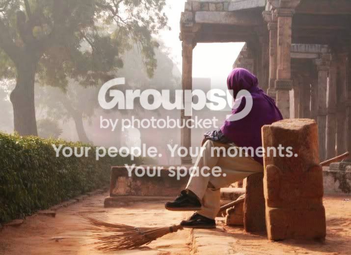
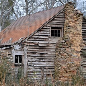
hmmmmm. ...after reading mohit's comments about delhi and this being fog I feel the lower contrast is more suited to the pics....but it does, IMO, need a bit of tweaking and I've cropped to where I feel it needed to be cropped to make it compositionally more appealing.
The square rock structure to the right was just drawing my attention so I cropped it out and I think it has put more focus on the subject. Also increased contrast, saturation and sharpness slightly and added some warmth.
Hope ya like it. :D

img01566pj.jpg
 
First off, awesome pictures. i really LOVE them.
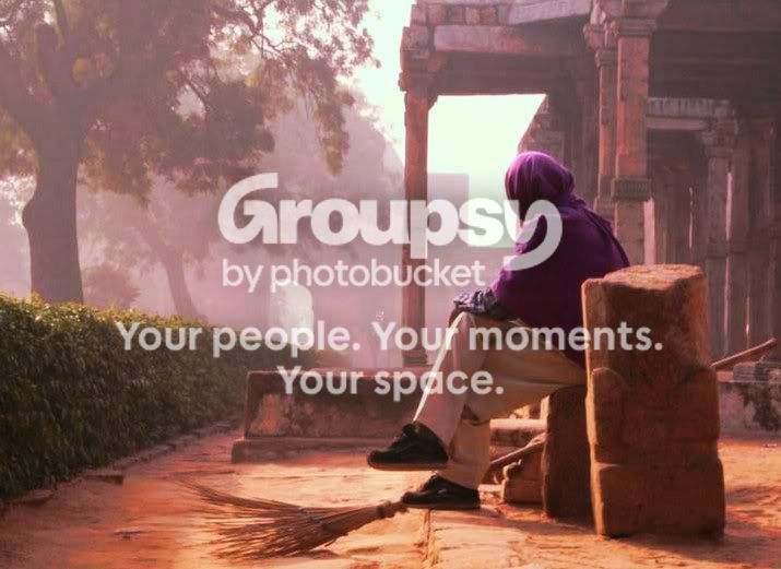
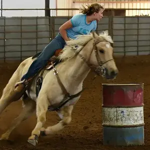
Ok, here's my modest conribution to the editing. I edited Mohit's version. What I was trying to achieve is to preserve the fog in th BG but make the guy "pop out" of it and to give some more life to the colors in the FG. Nothing drastic here, just general saturation, selected colors' saturation, selective contrast and lighting and some color balance changes... but as I said, it didn't change drastically. Hope you like it.

IMG_01562.jpg
 
hehehe....got enough to choose from yet kunal? :lol:
:thumbup: kudos to you too alex
 
thx Jon!
I made another one, trying to give it a warmer feel... messed with selective color balance... Maybe that's too much of reds, dunno... I just can't stop, it's an incredible picture I could keep playing with for hours and hours...
IMG_01563.jpg
 
all I keep in the back of my head is, if it looks photoshoped, then thats a problem...... just my thought...

unless its some kind of artsy thing thats supposed to be like that....lol

all are nice.....
 
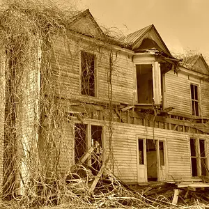
Kunal, I love these all... but something about #2 just screamed "black and white!" to me... since everyone else is working on your pics... here is what I see in #2:

img01681wy.jpg
 
Mohit – u rock man….thanku soooo much for a lovely comment….yes I’ll shoot the way I do only but still these things do help a lot…plz keep giving me these advises….they’re of gr8 help…..and also bout the eyes….I also feel that wud have added to it…..ur thing with the eyes reminds me of ur photo that u took in srinagar(too good)….
Taralyn romero – thanku soo much
Jon – I like the increased contrast, saturation and sharpness does add warmth….i agree with the square drawing the attention away but some how I don’t feel like cropping it…..cant express it but like the compo in the one before….but yes colours r much better….thx man…I like it ? I must say I love it….thx
Got a lot to choose from….and it’s a wonderful feeling….
Alexandra – nice to see one more new member contributing to the comments……its very nice of u….well I guess u also don’t agree with the cropping…I like the idea and wud have done it mayb but some how in this photo I don’t feel like….seems better this way…..ur editing with the colours is even better…u do make the subject “pop out”…nice stuff…..i wud have also avoided anything drastic….nice work…I like it.
I like ur 1st one more….wat do u say ?and also ur most welcome to play around wit the photo…if not here u can mail me if any changes made….thx a ton…once again…..
Thorhammer – I totally agree with u….do u feel that way with any of the photos ?

It’s a long reply but I guess couldn’t help it…..all u ppl have been gr8
 
looks a bit faded to me...wat do u say...and now that mohit has also said it....i wish i wud have got the eyes also in it....BW wud have looked even better...but i am missing the pink here....:-(
hope u dont mind...
 
They are wonderful shots Kunal, and your kind disposition has made this thread a pleasure to read. The people who have helped you in here are awesome, and I really like the efforts they have made to help you.. well done everyone, but I must say JonK has made the most appealing rendition of your first shot., giving it good balance overall., imo

PS is a great tool, and can make a incredible difference in photos, but it take a lot of time and practice to learn to use it, and end up with good results.

You will learn to develop an "eye" for post image work, as I am now., and it is great fun! Welcome to TPF, and good luck with your exhibition!

 
Welcome to the forum. A photo is different for everyone so for me I thought these images needed a much softer look so I desaturated quite a bit and gave them a diffused glow. This is only my opinion and it will be you to make the final decision on how you like the prints.

Cheers,

Eric

IMG_0156.jpg


IMG_0168.jpg
 
hey raymond
u guys r gr8....i guess i wont stop saying it...thx yaa....its gr8 to join such a forum...thx.....yes i guess i'll also have to start getting used to PS...it seems to be too good
airic - hey u give the whole photo a new meaning....very diffrent from others and u know wat...i am really really liking it.......gr8 work.....i might just post this one....a big thx to u.......thxxxxxxxxxxxxxx
 

Create an account or login to comment

You must be a member in order to leave a comment

Create account

Create an account on our community. It's easy!

Log in

Already have an account? Log in here.

Back
Top Bottom