Hrm, ok, here we go.
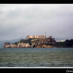
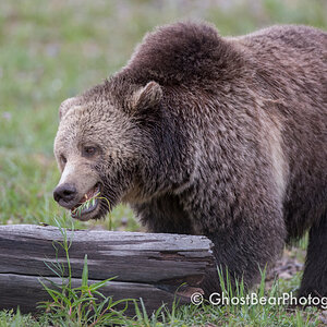
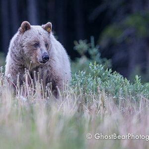
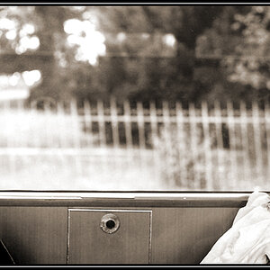
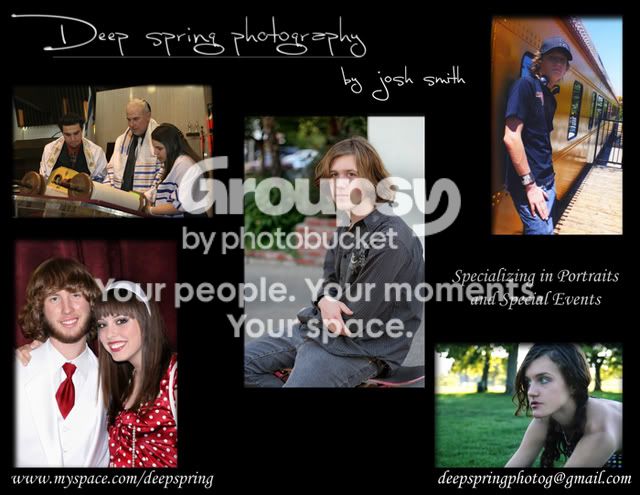
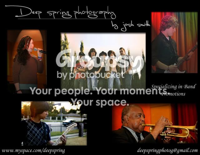
The layouts have some issues, in my eyes. The text, personally I don't like, mainly because of the fonts, but there are some layout issues. As for the photos, personally, I would pick one photo, your best obviously, and go with that, big enough for us to see. If you must do more than 1, do 3, and line them up neatly. Here they look disorganized. My eye doesn't know where to go. 3 across, evenly spaced, with a thin white border around would look sharp. You want this to look sharp, to show people you have a keen eye for detail and composition, which is important in photography.
The title where you have "Deep spring photography...by josh smith". I would capitalize all three words. It's fine if you want to leave your name lower case, but it needs to line up with the end of the first line. It looks like it wants to be a seperate entitity, which it isn't. I might try a more professional looking font as well. This font has a "written by a 13 year old girl" feel to it.
The link to your myspace page is nice, but a real website link would be better. Your OWN website. If you must use it, in this context, it shouldn't stretch out past the edge of the photo above it. Same thing with your email address on the bottom right.
I hope that helps. I do this for a living, and it's very difficult to do layout. There are lots of small details to pay attention to. The average person won't notice the small details when they are wrong, but they'll feel that something is off. When it's a clean layout, it can be really eye catching and make people notice.




![[No title]](/data/xfmg/thumbnail/34/34119-711b53445c011079fb89b6f42682ed00.jpg?1734164590)
![[No title]](/data/xfmg/thumbnail/39/39291-a89dc472765e04f66f617dd9acc8030d.jpg?1734173259)