Tennessee Landscape
TPF Noob!
- Joined
- Jan 19, 2008
- Messages
- 580
- Reaction score
- 0
- Location
- Seymour, TN
- Website
- www.myspace.com
- Can others edit my Photos
- Photos NOT OK to edit
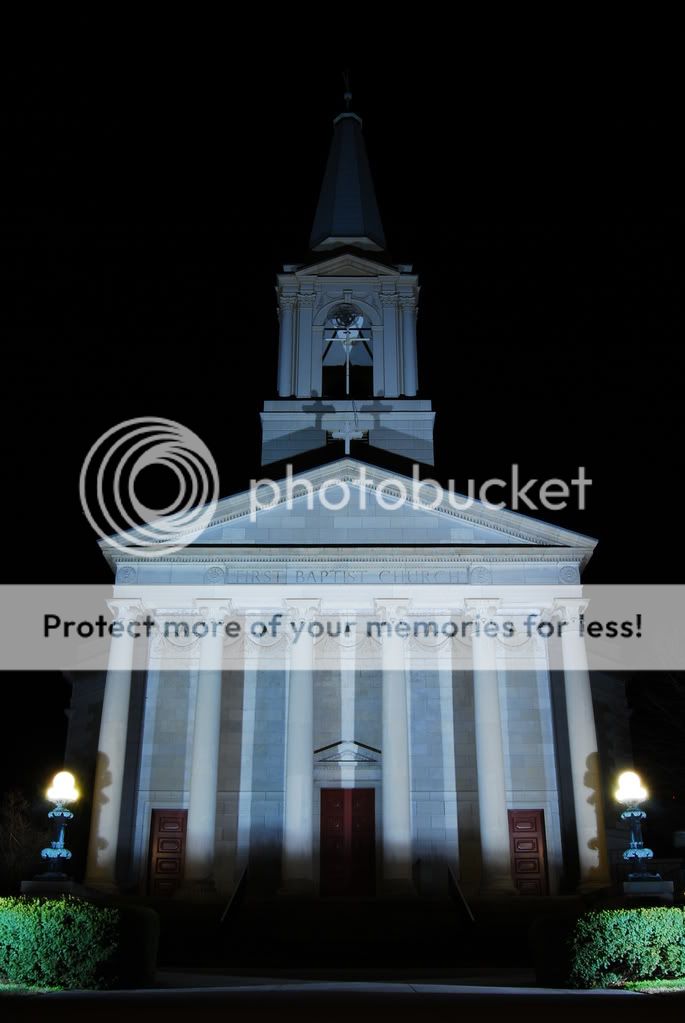
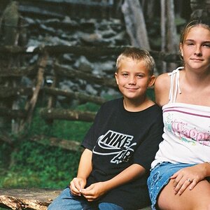
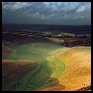
Which of the two picks is more correct concernig WB?
A
B
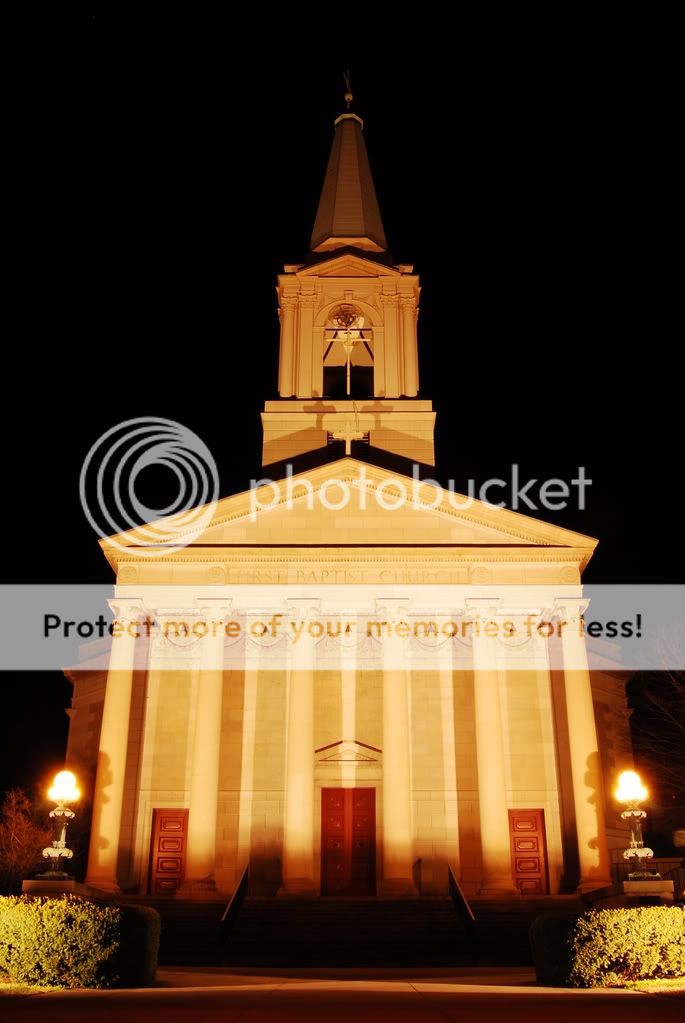
B
")
![[No title]](/data/xfmg/thumbnail/32/32160-4e45e524b050f1afae9fd21bf696d61b.jpg?1619735234)


![[No title]](/data/xfmg/thumbnail/34/34125-d7028823900ffcf1cfce62bf748dea24.jpg?1619736295)
![[No title]](/data/xfmg/thumbnail/32/32161-a5da499a329f1fae945778aac75d4442.jpg?1619735234)