Railroad bridges - 4 for C&C please

OrionsByte

No longer a newbie, moving up!
Joined
Jul 6, 2010
Messages
1,500
Reaction score
261
Location
N. California
Can others edit my Photos
Photos OK to edit
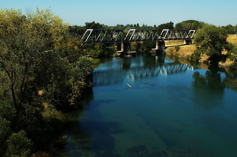
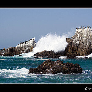
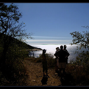
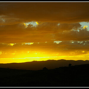
Went for a photography walk today, these are a few of what I ended up with. C&C would be greatly appreciated - I can't improve without feedback. :)

1.
DSC_8399-1.jpg


2.
DSC_8402.jpg


3.
DSC_8403.jpg


4.
DSC_8406.jpg
 
After seeing all four together, I realized that 3 and 4 seemed really flat compared to the really stark contrast in 1 and 2, so I went back in and increased the contrast and adjusted the curve in those two. Is it an improvement?

3. (edited)
DSC_8403-1.jpg


4. (edited)
DSC_8406.jpg
 
#3 is a trestle, #4 is a bridge, a through truss bridge.

Oh cool, thanks for the correction. The subject of #1 and #2 is the same as #3. In fact, you can see the through truss at the distant end of both of those. :)
 
#1 is ok, but I'd crop the top 1/3 because there is nothing interesting in the sky and the train is way too small.
 
I'm not crazy about the third one, but I love the rest! The first one is wonderful! Bridges are quickly becoming one of my fav. things to photograph, they can have so much character!
 
#4 looks a bit more saturated and you still maintained detail in the shadow and 3/4 tone areas but IMO you went too far in #3 and plugged up some of the darker areas, sacrificing detail for contrast. Personally, I try to never eliminate detail unless it's something that detracts from the overall picture. Try going into photoshop and using curves to lighten up the highlight end of the images and see if that doesn't make them look like they have more contrast. That will increase the tonal range of the picture.
 
#1 is ok, but I'd crop the top 1/3 because there is nothing interesting in the sky and the train is way too small.

That's not a train at the end of the tracks, it's actually the bridge pictured in #4. Point taken though.

#4 looks a bit more saturated and you still maintained detail in the shadow and 3/4 tone areas but IMO you went too far in #3 and plugged up some of the darker areas, sacrificing detail for contrast. Personally, I try to never eliminate detail unless it's something that detracts from the overall picture. Try going into photoshop and using curves to lighten up the highlight end of the images and see if that doesn't make them look like they have more contrast. That will increase the tonal range of the picture.

That's a good point, and I didn't notice how much detail I lost. I'll go back in to the RAW and play with the curves to see if I can do a bit better.

Thanks for the comments everyone!
 

Most reactions

Back
Top