Hmmmmm... I like these, very simple images, quite lovely.
That said, my critique (take this with a grain of salt of course, I'm a nooB):
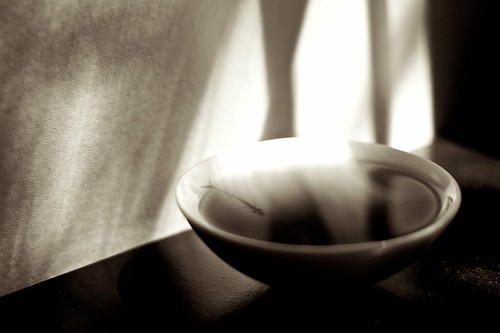
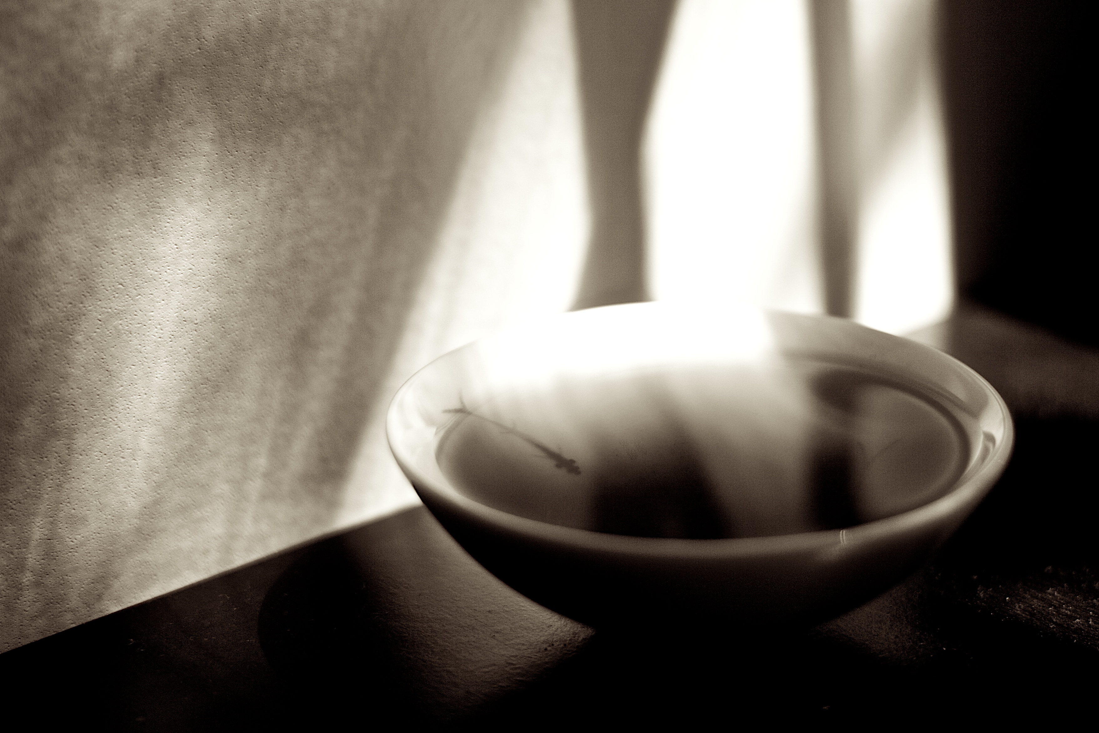
In the first picture, the brightest part of the bowl is washed out and blends into the background. I think I personally would have preferred some diffraction on the light source to keep this area from getting so washed out. Even so I think this is my fave image!
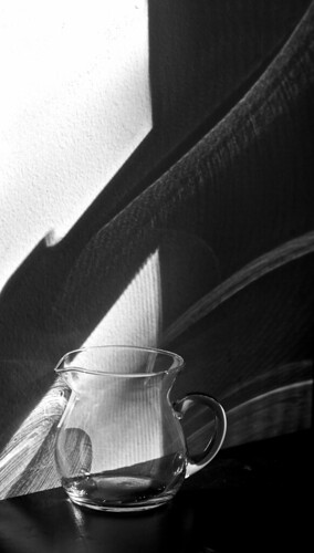
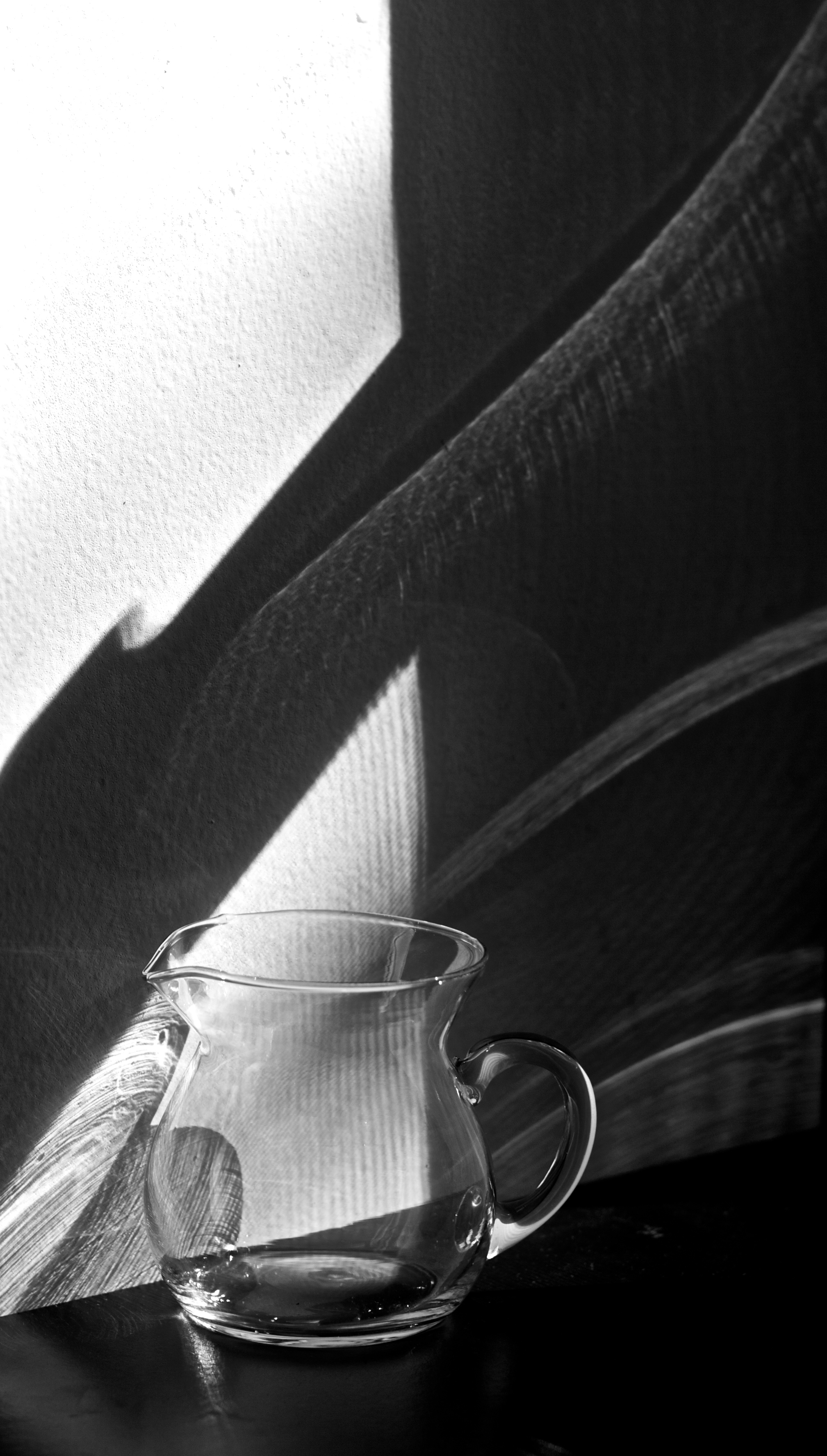
In the second picture, I really enjoy the way the light plays on the wall behind the pitcher, but I feel like it being directly behind/seen through the pitcher from this angle makes either the pitcher or the lighting seem distracting - my eye wants to be able to focus on one or the other but is attracted to both at once. Still, an interesting idea that would be fun to explore further!
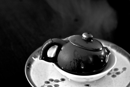
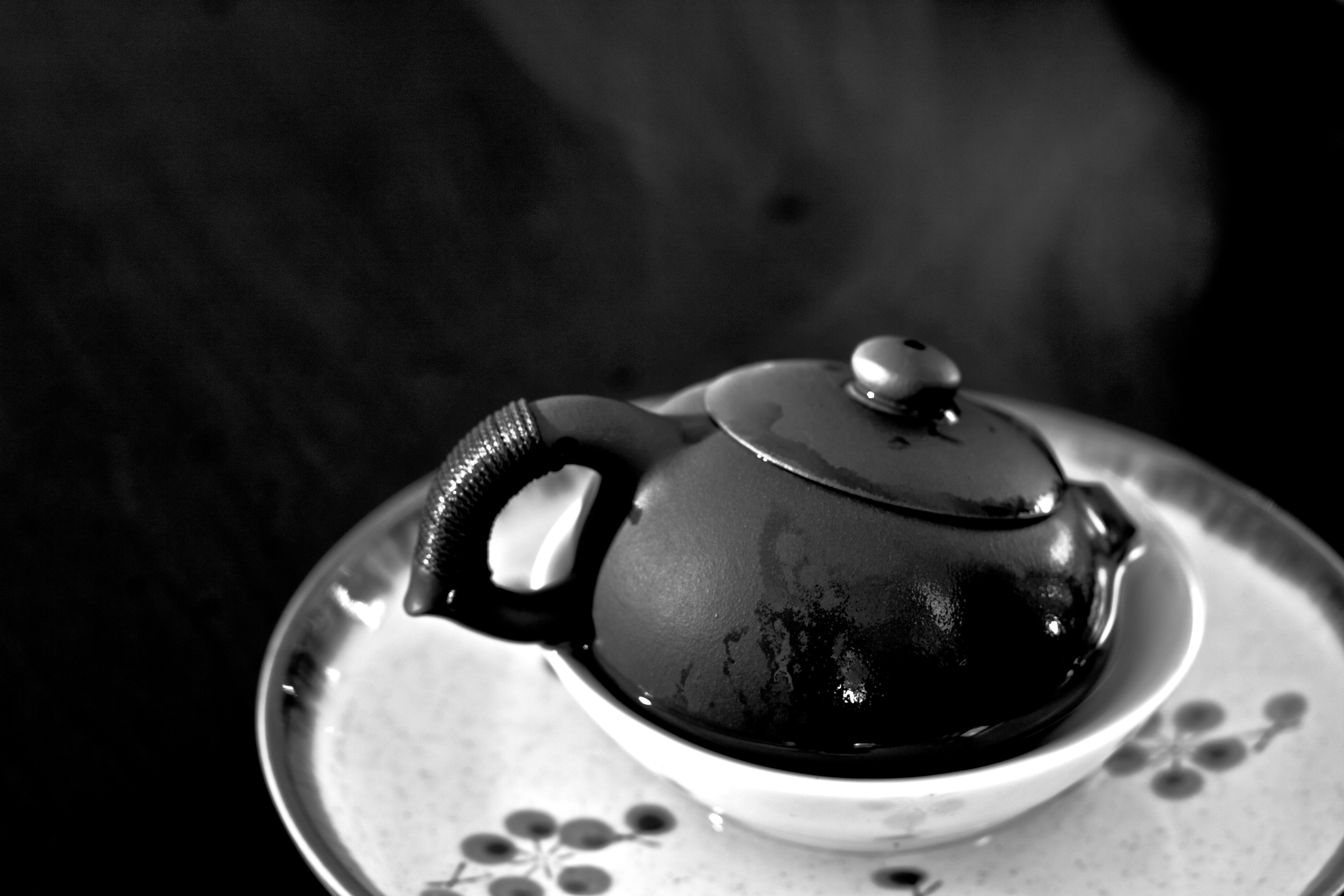
The third picture - its not my favorite but I'm not sure exactly what makes it less my favorite so I think I will leave that one for someone more experienced!




![[No title]](/data/xfmg/thumbnail/31/31038-84f0b9d14b7ced20e61bc19a9d4dfcc2.jpg?1734159138)