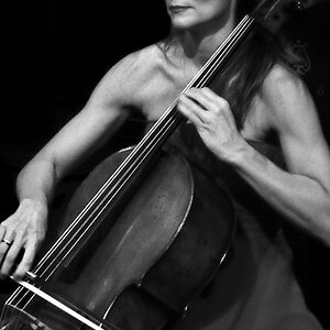
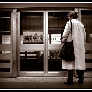
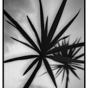
All in all, good start with reasonably composed, focused and arranged pictures but you need to do a bit more work on the creative side.
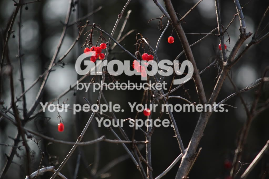
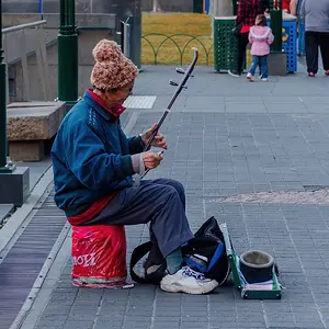
#1 is just another picture straight on with nothing much added by the photographer.
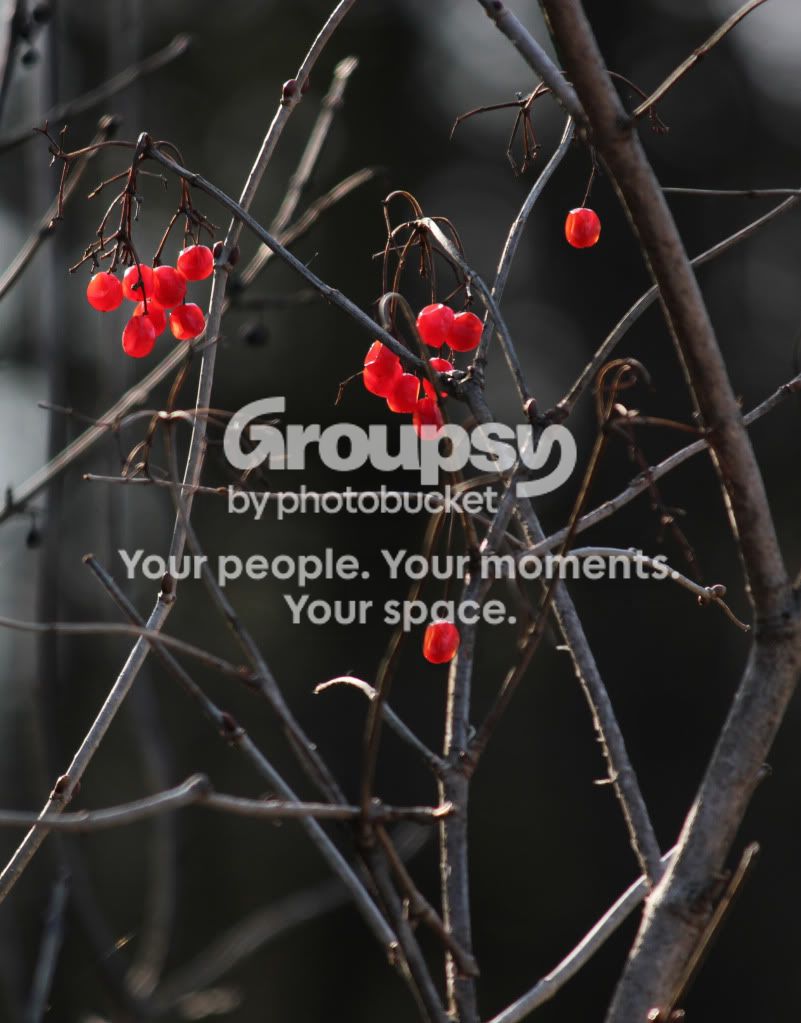
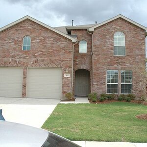
#2 is a nicer capture, nice arrangement, nice color, looks sharp (although the picture is a little small to tell and critical sharpness is good in these.)
But there is a lot of extra space that doesn't add to anything.
You could have shot this in portrait aspect, used a higher iso, with a slower speed and thus a smaller aperture and focused on the most front berry so it would be in focus also. As it is, that single OOF berry right smack in the middle is annoying.
View attachment 4370











![[No title]](/data/xfmg/thumbnail/33/33463-55c43b1c1b1a6eace5b4807ead885151.jpg?1734163528)