@Starskream666 OOF= Out of Focus. The term is usually applied to the out of focus area of an image and the creaminess of that blur.
@JWellman
The pic is a little soft and could benefit from a fill flash to control the bright upper third of the image. A fill flash would also allow an aperture adjustment to bring sharp focus to the family. You don't want to compete with the busy foliage in the background. 5/10
I love the sunbeam coming thru the foliage, I think it captures a spring/summer feel. The sky is still a nice blue and the leaves and trunk are bright. I give it a 7/10.
Keeping with the tree theme... I like this image because it gives a creepy kind of halloween feel.
I really like this picture, it def. has a creepy feel to it. The only thing I thought was that my eyes had a hard time focusing on the tree because all of the colors sort of run together. it seems like the sky is a little blown up but it adds to the effect. I really like it 7/10
There are a lot of things I don't like about the pic, but whoever rates it, give me some tips on how to make it better!
I find the picture with the silver balls to be a little boring. I like the depth of field but the subject is uninteresting and I don't like the reflection of the camera in all the balls. Was this the look you were going for? I would like to see some movement or something and maybe from a slightly different angle to avoid the reflection. The movement would give it some interest.
Oh...crashed!
Well, I'll leave my critique for the orange flower:
I think I would have moved the green stem on the left, and the foliuage on the right. The out of focus petals are ok, but the rest of the image needed to be simpler, I think. Lovely colour, however. 6/10
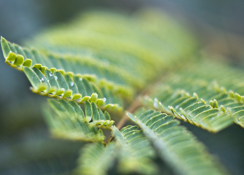
The green fern: A nice arty shot, with minimal depth of field. You might have got away with just one side of the fern, too...say cropping to leave the left half...that works, too. I can see it working with a greater depth of field, too. 7/10











![[No title]](/data/xfmg/thumbnail/37/37093-76cde0d618a8f2748a7d7543d7b4f9ea.jpg?1734169827)
![[No title]](/data/xfmg/thumbnail/37/37092-c446ffb89610a57384a51ac5254beffd.jpg?1734169827)
![[No title]](/data/xfmg/thumbnail/37/37096-449bdc6a1e392458a52fd1cca97c6b2e.jpg?1734169827)

![[No title]](/data/xfmg/thumbnail/37/37094-a3c300cd42f78d01d01fe80c1233002e.jpg?1734169827)