What's new

Rate the photo above you

Very pretty girl on a nice blurred background but just a bit too busy and i would have shot it in portrait orientation 6/10

Last one from me
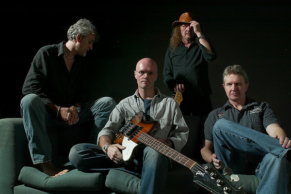
430391333_32JQ8-M.jpg
 
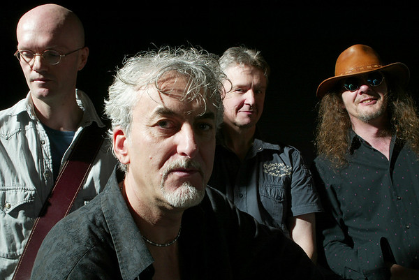
7/10. What I don't like: Foot & hand cut off on the guy on the right, head of the bass cut off. The guy in the back seems like he's too far away.

There are also a few specks on the background - not sure what that is... If this was film (is it?), I would say it's dust.

If it weren't for those things, it would have been a 9/10.


One from me:

04191123 by J E, on Flickr
 
Very nice but you have cut out half of the movement :lol: 9/10

Here you go this was the best one that they use on posters

468012210_FVgeC-M.jpg
 
7/10 Really interesting to see! Maybe there could be a little more room around the whale.

I'm curious what anyone thinks of this one. I don't think it's my best but it's a tad interesting to me.
img2721jpg.jpg
 
I actually like that one a lot... I'll let someone else give the rating though - getting ready to put dinner on, and I don't have a picture ready...
 
I like it. Only things I would look to try would be to tone down the green of the bushes so they compete less, and try to avoid the reflection of the shadow in the (her) right glasses lens. Not saying that'd be easy, and probably beyond me at the moment, but it'd help. 8/10


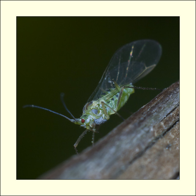
greenfly by http://bendthelight.me.uk, on Flickr
 
6.5/10 - A little bit more of the insect could have been in focus especially its wings. I think it could also benefit from some cropping so that there is not as much blank space around it.

img6247jpgcropped.jpg


I actually like that one a lot... I'll let someone else give the rating though - getting ready to put dinner on, and I don't have a picture ready...

Thanks!


7/10 Really interesting to see! Maybe there could be a little more room around the whale.

To tell you the truth I wanted the same. I had a 75-300 on thinking they would be at a distant but they were under the boat pretty much and I couldn't get far enough away

Haha... Same thing would so happen to me!
 
@tigertail

5/10 A good portrait with a direction of the light so there is no distracting shadows on the face, however I feel that the composition is kinda lacking and that the image would work better in portrait-orientation. Also the background is super distracting with both the dark shadow to the left of the subject, as well as the power-lines, and how the horizon is cutting through his head.

p37805413-4.jpg


Andi Deris, frontman/vocalist for the metal band "Helloween" shot with Lensbaby @ f/2.8
 
7/10

Very dynamic pose and colors, but the picture would be better if the camera had been rotated slightly to emphasize the diagonal lines created by the lights.

10773352.png
 
4/10 - Camera position too low, shoulders too square, lit side of face too yellow, contrasty light giving long, hard nose and chin shadows, right shoulder too bright, no separation from background, excessive negative space in top of frame causing eyes to be too low.


1094363291_gmS38-XL-1.jpg


Sorry for the cheat, but nobody rated me yet, I changed out photos. ;)
 
Last edited:
7/10 - everything is in focus and the face speaks for its self. The big black space seems too much for me. And I would of liked the sunglasses off. We already don't get to see one half of him- so getting to see more personality in the eyes would be my only "big" complaint. But Im a "catch light eye junkie"

Emailfolio1of1-3.jpg
 
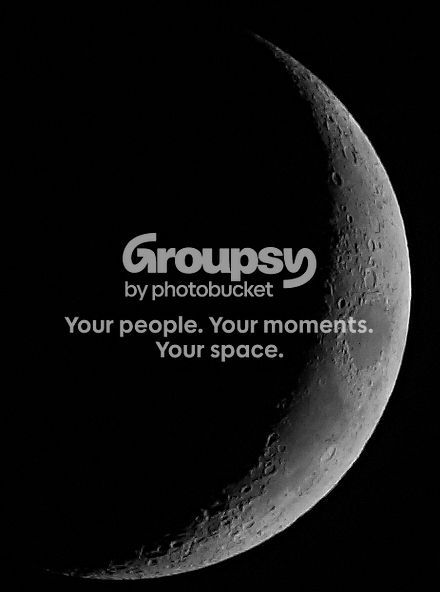
8/10
Good composition, focus, interesting subject. I might lighten it up just a touch.

Crescent7-4-2011.jpg
 
7/10 - everything is in focus and the face speaks for its self. The big black space seems too much for me. And I would of liked the sunglasses off. We already don't get to see one half of him- so getting to see more personality in the eyes would be my only "big" complaint. But Im a "catch light eye junkie"
Thanks for your comments. This was a lighting excercise to properly expose the subject (me) without having the light sources reflect in the sunglass lenses. The other one was just as clean. :biggrin: This is one part of a project I have on the back burner. The image is to evoke questions.
 

Create an account or login to comment

You must be a member in order to leave a comment

Create account

Create an account on our community. It's easy!

Log in

Already have an account? Log in here.

Back
Top Bottom