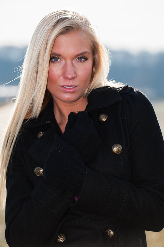
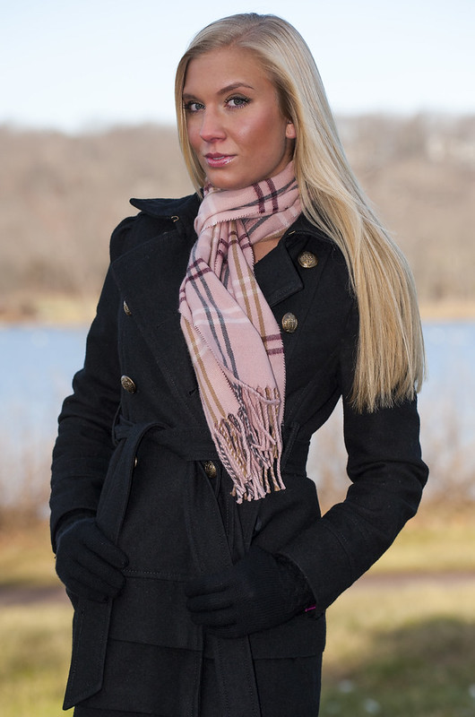
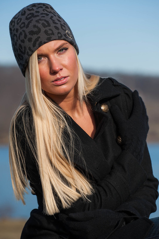
She's a very attractive lady!!! I'd agree with tirediron that #1 has her a bit too square to the camera, as we can see when comparing shot one against the second shot where she's angled to the camera and thus looks about 40 pounds lighter. SHot #1 also has a really dark,dark jacket...I cannot see much of the garment...it's just very dark. I think the contrast on these is a bit too high. Her face looks like it has a bit too much "sheen" on it, which I think is due to the flash, and also, as I mentioned, the dark jacket and gloves look very "inky"...which is why I say the contrast is too high...I'd like to see more DETAIL in the clothing...be able to "see into the blacks" a bit, perhaps through an adjustment toi the curves, or by using the fill-light control in say, Lightroom, or the Highlight/Shadow control in Photoshop.
I think comparing shot #1 against #3 is instructive; look at the eye area on either side of her nose in the first shot, and see the specularity, the "sheen" to the skin, and then look at the third shot, and look at the eye area on either side of the nose, and see the skin has less sheen, and a richer, more-saturated color, and her overall "Look" to her face in the third shot is MUCH sexier, much prettier. Shot #1 looks over-flashed; the flash is causing too much sheen on the skin, and is totally eliminating the shadows coming from the sunlight. In the third shot, there is a LOVELY, strong, deep, shadow under her chin, which shows us the time of day (mentally), and the fill-light you brought in is NOT over-powwering the sunlight. Using the sun the way you did in the third shot is an excellent way to do location "fashiony" portraiture of pretty ladies!!! The effect is a lot like using a large studio flash unit...crisp shadows, direction to the light, and nice modeling/shaping of facial features. The way the main light crosses over her nose in the third shot, and the way the shadow under the chin is cast, makes her look just great in shot #3. The fill-flash in #1 just ruins that sunlight.
In my mind--you wanna shoot MORE SHOTS the way you did the third shot, and no more of the kind done in the style of #1...



![[No title]](/data/xfmg/thumbnail/31/31041-5783ca3812325c3201a2dd513def662d.jpg?1734159146)
![[No title]](/data/xfmg/thumbnail/35/35955-01e9c8140cdcaac10d227d68e42ac0d4.jpg?1734167771)
![[No title]](/data/xfmg/thumbnail/32/32947-11daccca0ca979c310e3963ceb9d01d8.jpg?1734162797)