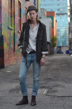
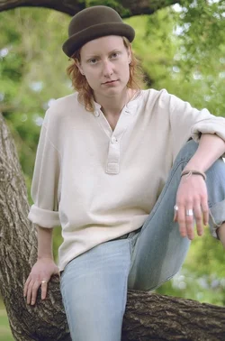
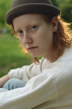
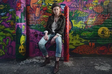
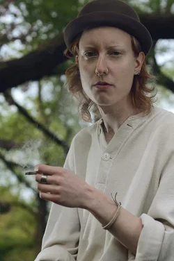
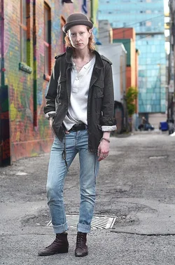
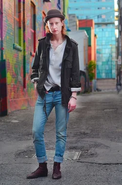
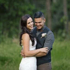
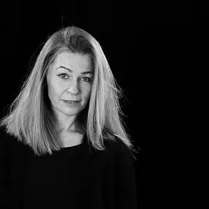
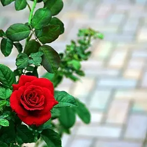
Interesting subject. I like #1 and #3. #1 being the more interesting but #3 being a better portrait - if that's what you were going for.
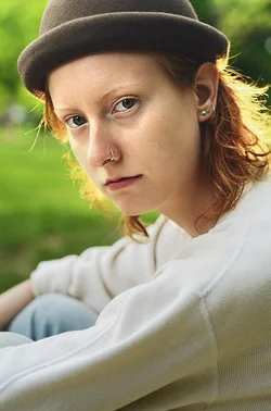
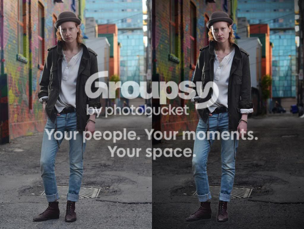
I took a stab at editing #3 just as an exercise. I'm learning so I like to try and see what I can come up with. I smoothed the skin just a tiny bit, increased the exposure overall but primarily on the face and lightened the eyes just a bit.
All of your images are underexposed and are lacking much needed light in the face. You focus is soft on several of them and I see some motion blur. #1 would have hit the mark except you needed additional lighting here to fill the face. I love that alley.
A basic problem in many portrait shots is the small difference in luminosity and value between the subject and the background.
Look what happens when the background is darkened without changing the contrast and the contrast of the subject is increased and the subject only is sharpened.
It would look better with a higger res original but this is a good example of how simple edits can change things.
I would have been much more careful with the pavement so she doesn't look so 'floating' but you get the idea.
I'd say this definitely has potential. Personally, the shade in #2 makes it look like he had an accident, but maybe that's just me :/ keep shooting, I like your style!
I like #3, too much color in background in some of the others, and like said, most look under/over exposed. Poses look good to me, but I am NO professional.
ha.... that was me... and it does not look like that on my pc.. lol!!! I promise... I was playing with a lab color type edit and it does NOT convert well.... oops







![[No title]](/data/xfmg/thumbnail/37/37634-504722605a418b398f3cd1dbabf936e5.jpg?1734170757)
![[No title]](/data/xfmg/thumbnail/32/32160-4e45e524b050f1afae9fd21bf696d61b.jpg?1734161046)