slow231
No longer a newbie, moving up!
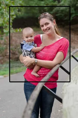
Photo 1, the story: so i recently joined the 70-200 club  . had to drive about 3 hrs to get it, but i got a killer deal. Dragged the wife and kiddo along and took a walk through a local park where i snapped this:
1:

overcast day w/ no light modifiers (only took the body/lens with me), so the lighting could be better (any tips or advice on this would be appreciated since i almost never use them anyways). but the main idea was to try and use the railing as a leading line. I've never really been satisfied with the results of using leading lines for a people type photo, and i'm not quite satisfied with how it works here either. I usually like to get the lines to come from a corner (as much as possible) because otherwise it looks like it's just splitting the frame. but doing this makes the railing take up too much frame real estate imo. it doesn't help that the railing isn't the prettiest of leading lines either, but any way to make this work better? I'm pretty close to abandoning the idea for people photos, even when it's done right i just don't think it adds all that much. my eyes don't tend to really follow lines in a photo, my attention goes more toward brightness/darkness.
i'll take tips on posing too. i kind of know what i like after the fact, but don't really know how to pose subjects to begin with. I like the kiddo's expression and mamma's head tilt in this. The lean on the railing helps her look more comfortable/relaxed too (imo).
2:

just silly one. bumbos are dangerous! I'm still playing with the tilt, not sure it works perfectly here, but i like that it puts his head to toe on a diagonal across the frame. i don't think the wobbly feel hurts too much here since fits the subject.
and 3:

i'm gonna put small version up so you guys don't laugh too much at me too much . but this was just completely confusing to me. i was going through and selecting shots to edit when i saw this. my gut reaction was i liked it, and i think that's because it's wrong in every way! the expression is bland, i cut off his head, he's looking off frame, it's landscape AND the background adds nothing and is way brighter... but all this just made it such an interesting photo to me.
I left the edit with him dark and with him looking off frame. i like that he looks like he's iced doing nothing (which he probably was) and is just staring incoherently at nothing (so maybe that's why off frame gaze works for me?). I like the contrast with the background (but it adds little else besides maybe some context and some negative space to the "wrong" side). but i feel like i'm reaching for reasons as to why i like it. it's obviously a technically weak photo, and if someone else showed me something similar, (even ignoring the technical "rules") i'd honestly feel that it's aesthetically weak because of the reasons stated... but for some damn reason i like this. maybe it's because i'm so use to picking out pictures where he's got some dramatic expression, lit way better, cropped better, composed better, that this being so different is just so endearing to me. anyways has anyone else ever gotten like that about a crappy photo?
and as usual cc on anything is fine with me.
. had to drive about 3 hrs to get it, but i got a killer deal. Dragged the wife and kiddo along and took a walk through a local park where i snapped this:1:
overcast day w/ no light modifiers (only took the body/lens with me), so the lighting could be better (any tips or advice on this would be appreciated since i almost never use them anyways). but the main idea was to try and use the railing as a leading line. I've never really been satisfied with the results of using leading lines for a people type photo, and i'm not quite satisfied with how it works here either. I usually like to get the lines to come from a corner (as much as possible) because otherwise it looks like it's just splitting the frame. but doing this makes the railing take up too much frame real estate imo. it doesn't help that the railing isn't the prettiest of leading lines either, but any way to make this work better? I'm pretty close to abandoning the idea for people photos, even when it's done right i just don't think it adds all that much. my eyes don't tend to really follow lines in a photo, my attention goes more toward brightness/darkness.
i'll take tips on posing too. i kind of know what i like after the fact, but don't really know how to pose subjects to begin with. I like the kiddo's expression and mamma's head tilt in this. The lean on the railing helps her look more comfortable/relaxed too (imo).
2:
just silly one. bumbos are dangerous! I'm still playing with the tilt, not sure it works perfectly here, but i like that it puts his head to toe on a diagonal across the frame. i don't think the wobbly feel hurts too much here since fits the subject.
and 3:
i'm gonna put small version up so you guys don't laugh too much at me too much
. but this was just completely confusing to me. i was going through and selecting shots to edit when i saw this. my gut reaction was i liked it, and i think that's because it's wrong in every way! the expression is bland, i cut off his head, he's looking off frame, it's landscape AND the background adds nothing and is way brighter... but all this just made it such an interesting photo to me. I left the edit with him dark and with him looking off frame. i like that he looks like he's iced doing nothing (which he probably was) and is just staring incoherently at nothing (so maybe that's why off frame gaze works for me?). I like the contrast with the background (but it adds little else besides maybe some context and some negative space to the "wrong" side). but i feel like i'm reaching for reasons as to why i like it. it's obviously a technically weak photo, and if someone else showed me something similar, (even ignoring the technical "rules") i'd honestly feel that it's aesthetically weak because of the reasons stated... but for some damn reason i like this. maybe it's because i'm so use to picking out pictures where he's got some dramatic expression, lit way better, cropped better, composed better, that this being so different is just so endearing to me. anyways has anyone else ever gotten like that about a crappy photo?
and as usual cc on anything is fine with me.







![[No title]](/data/xfmg/thumbnail/37/37113-886cb28b1e3fb197bdd00a9148269407.jpg?1734169831)