1- not sure if its the lighting or not, but the image seems soft to me, lacking sharpness. The concept is ok, but I dunno, might be too straight on for my taste
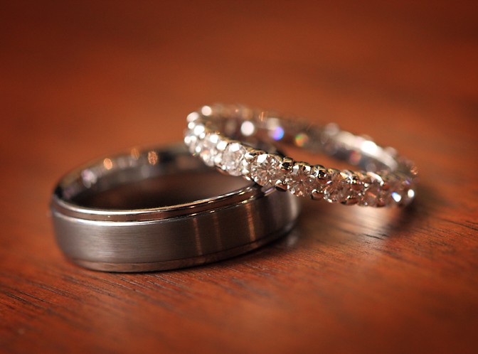
2- nice, clean, clear. I like the choice of wood for the bottom.
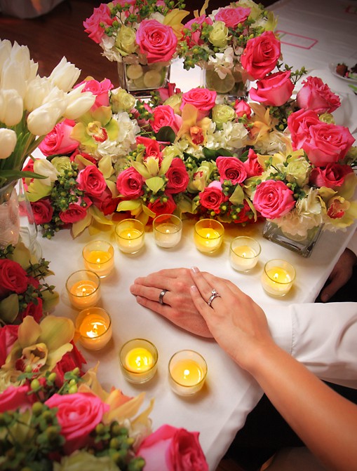
3- way too fake and posed for my taste. the whole candles going around the hands... I'm also not keen on the upper right of the frame with that empty space...removes from the intended subject
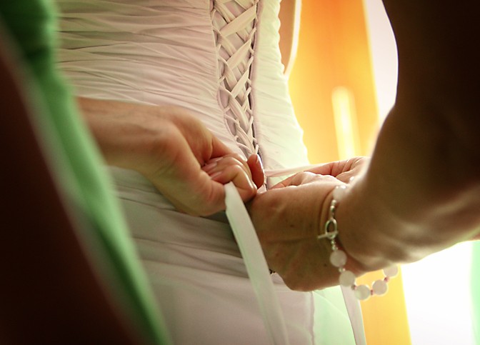
4- spot on, nice job. love the green, the angle.
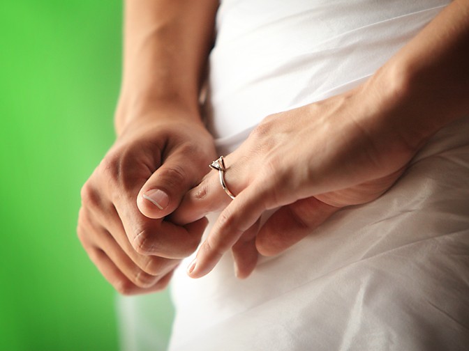
5- doesnt really say "wedding" to me. Would of turned the ring towards the camera more, unless this was candid.
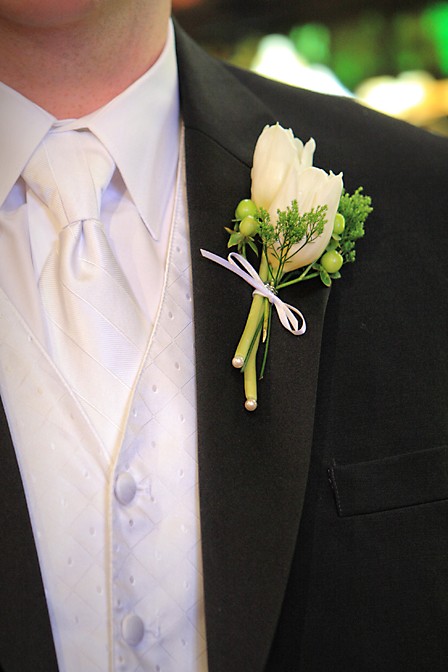
6- simple detail shot, clear, clean. I like. I guess the shirt and flower are both a cream colour? Maybe slightly more zoomed in to really have the flower as the focal point of the image, but I'm just nit picking
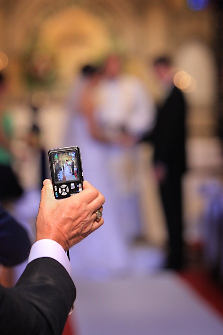
7- cute. might of liked a little bit more zoomed in on the screen to see more of the B&G
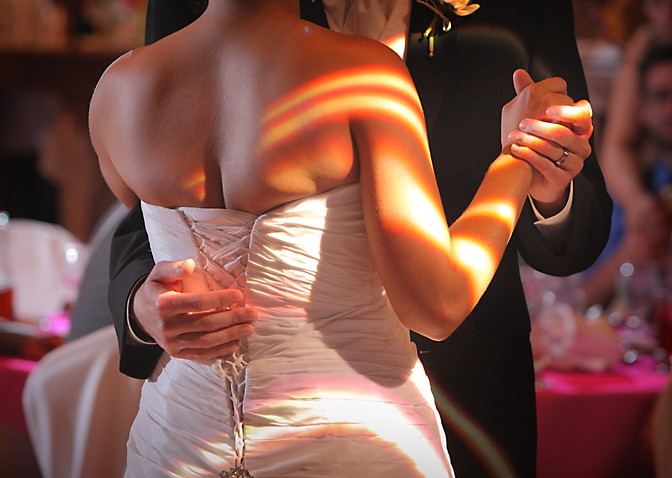
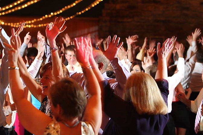
8- reception shot, its ok.
I gotta ask...any reason I dont see any heads or faces in any of these shots?!?
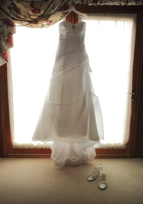
") ) - looks a bit underexposed (the dress does) I would up it a bit.
) - looks a bit underexposed (the dress does) I would up it a bit.


![[No title]](/data/xfmg/thumbnail/42/42271-5db67ba3109fc5edfe486ca6046bcc96.jpg?1734176671)


![[No title]](/data/xfmg/thumbnail/42/42275-2ca41f93a172e2e510afb46912a2bb61.jpg?1734176682)


![[No title]](/data/xfmg/thumbnail/39/39498-362f11d9bfd0d9e222faa85b38801745.jpg?1734173616)