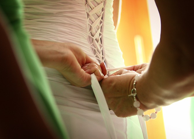
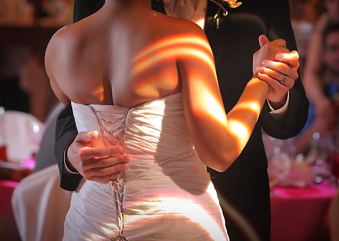
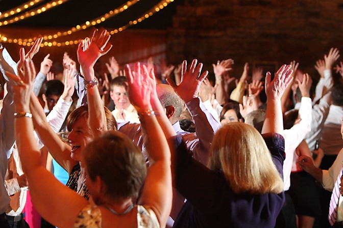
I would love to show you some of the portraits, but the client hasn't seen the photos yet. So here are just some of the non-face shots. Let me know what you think.
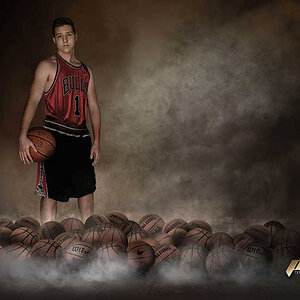
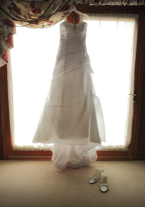
1- not sure if its the lighting or not, but the image seems soft to me, lacking sharpness. The concept is ok, but I dunno, might be too straight on for my taste
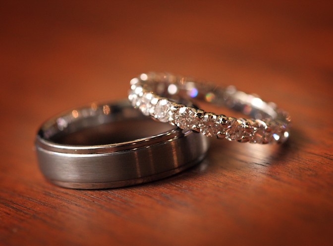
2- nice, clean, clear. I like the choice of wood for the bottom.
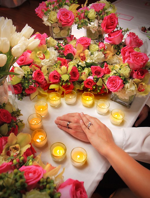
3- way too fake and posed for my taste. the whole candles going around the hands... I'm also not keen on the upper right of the frame with that empty space...removes from the intended subject
4- spot on, nice job. love the green, the angle.
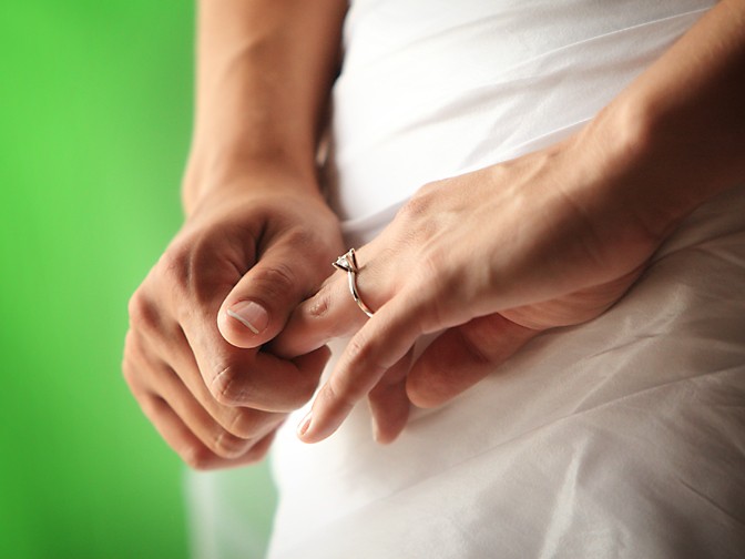
5- doesnt really say "wedding" to me. Would of turned the ring towards the camera more, unless this was candid.
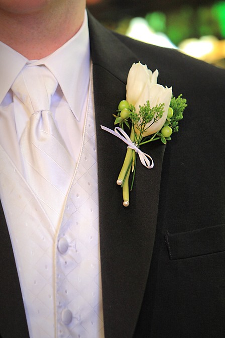
6- simple detail shot, clear, clean. I like. I guess the shirt and flower are both a cream colour? Maybe slightly more zoomed in to really have the flower as the focal point of the image, but I'm just nit picking
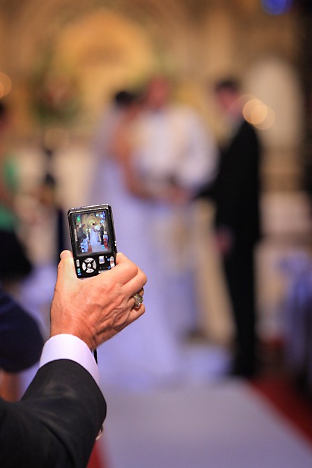
7- cute. might of liked a little bit more zoomed in on the screen to see more of the B&G
8- reception shot, its ok.
I gotta ask...any reason I dont see any heads or faces in any of these shots?!?
1- not sure if its the lighting or not, but the image seems soft to me, lacking sharpness. The concept is ok, but I dunno, might be too straight on for my taste
2- nice, clean, clear. I like the choice of wood for the bottom.
3- way too fake and posed for my taste. the whole candles going around the hands... I'm also not keen on the upper right of the frame with that empty space...removes from the intended subject
4- spot on, nice job. love the green, the angle.
5- doesnt really say "wedding" to me. Would of turned the ring towards the camera more, unless this was candid.
6- simple detail shot, clear, clean. I like. I guess the shirt and flower are both a cream colour? Maybe slightly more zoomed in to really have the flower as the focal point of the image, but I'm just nit picking
7- cute. might of liked a little bit more zoomed in on the screen to see more of the B&G
8- reception shot, its ok.
I gotta ask...any reason I dont see any heads or faces in any of these shots?!?
As for no faces, just read the beginning of the post. Thanks for the C&C. Here's just a bit of response to a few of your comments:
1. I almost never shoot straight-on symmetrical, but this composition just screamed it to me.
3. Understood. It is a very staged shot. I'd love to get away from it. But brides just love it as an album ender.
5. This was completely candid, not staged. It would say "wedding" in the context of all the other shots from the day. Not intended as a stand alone shot (like a portrait would be).
8. I agree, it's tough to get a great reception dancing shot. Usually the dancing shots just show people frozen in some dance move. For me, this was a bit more abstract - just show the hands in the air and not really bodies or faces so much - to allude to the fun without showing it directly.
Nice detail shots. I agree, #8 is kind of a back-fat shot. Not too flattering. Lovely lighting effect you captured, but the bride's back looks sub-par.
1. Looks nice. Not overly original (I do it all the time.. so not judging ) - looks a bit underexposed (the dress does) I would up it a bit.
2. Very nice.
3. Totally 80s. Brides love it. But I wouldnt' be putting it in my portfolio as to not attract that type of bride
4. Yup. Nice angle. Might also want to try it in BW
5. DOF awesome. Exposure awesome. Kind of feel like seh is about to crack a knuckel but oh well
6. Nice detail shot
7. Nice shot, they will like it, but not a portfolio shot
8. If you havent' sent this to the bride and groom yet.. may I suggest you don't? Not flattering.. not your fault but not flattering and not worth liquifying
1. Windows are too blown out. I don't mind pushing my whites to the edge, but there is no detail left. Dress is underexposed. Not feeling the composition.
2. Good rings and focus point. I kind of like the color reflections in the bride's band.
3. I'm guessing the clients wanted one of them wearing the rings. It's different than the standard close-up shot of the hands. So good work on thinking about something new. Crop it. Distracting elements on top right.
4. Excellent
5. Excellent
6. Well-executed standard shot
7. I HATE people with cell phones leaning into the aisle. But, I like this picture. Sharp, composed and exposed correctly.
8. Good idea, but too much blown out on the dress and arm.

") ) - looks a bit underexposed (the dress does) I would up it a bit.
) - looks a bit underexposed (the dress does) I would up it a bit.


![[No title]](/data/xfmg/thumbnail/38/38740-d1a7721cf77e9309a9b4a4829c65fdd4.jpg?1619738704)

![[No title]](/data/xfmg/thumbnail/37/37245-5f15b292311b21913f10cc41f40682ba.jpg?1619737952)