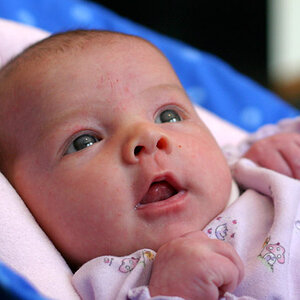
A few [unsolicited] thoughts. In the first the blown background is really hurting this one; the human eye is naturally pulled toward bright over dark. The colours and shadow are also imparting an unnatural colour cast on her. A bit of fill flash would have cleared all of this up. When you're posing people, ESPECIALLY bare-shouldered people against walls, etc, DO NOT let them lean against the wall. The should just barely touch it (yes, it's uncomfortable for the model; so what?) that will alleviate the "square" left arm she's developed. Also, watch the crop; you've nipped off her fingers.
In the second, the lighting is nice (though a little more light in her eyes wouldn't have hurt, but her position in the frame and the cropped elbows hurt the image. Generally speaking have the subect looking "into" vice "out of" the frame.
The best of the three in terms of exposure, but again, you have a bright background which pulls the eye away. Given how tightly you've cropped the two images above, WHY did you choose to leave most of that tradesman's van in the frame of this image? Moving just a bit to your left would have given you a MUCH better background!
Just my (unasked for) $00.02 worth - YMMV
~John



![[No title]](/data/xfmg/thumbnail/34/34057-a5a92fad5f5d96a5945d55a404b0cd27.jpg?1734164473)
![[No title]](/data/xfmg/thumbnail/34/34053-89f2960a2f30add00b9b4379abd6dd12.jpg?1734164460)

![[No title]](/data/xfmg/thumbnail/42/42034-6262420ff3ea238f05395bbcc7ae1f28.jpg?1734176420)