Redo on Belize Sunrise with Dock

cgipson1

TPF Noob!
Joined
Aug 18, 2011
Messages
17,142
Reaction score
4,350
Can others edit my Photos
Photos NOT OK to edit
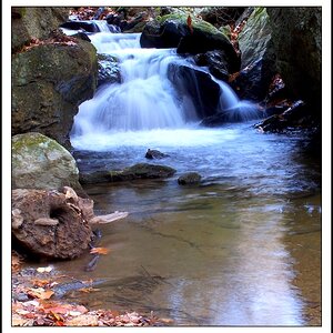
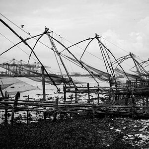
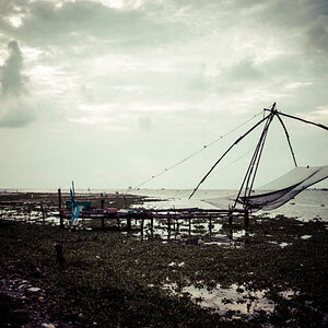
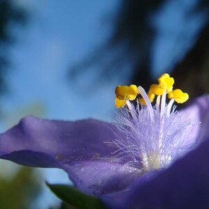
I decided to play with this image today. I redid the exposure fusion, and changed the tones a little bit. Just thought I would see what everyone thought....

Also what are your thoughts on the thin dark line of Land center left? Distraction or not? good, bad or indifferent?

$Belize-dock1.jpg
 
Last edited:
I think I like the original a bit more....although both are far better than I can do.
 
I think I like the original a bit more....although both are far better than I can do.

Thanks for the input! Several people have commented they can't see much difference.. it is pretty minimal, I guess!
 
I think I like the original a bit more....although both are far better than I can do.

Thanks for the input! Several people have commented they can't see much difference.. it is pretty minimal, I guess!


Awesome image, with 1 nitpick. That tiny piece of land on the horizon on the very left of the frame is making me nuts. I think if you clone that out, you will have a masterpiece. Hell I would hang it on my wall.
 
Does it work as a B&W?

$Belize-dock1BW.jpg
 
I think I like the original a bit more....although both are far better than I can do.

Thanks for the input! Several people have commented they can't see much difference.. it is pretty minimal, I guess!


Awesome image, with 1 nitpick. That tiny piece of land on the horizon on the very left of the frame is making me nuts. I think if you clone that out, you will have a masterpiece. Hell I would hang it on my wall.

Really? May have to get some more feedback on that... I thought it added context and scale.... thanks!
 
I think I like the original a bit more....although both are far better than I can do.

Thanks for the input! Several people have commented they can't see much difference.. it is pretty minimal, I guess!

Maybe it's the color makes the image seem a bit superficial? Maybe that's the look you're going for, though.

Question for you. Were you using a ND filter for the 3 minute exposure? I'm Just learning how to emulate that look (if I come across a nice dock sometime)
 
Thanks for the input! Several people have commented they can't see much difference.. it is pretty minimal, I guess!


Awesome image, with 1 nitpick. That tiny piece of land on the horizon on the very left of the frame is making me nuts. I think if you clone that out, you will have a masterpiece. Hell I would hang it on my wall.

Really? May have to get some more feedback on that... I thought it added context and scale.... thanks!

I think that's what hurts it so much. Besides it being a pitch black line coming into the center of a pink and peach/orange frame, it takes away from the fantasy/mystery of this image. It's a dream world-like image, and with the context of the island, it's no longer a 100 mile dock leading to this secluded lounge area in the middle of the ocean. That is of course where my imagination took me, but the land ruins all that for me. To each their own of course.
 
B&W is awesome. Maybe slightly less contrast?
You should sell some prints. I'd buy that.
 
Heres my take on these. I like the B&W better. The POV goes down the pier to the cabana, In the colored pic the focus goes to the clouds. Been to Belize twice. Beautiful once you get out of the cruise port. We collected as a group, about a hundred pounds of school supplies for a mission there. Had to have a special visit with customs before
I could go ashore. Later Ed
 
B&W is awesome. Maybe slightly less contrast?
You should sell some prints. I'd buy that.

What are your thoughts on the line of land on the left? Good or bad?
 
Ballistics... something like this?

$Belize-dock1-no-land.jpg
 

Most reactions

New Topics

Back
Top