Rehearsal

dancer

TPF Noob!
Joined
Sep 13, 2010
Messages
113
Reaction score
13
Location
Amsterdam
Website
www.facebook.com
Can others edit my Photos
Photos OK to edit
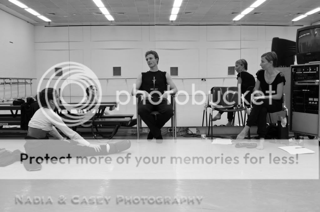
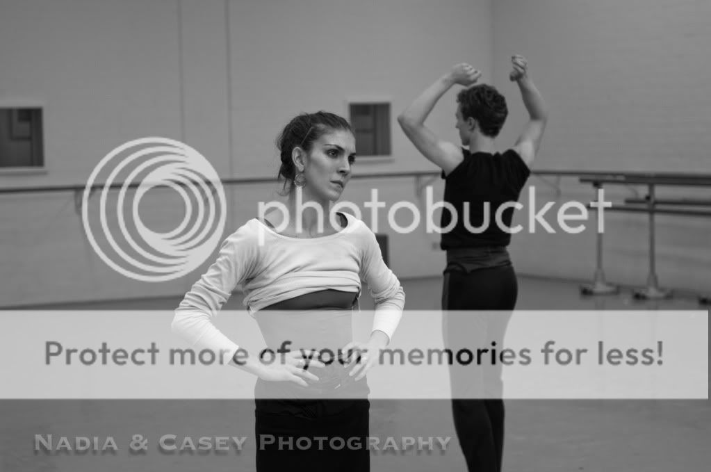
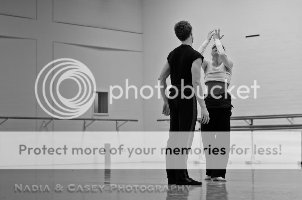
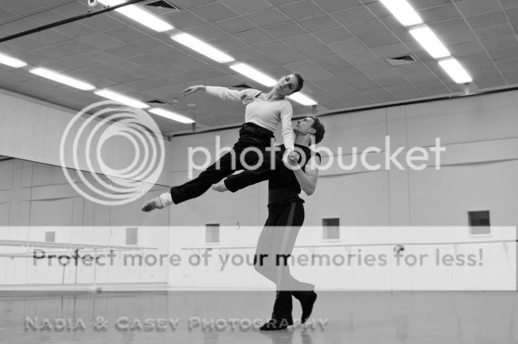
Hi all. I just joined the forum and thought I would post a few pics. This was a rehearsal I shot last week with my girlfriend and a friend who is a dancer/choreographer. I am also a ballet dancer and I finish early that day so I thought I would pop in and snap a few shots. I wasn't expecting much as they weren't dancing much, just walking through the steps. These turned out ok though so I thought I would see what you think. C&C is like gold to so critique away :cool-2:

1.
_DSC7484.jpg


2.
_DSC7456.jpg


3.
_DSC7382.jpg


4.
_DSC7352.jpg
 
Love the first shot, the way you composed it make it really interesting, making the guy at the center talking while both of the women looking at him from the right and left, the mirror behind them reflecting the room. Just beautiful ;-)
 
Hi,

I love all the shots, excepting #2. Here the girl's face is too central and the guy has been cut at the ankles, or thereabouts, and as a general rule you should try not to cut at at joint but rather between two joints. The effect is a little disjointed for me.

I'd agree with the comments already given on #1, it's a lovely image that suggests more; I personally love photographs that allude to something else happening, a synergistic effect of photograph and subject.

#3 is my favourite, if I was being very critical I'd say her arm in front of her face takes from it a little but other than that I love the placement of the subjects within the frame and the position of the camera

#4 is a nice shot but it doesn't give me the same impression of candid shooting that the others do, possibly because the pose could be replicated easily. As a shot on its own I'd say it would stand very well, but within the other 3 it doesn't work for me as much as the others.

The only comment I would make overall is that I'm not sure the B&W is adding much to the images, bar giving it a journalistic feel, as there is not really enough contrast for me.

Hope this helps,

Steve
 
I liked number 3. In number 2 I liked how the B&W conveyed so much of her emotion.
 
i think the compositions are good...but all in all the photos lack a pop...as in they could use more contrast. the subjects are well done...but the background is a lot of boring grey that distracts me. But i like contrasty photos.
Also...i know some people hate this, but some vignetting on the images might focus the attention more on the subject and less on the boring walls :)
 

Most reactions

Back
Top