- Joined
- Aug 27, 2012
- Messages
- 2,289
- Reaction score
- 661
- Location
- Orlando, FL
- Can others edit my Photos
- Photos OK to edit
I am trying to take your advice and work on lighting and not make the food look flat.
I know some of this food is not gourmet by any means... burgers, wings, ect, but that was the assignment. I haven't edited all of the Japanese Restaurant photos, but I will put at least 1 in this thread.
Thank You for your feedback!
1.
.jpg")
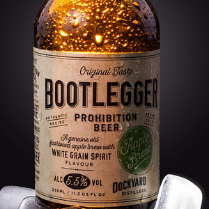
2. Light shined directly through the beer obviously...gave the peanuts a warm color.
.jpg")
3. BACON had to make an appearance! Should I remove the black specs from the cheese?
.jpg")
4.
.jpg")
5. Does this work at all?
.jpg")
6. I promised...

I know some of this food is not gourmet by any means... burgers, wings, ect, but that was the assignment. I haven't edited all of the Japanese Restaurant photos, but I will put at least 1 in this thread.
Thank You for your feedback!
1.
2. Light shined directly through the beer obviously...gave the peanuts a warm color.
3. BACON had to make an appearance! Should I remove the black specs from the cheese?
4.
5. Does this work at all?
6. I promised...
")


![[No title]](/data/xfmg/thumbnail/30/30991-43abf4dfee0a54010692c71c43f40981.jpg?1619734555)
![[No title]](/data/xfmg/thumbnail/32/32929-22e23acc63d6ecb25e5ee941be87121f.jpg?1619735758)
![[No title]](/data/xfmg/thumbnail/37/37524-6c51828efbc2361f9cfed53f63f28aa2.jpg?1619738130)