What's new

Sadie likes to Pose

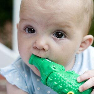
I like this. I like it a lot! I would like to crop just a bit off of the LH side to get rid of that full height vertical shadow, and a bit more off of the RH side to keep her close to the edge.
 
I like this. I like it a lot! I would like to crop just a bit off of the LH side to get rid of that full height vertical shadow, and a bit more off of the RH side to keep her close to the edge.

Good call on the crop. I did not notice the tall shadow you mention until you pointed it out. I will rework it and see what I can come up with. Thanks for the feedback.


Sent from my iPhone using Tapatalk
 
cute shot. im on the line with the processing, though.
 
I like it too, the b&w conversion is quite harsh which is something most people would shy away from with children.
 
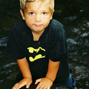
Love it. I'm on my phone but the right eye seems to have a dark shadow under. I would take that out in ps.


Sent from my iPhone using Tapatalk
 
cute shot. im on the line with the processing, though.

Something a little different for kids for sure. Thanks for the feedback.
 
I like it too, the b&w conversion is quite harsh which is something most people would shy away from with children.

Thanks!
 
Love it. I'm on my phone but the right eye seems to have a dark shadow under. I would take that out in ps.


Sent from my iPhone using Tapatalk

There is a little shadow there. I will mess with it.
 
Last edited:
Even window light can be modified, and perhaps should be.

In this shot, the dress seems over-exposed, her face has too much contrast, and there is a distracting shadow on the wall.

You can get a good exposure overall with more even lighting on her face and no backdrop shadow with just a few easy changes.
 
Even window light can be modified, and perhaps should be.

In this shot, the dress seems over-exposed, her face has too much contrast, and there is a distracting shadow on the wall.

You can get a good exposure overall with more even lighting on her face and no backdrop shadow with just a few easy changes.

Agreed that it can be modified and I do that occasionally as well. I actually like the harsh contrast on this one and prefer the shadows on the face as it provides a more dramatic look. Thanks for the feedback and comment!
 
Nice shot, Pops! Simple. Different. One for the future, for sure. Make sure to PRINT one out now though. I agree too about a LH crop, to eliminate the "tall" part of the shadow. Her shadow on the wall is critical of course, and so that "tall" shadow" kind of takes away from her shadow.
 
I like it.. I don't care for the harsh processing though. The one side of her face looks blown out to me while the other has the undereye darkness. Different processing and I would LOVE I think.
 
very cool! agree with cropping that tall shadow to the left
 

Create an account or login to comment

You must be a member in order to leave a comment

Create account

Create an account on our community. It's easy!

Log in

Already have an account? Log in here.

Back
Top Bottom