What's new

Screen Calibration Question

I'm simply referring to calibrating you're display so that what you see is an accurate representation of the file.
sRGB is pretty useless to me, because regardless of how they are labeled, monitors aren't usually accurate to sRGB. I care about showing files as they are actually most commonly seen, not how it is "supposed to be" but not actually IS. In other words, if 90% of people view so-called "sRGB" files under incorrect conditions for what sRGB is supposed to be, in the direction of being too red, then I want my monitor to also be too red compared compared to what sRGB files should be.

So calibrating to sRGB is not going to accomplish my goals. It only calibrates me to a make-believe world where everybody actually does use sRGB correctly.

When you calibrate, you're not calibrating to "the internet" or "the printer" - you're calibrating to the sRGB standard (or whatever other color space you choose). Average does not equal calibration.

Effectively, the ACTUAL average of viewing conditions and hardware = some hypothetical separate, new colorspace. Instead of sRGB, you could call it average RGB, "aRGB?" Whatever. My goal is to find or measure that color space and then calibrate my monitor to it.

I am defining "aRGB" as the real average of internet users' viewing. So yes, I am calibrating to the average when i calibrate to that.


I just went away from the PC, and whilst eating thought about this. I had an idea, I don't know if it's valid: All the monitors in the world, display a range of brightness, (and contrast combined), from quite dark to 'really really bright'. So set monitor brightness and contrast to 50% and that's the closest you can get to the majority of users. We know that using the RGB colour model, this is also going to have affected colour saturation. So once it's set 50%, then calibrate your colour. That's the closest you can get to the top of the internet bell-curve, no?
 
Note that every time a person in the world throws out an old monitor and/or buys a new one, or changes a lightbulb from incandescent to CFC in their office, true aRGB drifts slightly in some new direction.

But this drift will be extremely minor and slow over time. If fresh data were collected, say, every year or so, then that would probably be precise enough for those calibrated to the "best known up to date approximation of aRGB at this time" to be within 1% or so of actual aRGB.
 
That's the closest you can get to the top of the internet bell-curve, no?
I'm not sure what you're talking about. "Really really bright" is not a number and neither is half of "really really bright." Regardless, no amount of armchair philosophy gets you to the true average of internet users. The way you get closest to them is to put your boots on and go out and measure them (or rather, a statistical sample of them).
 
That's the closest you can get to the top of the internet bell-curve, no?
I'm not sure what you're talking about. "Really really bright" is not a number and neither is half of "really really bright." Regardless, no amount of armchair philosophy gets you to the true average of internet users. The way you get closest to them is to put your boots on and go out and measure them (or rather, a statistical sample of them).

Well you can give them numbers if you want: very dark =1, really really bright = 9, The median is 5. Use five as the best setting for most viewers, in most cases.
 
For your new project, you will need to chart the characteristics of as many monitors as you can lay your hands on. (You still need hardware, lol)

With enough samples, I'd be interested in seeing how the "real average" compares to the standard.
 
Okay, so really really bright = 9 of... what unit? Let's say watts per square meter.
Okay great, now "5 = average internet users." But this is just wrong! There is an actual average number of watts per square meter out there in the world of internet users' devices, and there's no reason to believe it is 5 watts per square meter at all. You just chose a number out of a hat.

The actual number might be 3.7 watts per meter or whatever, in the real world. If you just SAY "It's 5" you are simply incorrect, and that doesn't get us anywhere.

You need a device to physically hold in the room and measure people's displays.


Speaking of which, I can't seem to find any hueys for less than like $100, not $20. Am I doing something wrong? Not sure if I'm $100 excited about this project. Maybe I will be in a couple days.

I do work in a cognitive psychology lab... One of my colleagues in the building probably already owns some ridiculous $5,000 version of the same thing I could borrow.
 
No, I choose 5 (50%) because it's the middle. Most monitor settings will be closer to 50% than 1% or 99%. Fewer people listen to a radio at max volume or minimum volume than at around halfway volume. Do you drive at 1 mph or 99mph? Usually cars cruise at 55MPH. So, I assume if you want pictures to look good on screen to most people, then opt for middle of the road values.
 
Speaking of which, I can't seem to find any hueys for less than like $100, not $20. Am I doing something wrong?
That can't be right. Don't bother with the "Pro" models - the hardware is identical, the only differences are in the software, which you don't need anyway. Look for the most basic Huey you can find. Used.

Cheapest I can find after a quick search is $80 on Amazon for a Huey (non-Pro), new. There have to be used ones out there... They used to be all over the internet for $10-20 used. If you buy a new one, you mostly paying for the software, which isn't all that great (it will not even give you a profile chart). The "Pro" and "basic" huey are the exact same hardware - the only difference is the CD that comes in the box.
 
71M, okay I see what you mean now. But "people probably maybe sort of set their stuff to 50% 'cause... 'cause." is an extraordinarily hand-wavey and un-validated assumption, and I am pretty doubtful that would get me any closer to the true average than simply sRGB would.

Josh: I will ask vision researcher friends of mine for more tips on hardware or to borrow some soone. First, I decided to just spam all the vision professors in my department to see if they have advice / already know of a database like this / will tell me this is dumb / etc.
 
I know the point is to calibrate to a printer's standard.
Uh. That's not the point, because not all digital images wind up as prints. For printing photos accurately, you need some information about the printers device, known as it's ICC Profile.

The point is that calibration establishes a foundation for a a color managed workflow and allows for the standardization of color among a variety of devices.

In 1993, 8 companies - Adobe, Agfa, Apple, Kodak, Microsoft, Silicon Graphics, Sun Microsystems, Taligent - formed the International Color Consortium, ICC.
Today ICC-based color management is used the most because it is open, vendor-neutral, and cross-platform.
ICC-based color management uses a series of standardized device profiles and a method to convert from one device to another while maintaining the same or similar color appearance.
There are 3 basic types of ICC color profiles; Input profiles, Display and Working space profiles, and Output profiles.

There are a variety of Color Matching Methods (CMM). ICC standards determine how a CMM behaves.
Photoshop and Lightroom use the Adobe Color Engine (ACE)
There is Apple CMM, and the CMM Microsoft uses is called Image Color Management (ICM).
There is no 1 'best' CMM but many of us defer to the color science and management expertise of Thomas Knoll the principle engineer of Adobe Color Engine.
Thomas Knoll wrote Adobe Photoshop and Adobe Camera Raw.

Another part of of ICC profiles is the rendering intent - Perceptual, Relative Colormetric, Saturation, Absolute Colormetric.
Rendering intent influences the saturation of colors and the relationship of various colors to each other.
The rendering intent setting is used with device ICC profiles as an aid to soft-proofing photos in an image editing application prior to printing.

There are different types of computer display. The most common displays can only render 6-bits of color. The 2 additional bits the RGB color model require have to be made up. As mentioned the vast majority of those displays are not calibrated and there is no telling what a photo displayed on them actually looks like. You also have to consider that while color management on Windows and Apple computers is pretty much the same Apple has a habit of breaking it's color management with OS updates.
 
Ok KMH, there's more to it than what I thought for standardizing to printers. Like I said in the OP I've never done it before. Thank you for the extra info.

But still, what I need is, I guess, the ICC profiles of a sample of random internet users, then.

The bit rate doesn't seem like much of an issue. Rounding errors between 6 and 8 bits are probably sufficiently small as to almost all be under the threshold of minimal detectable human differences (not always/fully, but close)


And I have worked with CIE Lab color space and all its fun little perceptual foibles for my work before. :)
 
Just calibrate your damn monitor!
 
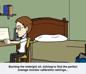
$Gavjenks_finding the Holy Average Grail.webp

[Gavjenks_finding The Holy Average Grail.jpg]
 
I've consulted The HitchHiker's Guide To The Galaxy and the answer is 42.
 
I've consulted The HitchHiker's Guide To The Galaxy and the answer is 42.


You just now figuring that out????


Word of warning, if a couple of white mice want to feed you a nice meal, don't sit on the chair.:mrgreen:
 

Create an account or login to comment

You must be a member in order to leave a comment

Create account

Create an account on our community. It's easy!

Log in

Already have an account? Log in here.

New Topics

Back
Top Bottom