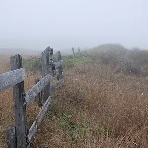
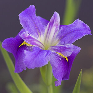
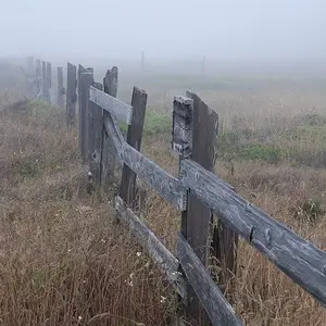
As said, #2 is too dark
There is too much null space too.
Try apply an Unsharp mask to your images
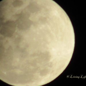
also leave the text out, Unless you learn to use typography in such a way which it does not obstruct the Photograph too much.
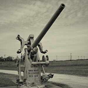
here is an edit:
as you seee, The watermark doesn't stand out as much and is very intimate with the image thus making it harder to remove.
I also Notice I have over-Sharpened the image and blown the belly




![[No title]](/data/xfmg/thumbnail/31/31977-2b717e032201241cbeae8226af23eba4.jpg?1734160754)