second portrait session...something is missing?

shingfan

TPF Noob!
Joined
Dec 29, 2006
Messages
569
Reaction score
0
Location
Toroto, ON
Can others edit my Photos
Photos OK to edit
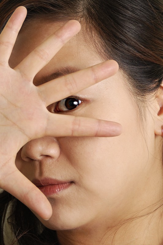
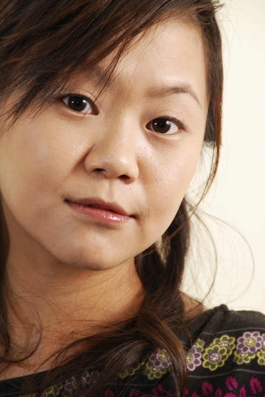
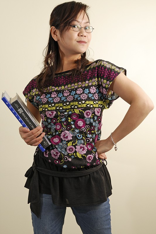
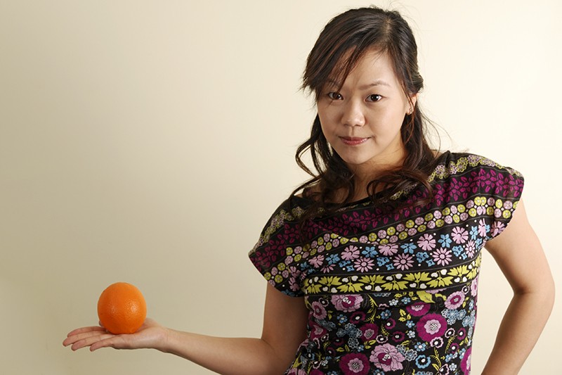
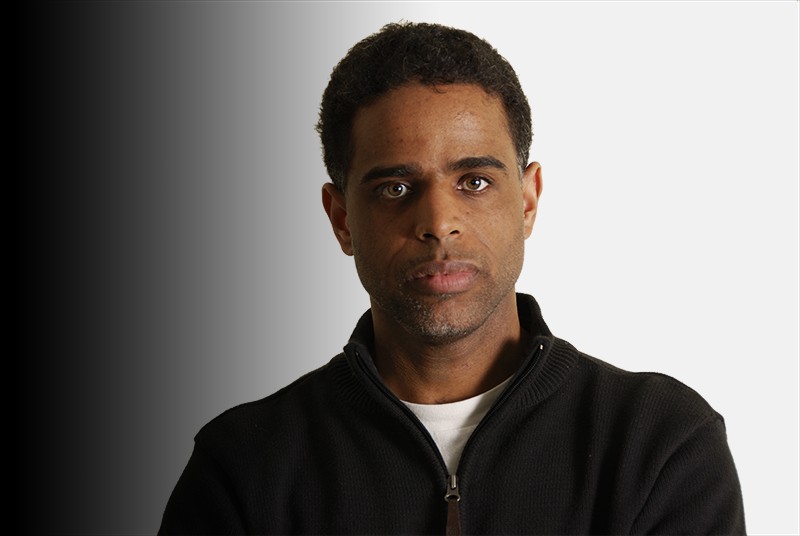
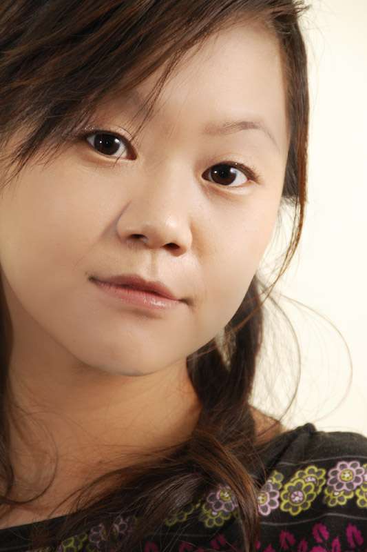
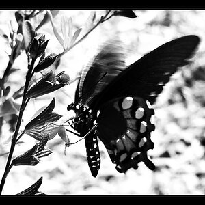
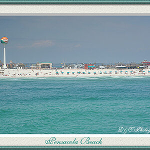
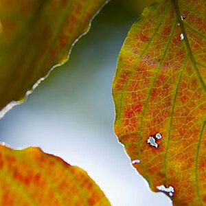
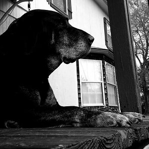
i dont know how to say it.....but they just dont give me the studio feel.....i guess with a stuido high power strobe + softbox + a proper backdrop....it makes a world of difference... (I was shooting those with SB600 off the camera with background being my living room wall) .......can anyone please give me some techincal opinion as to what i need to do to achieve more studio feel or better result......is it a matter of equipment that i'm lacking (proper backdrop and strobes).....or is it a terrible lack of skill that mess up the exposures? Any post processing that could have done to make them look better? Any comment is appreciated. Thank You!!!

#1
420650638_22d8f1a736_o.jpg


#2
420648018_a08b97d2df_o.jpg


#3
420695227_b31d0a57de_o.jpg


#4
420648008_607948b4c3_o.jpg


#5
419950561_12592cf108_o.jpg


#6
420667524_0b382884bd_o.jpg
 
I think the lighting is pretty good; it's soft and from the side. They do seem to be lacking contrast and maybe sharpness.

The yellowish) wall doesn't really help...but I like gradient that you have in the last two.
 
I think the lighting is pretty good; it's soft and from the side. They do seem to be lacking contrast and maybe sharpness.

The yellowish) wall doesn't really help...but I like gradient that you have in the last two.

yes....they seem to be lacking contrast.....and sharpness i think is from focusing issue.......because some of them do have sharp focus (the ones that i dont like...how ironic).....lol :p

the yellowish wall is my only resource in my house (either yellow or blue walls in my house....no white walls other than the kitchen and closet).....otherwise i'll need to use a blue wall with more narrow space......but then in order to use this wall i'll need to take away my bookshelf....my sofa.....my paintings....my coffee table...pretty much all the furniture within the area.....so conclusion is "the yellow wall is better"......lol :p.......thanks a lot for the reply and it is great to hear more opinion and improve my skills
 
Here is a quick edit. Levels, curves and Unsharp Mask.

shingfan.jpg
 
mind to show me the adjustment values? i'm still new to photoshop.....not sure most of the time what range of values i should use when adjusting my photos
 
If you only have one light, you should buy a reflector, or a large piece of white foamcore, so you can bounce some light and create different ratios.
 
I just did a quick edit, flattened it and saved it...but I'll give you the basic idea.

I created a levels adjustment layer and grabbed the left slider and moved it toward the middle...just a little, maybe 5% to 10%. Then I did the same with the right side slider. This helps to make the highlights white and the shadows black.

Then I created a curves adjustment layer and made a slight S-curve. I grabbed a spot 1/4 from the bottom and moved it down just a touch, then grabbed a spot 1/4 from the top and moved it up just a touch. This gives contrast to the mid tones.

Then I applied USM to the image...80, 1.2, 0 (give or take). These numbers will change for a full sized file.
 
If you only have one light, you should buy a reflector, or a large piece of white foamcore, so you can bounce some light and create different ratios.

so the difference in light ratio would yeild a more contrasty image....is that correct?

so even lighting that lits the entire subject is not as good as more contrasting light source creating more depth of "feel".....do i get the idea right?
 
A broader light ratio will yield more contrast, yes.

There's no such thing as "not as good" when it comes to lighting. It all depends on what you want to do. You'll at least have more options if you add something to bounce light.
 
My opinions are coming from a vast well of ignorance about lighting and I am only reponding to the pictures as I see them so take them with a lot of skepticism.

IMO, the last 3 are really good and can be made even better with a little more contrast enhancement

#1 is a not-good angle for her because it makes her face look fat. her hand is OOF.

#2 - I', not sure but maybe the camera is too low.

#3 is the one that IMO shows a real problem.
There's a lot of side light so it makes her skin look rough and the level of light is dramatically different between from her face and her neck. This can be improved with a lot of PSing but there is a basic lighting problem.
 
Traveler....what did you do to get this effect?....
 
I use a technique that I learned at photoshopmama.com for makeovers. If I had a full-res orgiginal I could add a texture layer in there that would make it more 'real'. Working on web-resolution pictures makes for a mediocre result.

Why, do you like it or not?
 
hmm....hard to say whether i like it or not.....i like the pale look....but i also like a bit more texture..........what am i talking about?.....but i like to learn methods that i be able to make use of....always good to learn
 
If you are going to be doing portraits, especially of women, you need to learn how to retouch. I would recommend getting the book "Skin" by Lee Varis. It will not only teach you great retouching techiques, but also give you great advice on lighting.
 

Most reactions

New Topics

Back
Top