Selective color by request C&C

eric-holmes

No longer a newbie, moving up!
Joined
Aug 8, 2009
Messages
1,858
Reaction score
49
Location
Arkansas
Can others edit my Photos
Photos OK to edit
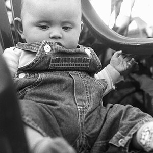
I know that people on here tend to bash selective color because it is extremely done now days. But what do you do when it is what the client wants? I do it. But I try to find a way to tastefully do it. I hope this works.

896830532_qgGrQ-XL.jpg
 
Yeah, if your client is happy then that's all that matters.
 
Just incase you weren't going for it.. I wanted to point out that you also brought out the blue in her bracelet gemstones, as well as the flowers. Maybe you did on purpose, and if so just ignore this:lol:
 
Yes, that was done on purpose. I wish the watermark wasn't in the way. Do you like it?
 
I don't normally like selective color, unless it helps "tell the story" of the picture. I think it could work here, the girl is interacting with the flowers, and somehow the action "brings them to life" in a black and white world of sorts.. Or it could be interpretted that the flowers are the main subject of this picture, in which case it wouldn't work.

I have mixed feelings about SC in portraiture, but I've also run into parents who *LOVE* it for some reason:lol: I think if you had to use it somewhere, you picked a good way to utilize it for this picture. I'm not sure how I feel about the gemstones of her bracelet also being blue...I can't think of what story that would tell.. having blue flowers and a blue bracelet.

I'm glad you didn't choose to just make the bows on her dress pink, or just her hair yellow though.. If the client likes it, then that's all that matters:) Overall, it is a pleasing image.
 
I'm not really sure why there's so much disdain for selective color...maybe because at one time it was the "in" thing to do and it was done to death. I imagine HDR will get to that point sometime soon too.

I happen to like selective color, especially when flowers are involved. To me, it emphasizes that they are bringing beauty and color into an otherwise drab world.

My only issue with this particular photo is that there is a lack of contrast. It's difficult to make out the veins and folds of the individual flower petals. Perhaps add some sharpening and/or contrast adjustments?

:thumbup:
 
Thanks, I'll look into that.
 
The picture looks pretty awesome!
Although the added contrast and sharpening of the flower might've been nice, I like the softness that it has. Sort of suites the entirety of the photo.

I don't want to go of of the topic too much, but personally, I like SC a bit, and to incorporate it into my photo's I'll just desature the background a about 30% so that the foreground has a greater contrast and vibrancy in colour without actually doing any pp to it (foreground).

Buuut that being said, this pic is a great presentation of well used SC
 

Most reactions

New Topics

Back
Top