Selective Coloring: Am I on the Right Track?

RichieTang

TPF Noob!
Joined
Feb 9, 2014
Messages
42
Reaction score
7
Location
Canada
Website
www.notrevuephoto.com
Can others edit my Photos
Photos OK to edit
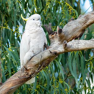
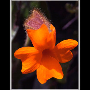
Hi. I posted a few photos before about selective coloring, so I understand that people are not a fan of this post processing. However, This is something I found I enjoy, so I want to get better at it. Any constructive feedback would be appreciated.

Note: I did these rather quickly hoping to know if I am isolating the right subject, so usually the post processing are more polished. Two of these were taken in the Philippines and the chicken photo was taken in Malaysia.

Thanks for your feedback!

P1090085.jpg
P1090057.jpg
P1220943.jpg
 
Last edited:
it serves no purpose on any of these
 
I kinda get the young boy on the barricade, but don't understand why the gutter is part of the message.

Same with the Toyota sign/Ford building. Why is the small building, yellow/black warnings, and the people next to the taxi (as well as the sign on the taxi) included? What do they add to the message you're trying to convey?

I'm not a SC fan, but I'd have chosen a different chicken in that shot.
 
No, you're not on the right track. I've seen better.
 
it serves no purpose on any of these

No, you're not on the right track. I've seen better.

Any chance you two could elaborate into the reasons as to why? Otherwise I'm to assume I was criticized by 8 year olds and disregard it. (although it is partly my fault for asking just "anyone" to provide feedback. I will change that.)

I kinda get the young boy on the barricade, but don't understand why the gutter is part of the message.

Same with the Toyota sign/Ford building. Why is the small building, yellow/black warnings, and the people next to the taxi (as well as the sign on the taxi) included? What do they add to the message you're trying to convey?

I'm not a SC fan, but I'd have chosen a different chicken in that shot.

In my train of thought, the gutter represents the environment that further explains why the shoeles
boy is playing on the street, as well as him being so close to such filth.

The yellow/black warnings and people next to the taxi were not part of the message. Just a 30 second cleanup that was not very thorough. Woops I'll replace it

Which chicken would you have chosen? Perhaps the other chicken with it's head raised? Thanks for taking your time to write constructive feedback.
 
In my train of thought, the gutter represents the environment that further explains why the shoeles
boy is playing on the street, as well as him being so close to such filth........

Then you've got far too much extraneous stuff in the image. All the other people, the power lines, the scaffolding and the buildings don't add anything. Yet they take up a large part of the image.
 
IMO, there is no 'right track' for selective colouring. Selective colouring is really an advertising method of directing potential buyers to the product. If, for instance, I'm selling beer, I might show a scene in monochrome, with the product in colour to direct the viwer's eye right to that. When it is used photographically, careful thought needs to be given to what you are colouring and what is monochrome.

The level of colour needs to be appropriate to the scene; in the first image, the yellow is far too intense, whereas in the second, the colours are much more subtle, but definitely strong enough to graby your eye. In the last, the colorus are decent, but I would be inclined to colour all of the chickens; what makes one more special than the other?

Now... say to yourself: "I've tried selective colour and I am done with it. Under the threat of one thousand lashes from a rusty cable release I shall never use it again!"
 
The chicken is great. The others are definitely unclear. After you explain the boy in the street, well, maybe. But you shouldn't have to explain it.

I read the boy as a somewhat clumsy statement about the separation of the boy from the crowd, and I was confused as to why anything but the boy was in color.
 
I think the one with the boy would be good if just the boy and the gate were coloured. I really like the chicken one though.
 
it serves no purpose on any of these

No, you're not on the right track. I've seen better.

Any chance you two could elaborate into the reasons as to why? Otherwise I'm to assume I was criticized by 8 year olds and disregard it. (although it is partly my fault for asking just "anyone" to provide feedback. I will change that.)
I think if you're going to use that technique, you should reserve it for those (few, IMO) shots that actually benefit. That is; to draw attention to one particular element in the composition.

Also, a more delicate touch is going to be appreciated more than heavy-handed.

I'm so glad you're not going to ask my opinion any more.
 
IMO, there is no 'right track' for selective colouring. Selective colouring is really an advertising method of directing potential buyers to the product. If, for instance, I'm selling beer, I might show a scene in monochrome, with the product in colour to direct the viwer's eye right to that. When it is used photographically, careful thought needs to be given to what you are colouring and what is monochrome.

The level of colour needs to be appropriate to the scene; in the first image, the yellow is far too intense, whereas in the second, the colours are much more subtle, but definitely strong enough to graby your eye. In the last, the colorus are decent, but I would be inclined to colour all of the chickens; what makes one more special than the other?

Now... say to yourself: "I've tried selective colour and I am done with it. Under the threat of one thousand lashes from a rusty cable release I shall never use it again!"

Thanks for the mentoring =). I'll work on the coloring (making them less subtle but still just enough to stand out).

As for stopping SC, I won't. From what I've seen, heard, and read, photographers of all calibre seem to hate it for many reasons, but the main ones are that it's "overused" and "tacky". It definitely is "tacky" when used wrong, so I'm going to practice so people can only complain about overused. If other photographers don't like them, it's fine, but as long as I like what I do, and consumers/viewers like them (which I know there are a good portion who do - I don't need 100% of the population to like what I do), then why should I stop? :D

To Designer: For those "few" shots that actually benefit, of course those are the ones I'd want to focus on. Who creates/showcases a portfolio with 99% of their photographs?
 
Last edited:
Since you knew the technique isn't very popular here, you shouldn't be surprised at negative comments.

If you're interested, I can point you to a forum where they love selective coloring and sepia conversions.

That said, I'll take my one and only chance at opining, as well.
The first doesn't work.
Try the second one without coloring the garbage in the gutter - just the boy & gate.
The last one is somewhere in between.
 
Selective colouring is a bit like the overuse of HDR. Ever since the effect first appeared on DSLRs about 5 years ago, every man and his dog was doing it. It is one of those post processing effects that overwhelmingly ends up making a photograph looking amateurish because so many amateurs would just use the effect because it was "cool" at the time or for the sake of it.

As @tirediron mentioned, it does have its uses but they are few and far between for the vast majority of photographs. Product and advertising it definitely has its place. I personally have desaturated certain backgrounds (white backdrops mainly) because they were too warm/cool or had colour cast of some kind in them. Desaturating a white backdrop and leaving the subject matter in colour is selective colouring but, it's so subtle that people wouldn't immediately, if ever notice it. I'm definitely in the "less is more" camp and selective colouring as in the images you have posted are just too "in your face" with what has been done.
 
I like the chicken!
And on a different note, I never thought of transporting chickens that way, it's brilliant!!! :)
 
Since you knew the technique isn't very popular here, you shouldn't be surprised at negative comments.

If you're interested, I can point you to a forum where they love selective coloring and sepia conversions.

That said, I'll take my one and only chance at opining, as well.
The first doesn't work.
Try the second one without coloring the garbage in the gutter - just the boy & gate.
The last one is somewhere in between.

I enjoy negative points of view and criticism because then I know what to work on. What I don't like (same as others) is useless comments that provide nothing to help you improve. On the flip side, if people were just to tell me they're good, I'd never find anything to improve on. So thank you for your offer and your advice, but I don't think I'll need that forum that loves sc.
 

Most reactions

Back
Top