What's new

Self Portrait/Appropriation C&C will be appreciated

Mo.

No longer a newbie, moving up!
Joined
Dec 30, 2011
Messages
175
Reaction score
35
Location
London
Can others edit my Photos
Photos OK to edit
Hello everyone,
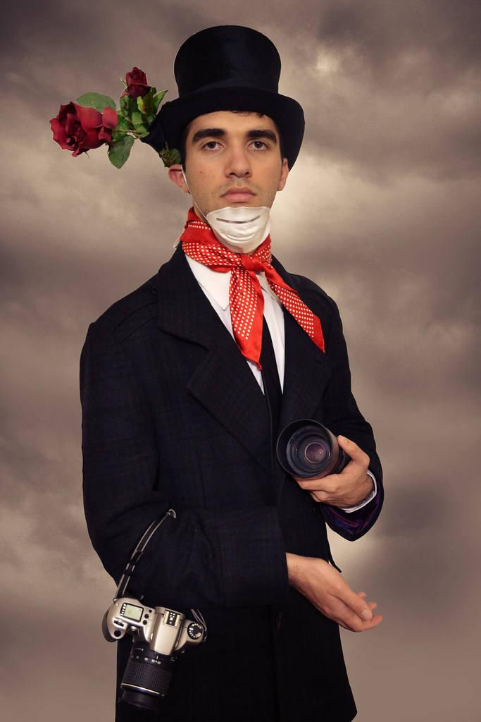
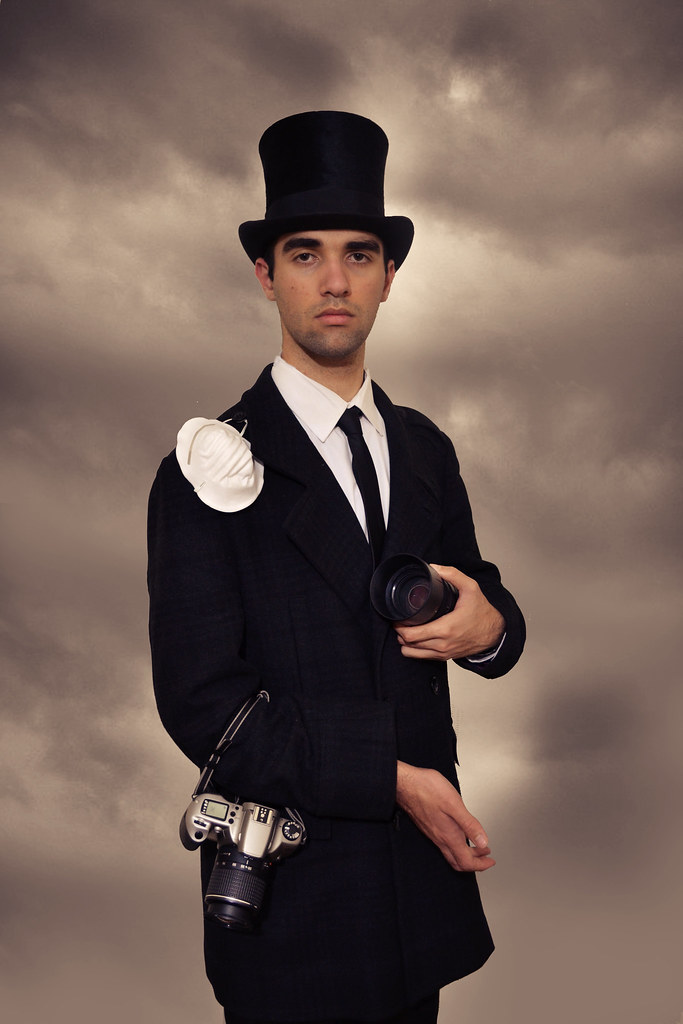
Just wanted to show a my self appropriation of an image and hopefully you can criticise it as much as you can. The only way I see myself improve is through criticism and experience.

The painting I appropriated: File:Self-portrait in a Straw Hat by Elisabeth-Louise Vigée-Lebrun.jpg - Wikipedia, the free encyclopedia

Version one:
24ecrwz.jpg


Version Two:
6525004351_c393bc3bf1_b.jpg


Version Three:
6525003237_075cf1a08e_b.jpg


Open up for interpretations.

 
What's with the mask??

Your lighting is way to flat. the painting has much more light on camera left than on camera right. interesting shoot though.
 
What's with the mask??

Your lighting is way to flat. the painting has much more light on camera left than on camera right. interesting shoot though.

Hmm, thank you.

The mask is one illustrating the pollution we have now a days and at the same time how restricted people are now a days in sharing their views.
 
The mask is killing it for me... why the mask? As mentioned.. your lighting is lifeless and flat... need key and fill lighting. If you really want to emulate the painting... use the key really high at a 45 degree .. and adjust the fill to leave a strong shadow that still has good detail. Good shot otherwise... focus is good... no shadowing issues. I would say #3 is most like the painting expression wise.
 
What's with the mask??

Your lighting is way to flat. the painting has much more light on camera left than on camera right. interesting shoot though.

Hmm, thank you.

The mask is one illustrating the pollution we have now a days and at the same time how restricted people are now a days in sharing their views.

Pollution? And HOW is the viewer supposed to know that? There is nothing in the photo to give that context. I was wondering if you had health issues.. TB, or something.... that is what it made me think.
 
The mask is killing it for me... why the mask? As mentioned.. your lighting is lifeless and flat... need key and fill lighting. If you really want to emulate the painting... use the key really high at a 45 degree .. and adjust the fill to leave a strong shadow that still has good detail. Good shot otherwise... focus is good... no shadowing issues. I would say #3 is most like the painting expression wise.

Appreciated, will definitely look into it more.
 
What's with the mask??

Your lighting is way to flat. the painting has much more light on camera left than on camera right. interesting shoot though.

Hmm, thank you.

The mask is one illustrating the pollution we have now a days and at the same time how restricted people are now a days in sharing their views.

Pollution? And HOW is the viewer supposed to know that? There is nothing in the photo to give that context. I was wondering if you had health issues.. TB, or something.... that is what it made me think.

Hahaha, yeah it's not the best bit about it. I just thought the contrast between my background and the painting's background may emphasises a bit more.
 
Hmm, thank you.

The mask is one illustrating the pollution we have now a days and at the same time how restricted people are now a days in sharing their views.

Pollution? And HOW is the viewer supposed to know that? There is nothing in the photo to give that context. I was wondering if you had health issues.. TB, or something.... that is what it made me think.

Hahaha, yeah it's not the best bit about it. I just thought the contrast between my background and the painting's background may emphasises a bit more.

Only if the viewer associates your background with pollution! If you had smokestacks bellowing out black smoke or something similar, it might work.. but even then.. the viewer would probably need a clue of some sort.. a sign, or the title of the pic "pollutions kill, I am the undertaker" or something. You know what you are trying to say.. so it makes sense to you. The rest of us? We have no idea.. you have to tell us! :)
 
^^^ this.

something that tells me it's polution.

and i think the mask looks silly on the chin. if its going to take attention, at least wear it.
 
Your lighting is flat as mentioned, but furthermore it is inadequate on #1 & 3. In #2 you can see the suit's design pattern, but not on at all on #1, but moreso on #3.

The painting your are attempting to emulate has ~3:1 lighting ratio. You have none on #1 & 2 and ever so slightly on #3. #3 also shows a harsh shadow line below the chin which means you need more Fill light and possibly your Main light is set too high (the catch lights are slightly off center, but just below the eyelid)

I would also suggest to loose the flower arrangement on the top hat and go for a more reserved boutonniere. Unless you have an environmental shot, the mask is worthless here IMO.


Lastly, notice the break at the right wrist on the painting.... yours is pretty much a straight-on extension, let the hand naturally bend down to create another angle.


You've done well, just a few thoughts for the next time.
 
Your lighting is flat as mentioned, but furthermore it is inadequate on #1 & 3. In #2 you can see the suit's design pattern, but not on at all on #1, but moreso on #3.

The painting your are attempting to emulate has ~3:1 lighting ratio. You have none on #1 & 2 and ever so slightly on #3. #3 also shows a harsh shadow line below the chin which means you need more Fill light and possibly your Main light is set too high (the catch lights are slightly off center, but just below the eyelid)

I would also suggest to loose the flower arrangement on the top hat and go for a more reserved boutonniere. Unless you have an environmental shot, the mask is worthless here IMO.


Lastly, notice the break at the right wrist on the painting.... yours is pretty much a straight-on extension, let the hand naturally bend down to create another angle.


You've done well, just a few thoughts for the next time.

Much appreciated. I will hopefully sort out the lighting better in my other pieces.
 

Create an account or login to comment

You must be a member in order to leave a comment

Create account

Create an account on our community. It's easy!

Log in

Already have an account? Log in here.

New Topics

Back
Top Bottom