C&C per request:
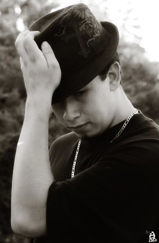
1) My favorite of the bunch. I like the personality you captured, though I would rather have seen him looking out from under the hat brim towards the camera, to engage the viewer, rather than looking down at some unknown spot. Did you add a bit of tint during your conversion process? Sometimes that works, but here I think I'd rather see it in straight black-and-white. In this version I'd like to see a bit more contrast; I'm not sure if that would be necessary in a straight B&W. Lastly, though it may be how he naturally puts on/takes off his hat, I don't like his hand position. With his fingers crooked over the top, his palm flat against the front, and (most importantly) his wrist bent slightly back, this pose looks too settled and static. Had he been gripping the same spot with his finger tips and had his wrist bent inward (so that his palm was away from the hat and his fingers extended), the pose would appear more dynamic. It also would have helped frame his face. I'd also try to edit out the bit of light that got through onto his arm, so that the skin tone of that arm is consistent.
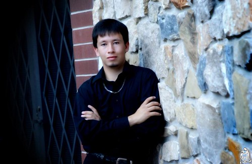
2) I like the view down the stone wall, and I think his pose is solid for a senior pic. This shot could use a temperature adjustment (white balance), and possibly a bit of brightness. I don't like that he's positioned (as far as the camera's perspective is concerned) at the transition between the stone and the brick/gate...the shot would have been better if you were able to get only stone wall in the shot. The tilt adds nothing to this image and, because of the straight lines of the brick and gate, actually detracts. (Had there been only stone wall in the shot I might not have noticed any tilt.) He is positioned too close to center...either move him appreciably off center (think Rule-of-Thirds), or really center him (here his left ear is pretty well centered, not his face or his torso). Finally, I'm all for breaking the "portraits must be shot in vertical (portrait) orientation" convention, but I think this one would have been better off in portrait rather than landscape orientation. You would have either been able to get his lower body in the shot (from the position of what we can see of his hips, that would make it a more interesting pose than simply crossing his arms) or tighten the frame so that you didn't need to get the brick and gate in the frame.
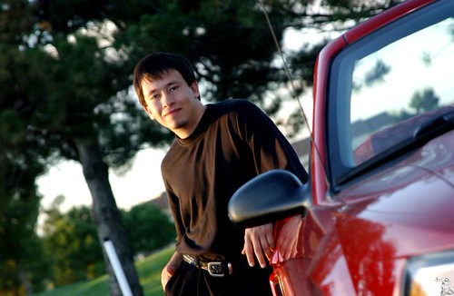
3) Decent job with the lighting, though a reflector or fill flash would have helped the shadowed side of his face. I really dislike the tilt here. I also don't like the perspective relative to the car...the car is much too prominent a part of the foreground, and the mirror and antenna are way too distracting. Every time I go back and look at it I see "a car with a guy leaning against it" not "a senior and his car" If you really wanted to use the car as a prop, there are a couple things you could have done. A) If shooting the car from this angle, move him from leaning against the door to leaning/sitting on the hood. That puts less of the car in the foreground and gets the mirror and antenna behind him. B) Shoot the car much more from the side, from a 3/4 view to straight on sideways. I also might have suggested posing him on the other side of the car - putting him on the driver's side does more to imply that it is his car.
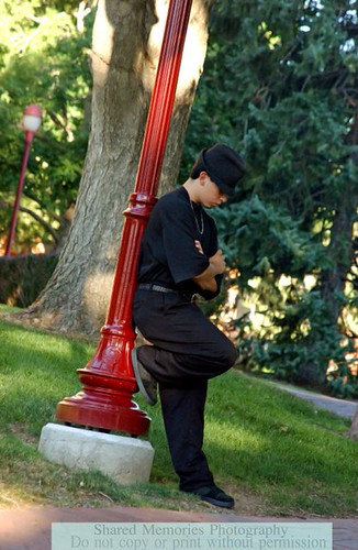
4) I like the concept - nice pose, nice location. Again, the tilt does nothing to help this shot. I also would have rotated him and you around the lamp post until you got to a perspective in which the tree was not directly behind the post.