First of all, please number your images, it makes critique much easier.
Well, there are a few too many images to critique (well, within a short timespan), but, here goes...
No matter what I say below, these are decent. Don't become discouraged.
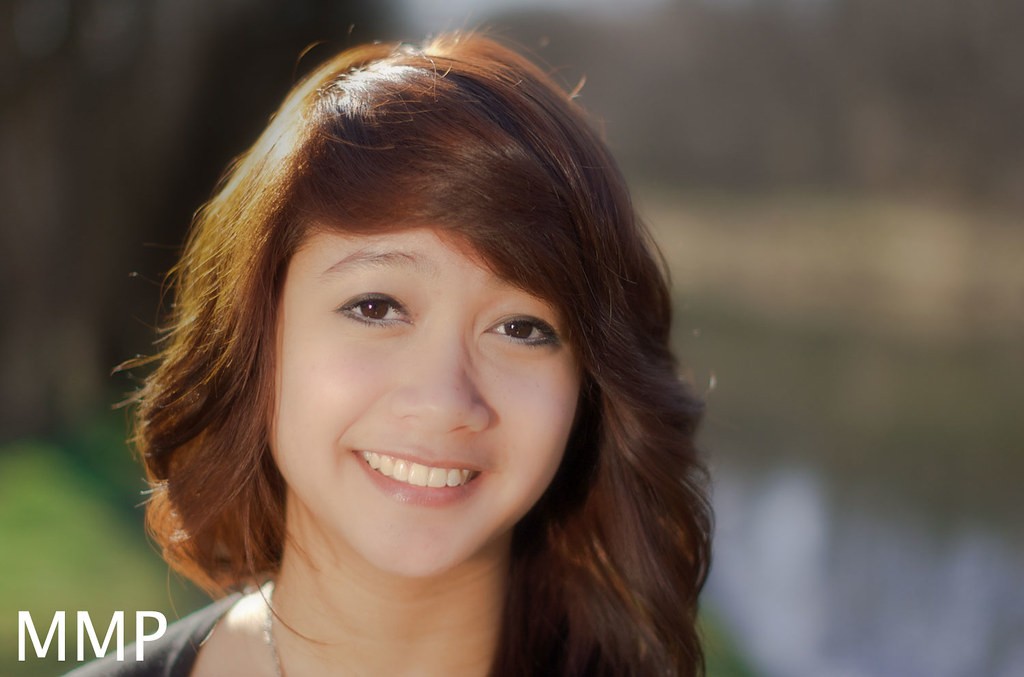
the first seven all look relatively the same. I mean, if you scroll over them, her face doesn't really change positions whatsoever.
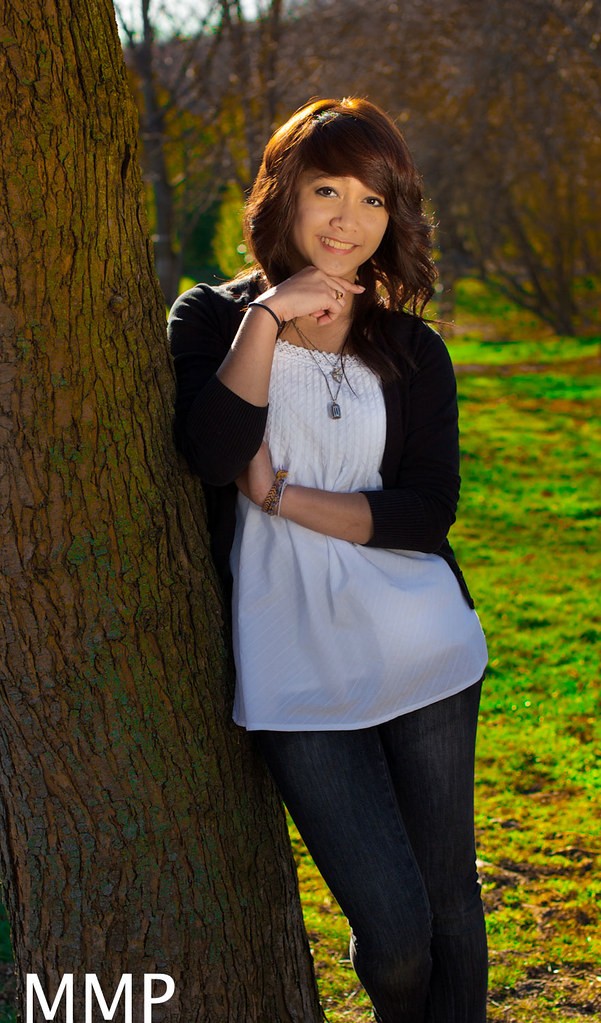
1. I like the hair lighting, but to me, trees are really cliche. Even so, not bad at all
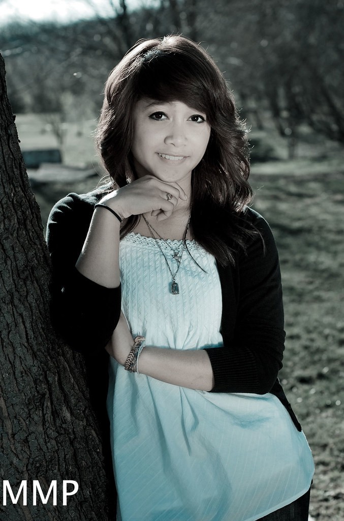
2. looks like practically an identical shot to #1, except for the processing, which I really don't like. I think it's overly desaturated, and I'm not a fan of the greenish tint.
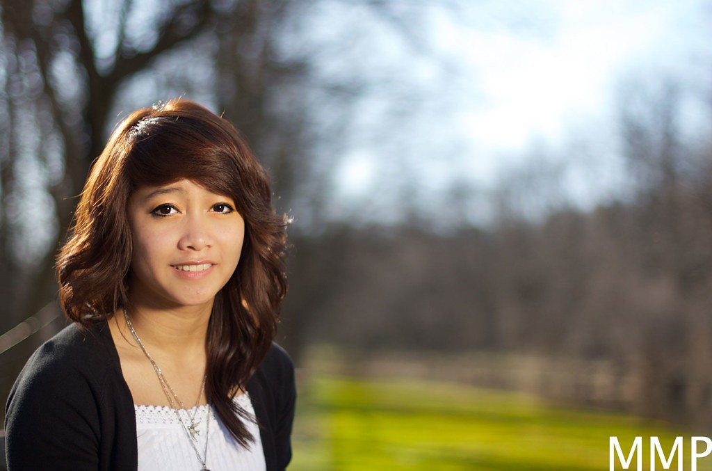
3. is ok, but she looks kind of sad, which I don't think is the point.
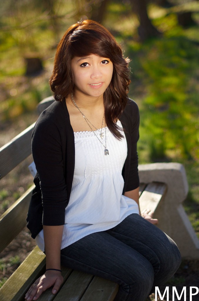
4. again has that sad expression, also, I'm not a huge fan of the framing. To improve it in a future shot I would try to take the image from closer to her eye level or maybe a tad below.
5. very common portrait look, but she has no detail. I don't know if you washed her with the clarity slider or what, but for me that's a problem, primarily because the whole image is her face, and it's not sharp.
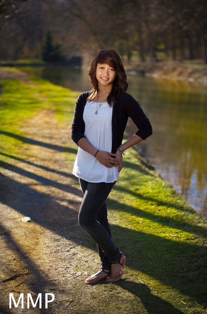
6. not bad, the lighting is pretty good, but I would change the crop so that she is not smack dab in the middle. Also, again I think a lower angle of view would look nicer.
7. ok, sad face again and I feel like I'm looking down on her. I would also work on the B&W conversion, it seems a little boring to me.
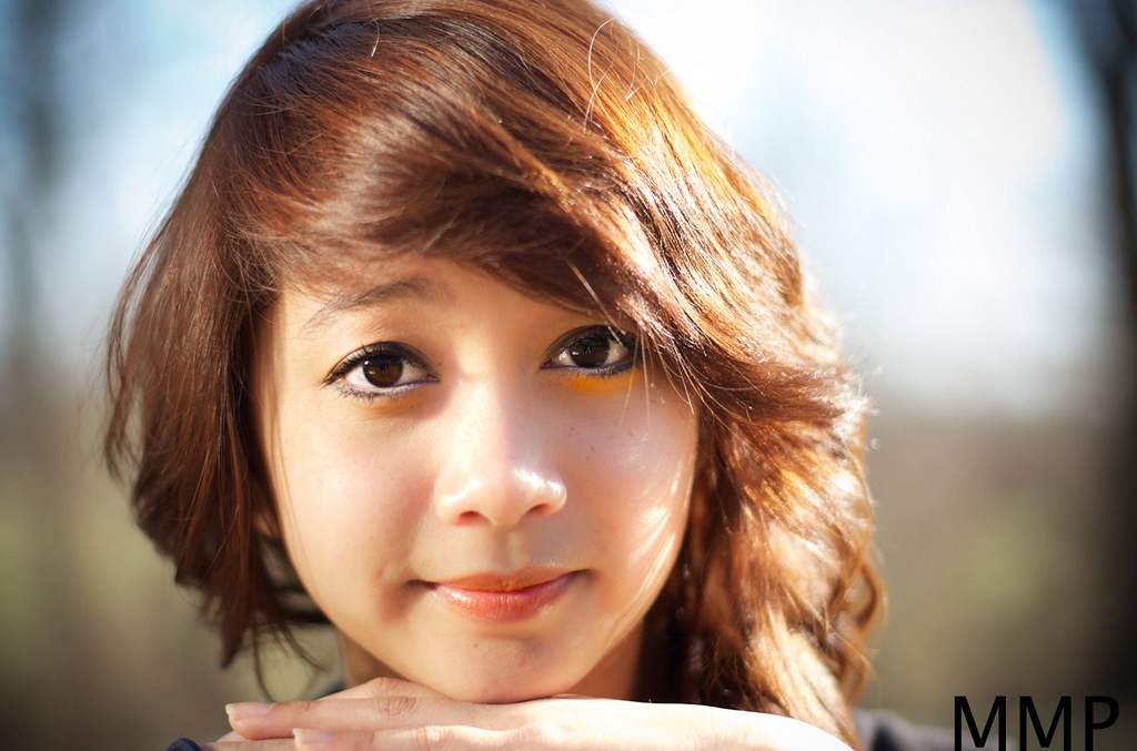
8. I like that this one has more detail in the close up shot, much better than the other one. Not sure what I think about the hand placement... but overall not bad.
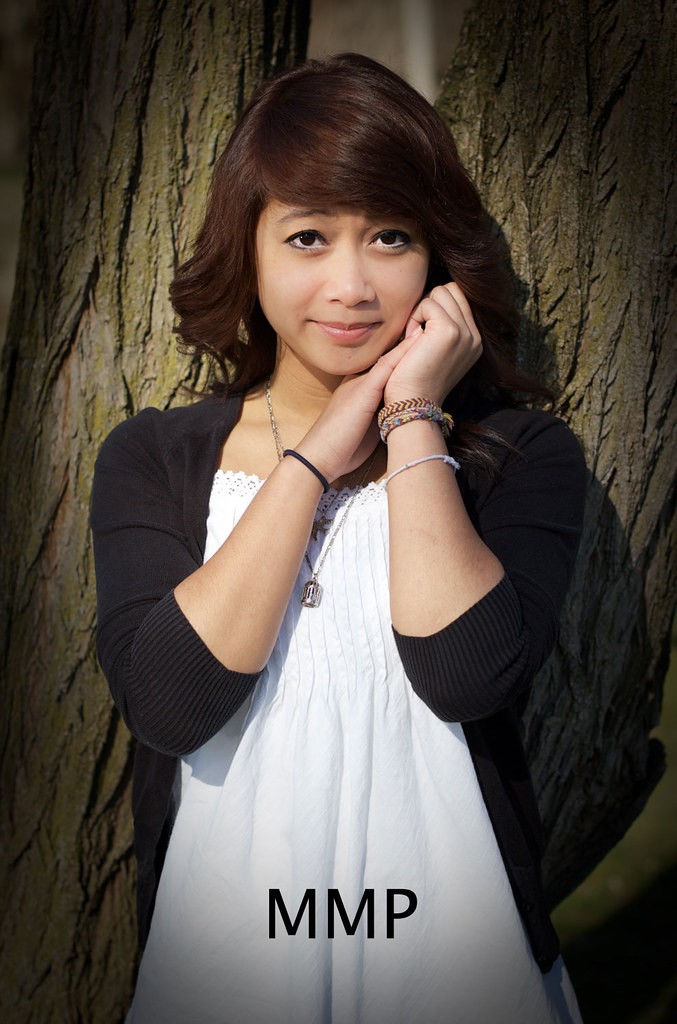
9. quite cute, but I think the vignette is wayyy over the top too strong. She's kind of doing the pinched forehead thing, but I think it works here... I would still try to crop it over to the left or right.
Overall Thoughts
I think the set is decent, but here's my biggest problem. After looking at these images, I really have no idea who this girl is. I don't really feel a connection to them, Maybe the park is important to her, but it would be nice if there were something in the images that told me who she is.
Other than that, there's some work to do, but this is a decent start
She seems to have a look of uncertainty on many of them as well... +1 on the vignetting... good start, though.. I just looked at a person who lives around here who had some senior portraits done, and these are much better than them... keep at it.
You chose a good setting. Although you did fairly good with lighting in such a tough situation. But, you have more work to do on this.
Work on posing too. It feels like you were feeling your way through this, especially with the hands. Do some reading, learn how to pose individuals, and then you can go into a sitting knowing what you need to do.
Thanks a lot for all the C&C. I appreciate all of it, truly.
And i just finished a book all about portaits, about 300 pages, but i don't have it memorized obviously, so i took it with me and tried to run and gun with the poses. I definitely know there needs to be improvement here. I also wanted to mix up the locations, but my friend, the model, didn't have the time.
there was a member who was contracted to do a few senior portraits, the person took shots of the teens doing something they enjoyed, one was riding their bike, another working on a car, another girl strolling through the mall with shopping bags. They were GREAT shots and by far the best senior portraits i've seen on this site. The main reason was the natural feel of the shots but combining the aspect of a portrait


![[No title]](/data/xfmg/thumbnail/42/42492-60144191c917c21139f8acd72f6ba090.jpg?1619740197)
![[No title]](/data/xfmg/thumbnail/30/30870-c7febc7c14dc6447653c2ae2355ffc61.jpg?1619734488)
![[No title]](/data/xfmg/thumbnail/37/37095-648a4e65f10e6fdeeb231be5ed8c3152.jpg?1619737881)


![[No title]](/data/xfmg/thumbnail/30/30868-01a498267fd96ce5b2d98347458d3903.jpg?1619734486)