Remember, i'm no pro, so just trying to give honest critique here
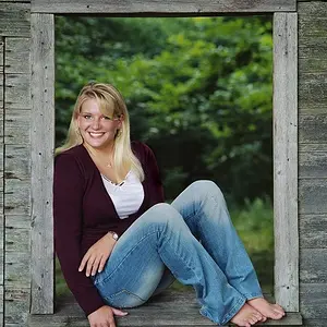
1: I like the framing, but you clipped her toes off, and the bump in her hair on the left side looks strange.
2: I like it, and i like the composition, but i wish there was a bit more separation between her hair and the light from the window, mainly because her hair and the window sort of melt together at the top of her head.
3:Well done, but again, you clipped the top of her head.
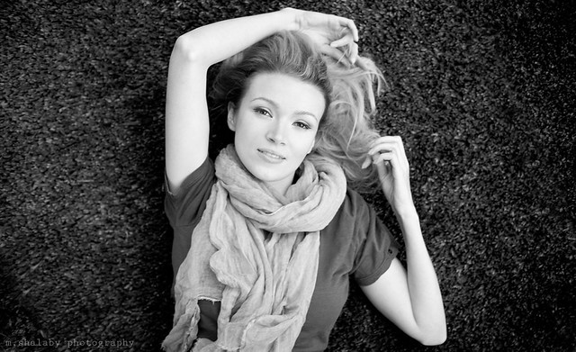
4: IMO, the best of the set, but why you use landscape on a portrait composition?








![[No title]](/data/xfmg/thumbnail/37/37602-1ef8dbb1c2d0e4ff347ee65d328c3603.jpg?1734170730)