I guess I'll take a shot at it Amanda....
I really like your idea but I think it would work better if it had a little more black above the headstock. (it's cut off)
Other than that little detail maybe a different font... so it fills the bottom frame.
I like it though!
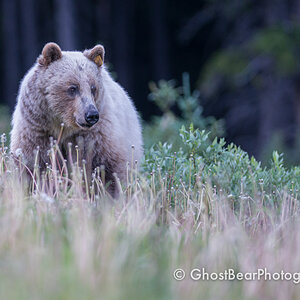
I'm not a big fan of the framing in the first one. I don't like all that white space. The photos themselves are all nice. I like the second and third ones the most.


![[No title]](/data/xfmg/thumbnail/41/41922-e7a483d91c9d307d9bb8d6143d03889b.jpg?1619739944)
![[No title]](/data/xfmg/thumbnail/35/35265-c9ea3efd2c618a57ea136e63ad106880.jpg?1619736970)
![[No title]](/data/xfmg/thumbnail/35/35264-5ade32b7036391926536661aeb7491c3.jpg?1619736969)