jacquelynecullen
TPF Noob!
- Joined
- Jun 22, 2014
- Messages
- 19
- Reaction score
- 10
- Location
- United States
- Website
- www.jacquelynecullen.com
- Can others edit my Photos
- Photos NOT OK to edit
My Site: Jacquelyne Cullen Photography | PA Family Portraits + Events
Background: I just launched May 1st. Business is sporadic so far. Some weeks I'll have 3 shoots, some 1, but the feedback so far from clients (and their friends/family) has been outstanding. So, I'm hoping with continued patience and diligence this will really be all I've dreamed for so long for it to be. That all being said, I'd really be grateful if you'd take a look around, whether you're a pro or not, beginner or advanced, (as clients aren't pros and it's always great to have that untrained eye feedback too!).
I have some questions here just to get the juices flowing, but feel free to shoot me any thoughts that stand out to you when you view the site. Doesn't have to be these.
Note: Definite issue right now is I haven't blogged in 20 days, and I have it on my must do this week, but tomorrow is a newborn shoot, so it will probably be Thursday before that happens. :blushing: So please excuse my embarrassingly not up to date blog.
Background: I just launched May 1st. Business is sporadic so far. Some weeks I'll have 3 shoots, some 1, but the feedback so far from clients (and their friends/family) has been outstanding. So, I'm hoping with continued patience and diligence this will really be all I've dreamed for so long for it to be. That all being said, I'd really be grateful if you'd take a look around, whether you're a pro or not, beginner or advanced, (as clients aren't pros and it's always great to have that untrained eye feedback too!).
I have some questions here just to get the juices flowing, but feel free to shoot me any thoughts that stand out to you when you view the site. Doesn't have to be these.
- Does it navigate easily for you?
- Load quick enough for you?
- 2 photos you'd take out
- 2 photos you'd definitely keep
- My tag line is "feel good. feel inspired." Is there anything of the site that doesn't jive with that tagline, and thus should be nixed?
Note: Definite issue right now is I haven't blogged in 20 days, and I have it on my must do this week, but tomorrow is a newborn shoot, so it will probably be Thursday before that happens. :blushing: So please excuse my embarrassingly not up to date blog.
") The payments section issue will be fixed as soon as I integrate studio cloud into the system because studio cloud take care of the booking, invoicing, payments, all of it. It has so much potential to really ease up my workload, but getting it all set up is the tough part, which I'm working on this week.
The payments section issue will be fixed as soon as I integrate studio cloud into the system because studio cloud take care of the booking, invoicing, payments, all of it. It has so much potential to really ease up my workload, but getting it all set up is the tough part, which I'm working on this week.

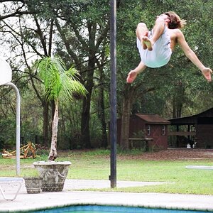
![[No title]](/data/xfmg/thumbnail/38/38745-268bf5126e563d77957d73c4fb17dc83.jpg?1619738704)
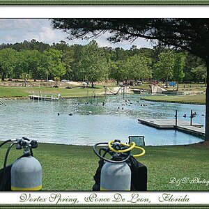
![[No title]](/data/xfmg/thumbnail/38/38729-27329be54dcb93a3723bad97259e6428.jpg?1619738702)