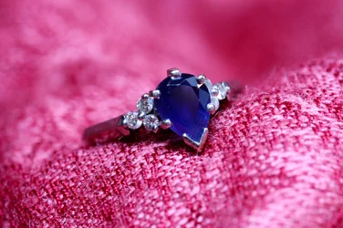
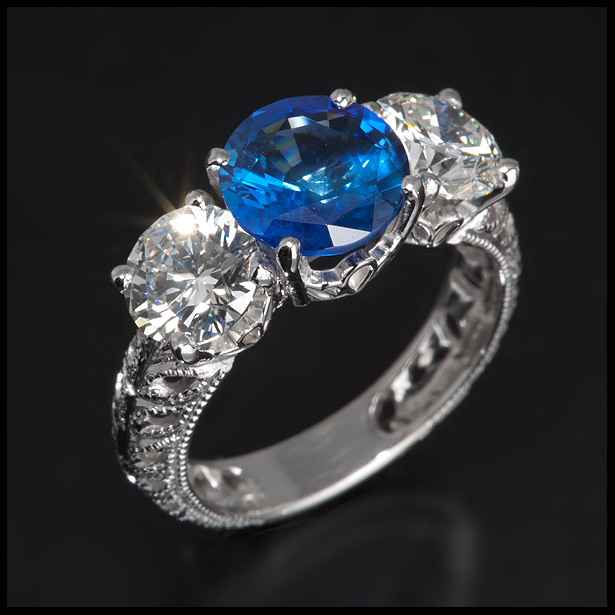
I do like the first one, although the previous poster does have a point that it could perhaps be seen as being 'lost in a sea of pink'. Although I think if you had added a bit more direct lighting onto the ring it would have made it stand out more. I would have perhaps liked the shot closer, but that's just a subjective point on my part.
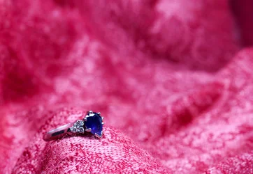
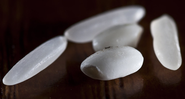
The second one is actually quite nice composition wise, as it follows the rule of thirds. You wouldn't be able to use it as the main feature of an ad for product photography, but it would be a nice compliment to a set of shots.










![[No title]](/data/xfmg/thumbnail/38/38294-cb4a5aa0ded725d4c694e6eebe276f0d.jpg?1734172202)


![[No title]](/data/xfmg/thumbnail/36/36301-27972c0474532c2ef657014362950733.jpg?1734168626)




![[No title]](/data/xfmg/thumbnail/41/41932-53eeba896d5bf8f132e52d5277f94ce2.jpg?1734176288)