#2 is nice. The first one looks like a basic point and shoot image with selective coloring. The eye sharpening and coloring in #3 is too unrealistic and takes away from the image instead of enhancing it.
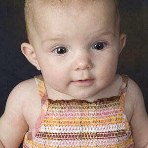
1. She doesn't take up enough of the frame.
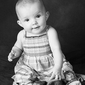
2. Pretty nice shot.
3. Children of the Corn. Seriously. Neat, yes? But on a child? Nooo... way too freaky.


![[No title]](/data/xfmg/thumbnail/31/31013-b871f1d295c83b831c1423028e1ce5dc.jpg?1619734568)