Silky

PixelRabbit

A naughty little bunny...
Joined
Nov 28, 2011
Messages
6,593
Reaction score
3,719
Location
Ontario
Can others edit my Photos
Photos NOT OK to edit
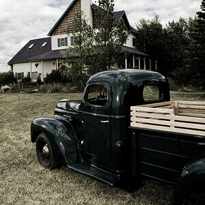
Saying nothing ;) would love to hear your thoughts though!
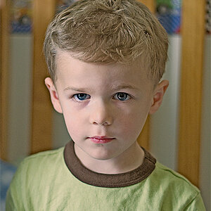
Silky

 
Neat. Dunno why but it has a very Alice in Wonderland feel for me.
 
Interesting, like the shades. If I look long, I see butterflies and faces. Time for an evening drink. Ed
 
Thanks guys :) that's perfect!!
 
I can see the butterflies, too, but more than that, I like knowing that it's flowers....

...hit me in the face, bay-bay!!* Aggressive and beautiful. Don't show us the color version, ever. ;)

Great stuff.


* Have already had my evening drink.
 
Don't show us the color version, ever. ;)
Nicely done, but show us cold tone version. As much as I like warm tones pictures, this one, I have a feeling, will be better in cold tones.
 
Don't show us the color version, ever. ;)
Nicely done, but show us cold tone version. As much as I like warm tones pictures, this one, I have a feeling, will be better in cold tones.

Excellent point...but doesn't this remind you of selenium toning? :)
 
Excellent point...but doesn't this remind you of selenium toning?
Not sure about that, but what I see on my screen is a tone of my Bergger warm tone paper in diluted ID 78.:D
 
Thanks Murray, Terri and T :)

Terri and T, I have little clue about what you two are talking about beyond warm and cool but I can't wait to learn! THURSDAY T! WOOT!!

I did do it both warm and cool tones and chose the warm, it seemed to be a little more..... defined perhaps? Here is the cool one...


Last edited:
I really like this Pixel. It's real busy but I'm thinking that might be part of the appeal if that makes any sense.
 
Thanks Rick, that makes perfect sense! I almost didn't post it because of that slight "huh?" (there is a very good reason it reads slightly odd ;) ) but something keeps drawing me back into it.
 
I really like this....can't stop looking at it. :D I like both versions, but the warmer of the two wins by a landslide in my book.
 
Thanks Carol :)

I actually did the blue conversion first, I thought it was going to be perfect considering the colours I started with, I find it a little "harsh" whereas the warm one just draws me in and keeps me :)
 
I like the warm-toned version. This is a lovely study. Splendidly done.
 

Most reactions

New Topics

Back
Top