Skyline Tone Mapping - Houston

DiskoJoe

Been spending a lot of time on here!
Joined
Mar 24, 2011
Messages
4,540
Reaction score
528
Location
Houston
Can others edit my Photos
Photos NOT OK to edit
I got a comment on my last post that my pictures did not look HDR. So I thought I would actually crank up the Photomatix and put a bit more effort into the process. Feel free to comment or critique if you want. I'm always open to questions as well.

1.

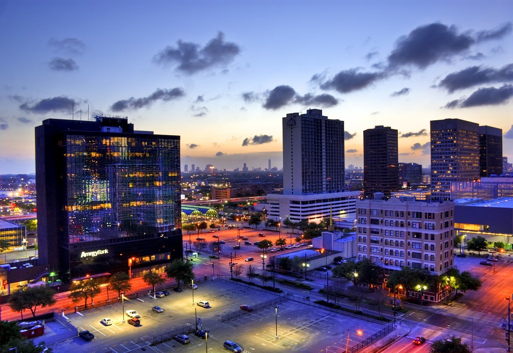
amegy bank edit by DiskoJoe, on Flickr

2.

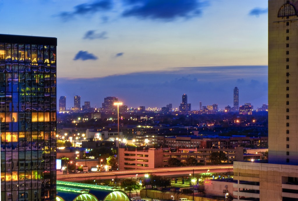
The In Between by DiskoJoe, on Flickr

3.

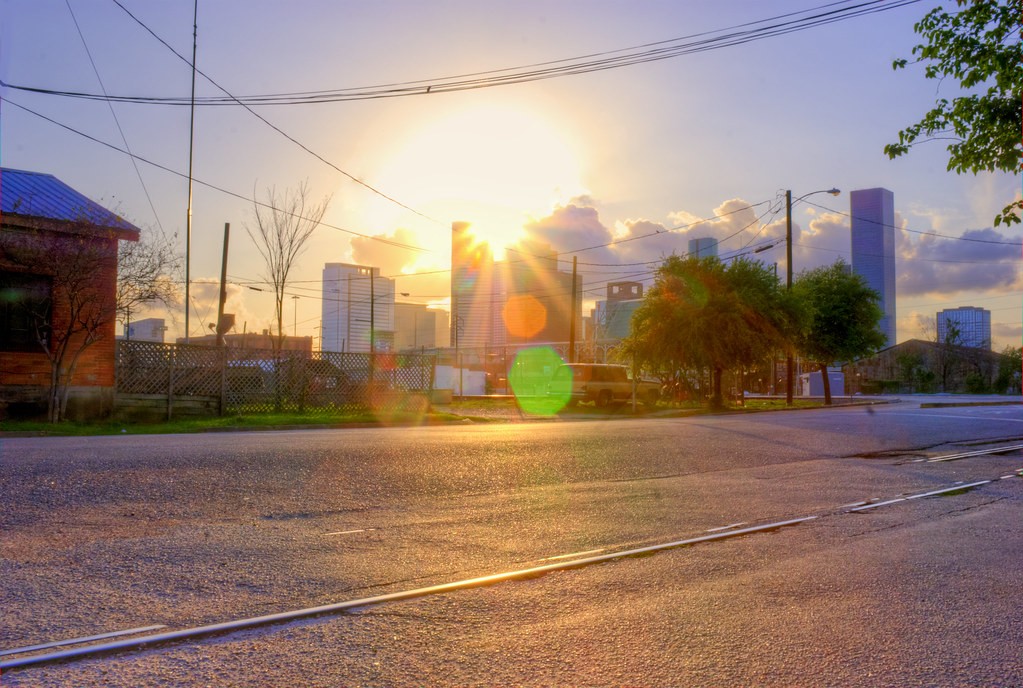
sunflare redo by DiskoJoe, on Flickr
 
Maybe its just me but these don't look HDR either. Just looks like you aded a bunch of colors. I liked the last one you posted much more.
 
Maybe its just me but these don't look HDR either. Just looks like you aded a bunch of colors. I liked the last one you posted much more.

If you compare the two threads you can see how more of the details come out when the tone mapping is used. The other shots were processed just using the raw converter with photoshop.
 
Maybe its just me but these don't look HDR either. Just looks like you aded a bunch of colors. I liked the last one you posted much more.

It is just you. Your response makes no sense.

How in the world would you obtain an image like #3 without multiple exposures? Unless you think he had 20 OCF's placed out of frame. Do you know what happens when you point your camera directly at the sun at 3pm -4pm in the afternoon (probably about the time this image was shot)? You get a completely dark foreground with zero detail and very little detail in the sky itself. For him to capture the DR in that scene probably required 5+ exposures. The sun area is blown out, which means he probably should've taken more underexposures.

If you know anything about dusk/night time HDR photography you know that your long exposures blow out skies. So he had to expose for the skies, the city, the city lights, and the buildings.

These are obviously all HDR.

#1 is a very nice image. #2 is weak from a composition standpoint. #3 just isn't very good: power lines, clipped building, branches encroaching. It's a technically flawed image. Shot a couple hours later with softer light and nicer skies, the skyline could be nice.
 
Last edited:
Maybe its just me but these don't look HDR either. Just looks like you aded a bunch of colors. I liked the last one you posted much more.

It is just you. Your response makes no sense.

How in the world would you obtain an image like #3 without multiple exposures? Unless you think he had 20 OCF's placed out of frame. Do you know what happens when you point your camera directly at the sun at 3pm -4pm in the afternoon (probably about the time this image was shot)? You get a completely dark foreground with zero detail and very little detail in the sky itself. For him to capture the DR in that scene probably required 5+ exposures. The sun area is blown out, which means he probably should've taken more underexposures.

If you know anything about dusk/night time HDR photography you know that your long exposures blow out skies. So he had to expose for the skies, the city, the city lights, and the buildings.

These are obviously all HDR.

#1 is a very nice image. #2 is weak from a composition standpoint. #3 just isn't very good: power lines, clipped building, branches encroaching. It's a technically flawed image. Shot a couple hours later with softer light and nicer skies, the skyline could be nice.

LOL. Well you are right and wrong too. Only one image was used for any of these. I did tonemap them with photomatix though. And you can shoot directly into the sun if you have certain conditions. See here the sun is peeking out from behind the buildings. This is how you get the nice flares. Shot would have been nicer a few hours later but I was at Houston House taking the other shots at that time. As for the powerlines and such that part of the shot I meant to include. This is a ugly dirty part of town and I am not trying to sugarcoat it.

But great feed back. Thanks.
 
I guess I should have waited to post till I was able to look on a screen bigger than my smartphone. Didn't say i didn't like them.
 
Great pics Joe!


Regarding the look of HDR. Most of the images we see with regard to HDR imaging techniques are very dramatic and stylized looking (just Google "HDR pics"). They offer a different way of PP an image to a more artistic , if not photorealistic, image. But not all HDR need be so stylized. There is very wide range of HDR processing that can take an average (read boring) shot and make it a really pop, or apply subtle changes that correct lighting problems in a image and make it appear as if it has not been processed at all.
Some HDR images fall inbetween and work well as DiskoJoe has shown.
 
I guess I should have waited to post till I was able to look on a screen bigger than my smartphone. Didn't say i didn't like them.

S'all good bro. I would recommend viewing on the large screen. :thumbup:
 
The only one I like is the first and I think it would benefit from a bit of sharpening. I viewed it on flickr and it looked better than here but still think it would benefit from high pass sharpening.

Second one I don't like the composition and the third the sun is to strong and is in the center of the picture which keeps your eyes there. The flare out also is not attractive.

So yeah my vote would be #1
 

Most reactions

New Topics

Back
Top