What's new

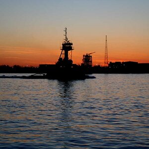
So confused. I can't see the water for the pier. c&c PLEASE!!!

Tight Knot

No longer a newbie, moving up!
Joined
Nov 30, 2010
Messages
1,398
Reaction score
159
Location
Boca Raton, FL
Can others edit my Photos
Photos OK to edit
Hi all,

I have a few photos that I have no clue which are the better ones from these upcoming sets (just kidding, I have a clue, but would love to see what you think).


Set A:

1:
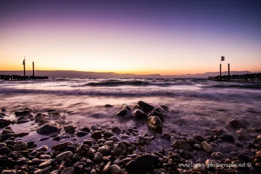
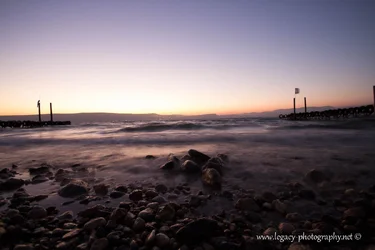
$Kinneret at sunset with 2 piers - leading lines - 2.webp

2:
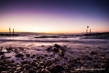
$Kinneret at sunset with 2 piers - leading lines - dreamy.webp


3:
$Kinneret at sunset with 2 piers - leading lines.webp


Set B:

1:
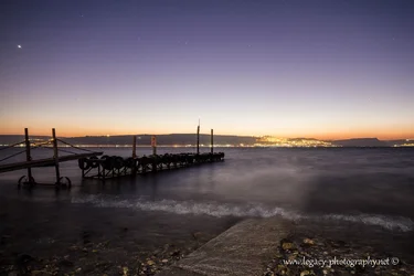
$Pier leading into the Kinneret  and Tiberias at Sunset.webp

2:
$Pier leading into the Kinneret and Tiberias at sunset - 2.webp


And one just for C&C:
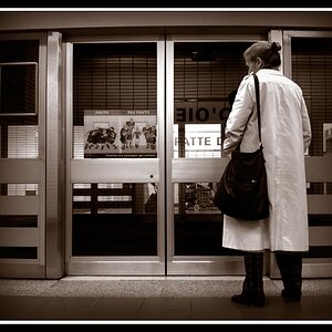
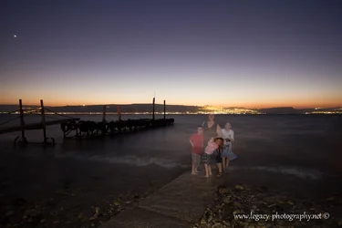
$Kinneret at sunset with pier at Ein Gev.webp
 
little itsy bitsy bump, anyone?
 
Still no C&C? These must be the worst photos I've ever taken. Anyone interested in telling me which images of the 2 sets they prefer (and if it's not too much to ask, and why)?
 
I have no particular preferences. They all look like good examples of what they are, which strikes me as slightly overcooked and otherwise pretty decent examples of a kind of cliche.
 
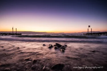
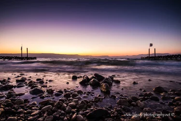
In the first set, I prefer #1. Cleanest lines of the three. In the second one, it seems the water needs to either be frozen or smoother. In the third one, that big wave right in the middle seems to unbalance things a bit too much.
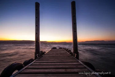
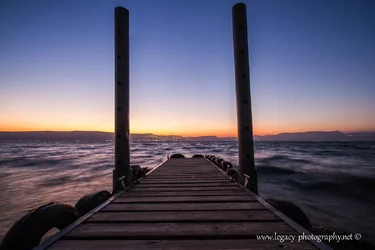
In the second set (which I think needs a bit of straightening), I prefer #2. Better tones.

For the additional c&c shot - too many things to look at: pier, sun (or are those city lights?), star, boat ramp, surf line...

Don't know if that's helpful or not. I don't really take these kinds of photos so people who do might have other things to say completely.
 
I think #2 from Set A is the best. It has great depth and I think the placement of the foreground rocks is the most powerful. Good work.
 
I'll give 'ya some.

on the first 3 it looks like you just darkened the exposure a bit ?

Bit I like them with the corner vignetting - makes it all ghostly in a way.
But I like the first one hte best because of the mix of water and rocks seemed better balanced in an undescribable sort of way. - the wave is very centered in it's height versus going across the entire frame - I think that makes the picture a bit more unique.

I like the 2nd pier one the best - best colors


on the last one, the middle to the right the light is too bright and it draws my eyes to it, so a bit distracting to me
at the bottom too, it's odd, looks like there's a pseudo walkway leading to the water - did you remove something in post ?
 
I prefer the first set over the second, and would probably pick #1 from set A as my favorite, although I had a little trouble really telling a lot of difference between the three--the small, embedded images are too small for these old, vision-impaired eyes, and when I clicked on the larger images, I couldn't really remember how the other versions differed.
I do know that #3 was a little darker than I'd prefer, and #1 just seemed to have the best color to it.

I'm not a big fan of the second set. For me, I think that dock is just too short to really effectively create a good leading line, plus the whole thing just feels a bit off-kilter to me.
 
I have no particular preferences. They all look like good examples of what they are, which strikes me as slightly overcooked and otherwise pretty decent examples of a kind of cliche.

Hi amoliter,

Thanks for the feedback.

What do you mean by "overcooked" and what type of cliche are you talking about?
 
In the first set, I prefer #1. Cleanest lines of the three. In the second one, it seems the water needs to either be frozen or smoother. In the third one, that big wave right in the middle seems to unbalance things a bit too much.
In the second set (which I think needs a bit of straightening), I prefer #2. Better tones.

For the additional c&c shot - too many things to look at: pier, sun (or are those city lights?), star, boat ramp, surf line...

Don't know if that's helpful or not. I don't really take these kinds of photos so people who do might have other things to say completely.

Hi limr,

Thanks for the nice and detailed feedback.
 
I think #2 from Set A is the best. It has great depth and I think the placement of the foreground rocks is the most powerful. Good work.

Hi batmura,

Thanks for the feedback.
What did you think of the 2nd set and the 3rd "just for c&c"?
 
I'll give 'ya some.

on the first 3 it looks like you just darkened the exposure a bit ?

Bit I like them with the corner vignetting - makes it all ghostly in a way.
But I like the first one hte best because of the mix of water and rocks seemed better balanced in an undescribable sort of way. - the wave is very centered in it's height versus going across the entire frame - I think that makes the picture a bit more unique.

I like the 2nd pier one the best - best colors


on the last one, the middle to the right the light is too bright and it draws my eyes to it, so a bit distracting to me

at the bottom too, it's odd, looks like there's a pseudo walkway leading to the water - did you remove something in post ?


Hi astroNikon,

Thanks for the feedback.
I did quite a bit more than just mess with exposure on the first 3, here is number 1 of the first 3 as a SOOC image.
$IMG_0193 - Copy.webp and after processing $IMG_0193.webp


In the second set, I agree. the second one has more color, but for some reason, I'm feeling more emotion in the first one.

As far as the last goes, very good eye (or it's just that I still haven't recovered from my eye surgery as much as i thought I had, or maybe my editing skills aren't what they should be. I think I'll go with the former, lol)
Here is the image SOOC.

$IMG_0224 - Copy.webp
 
I prefer the first set over the second, and would probably pick #1 from set A as my favorite, although I had a little trouble really telling a lot of difference between the three--the small, embedded images are too small for these old, vision-impaired eyes, and when I clicked on the larger images, I couldn't really remember how the other versions differed.
I do know that #3 was a little darker than I'd prefer, and #1 just seemed to have the best color to it.

I'm not a big fan of the second set. For me, I think that dock is just too short to really effectively create a good leading line, plus the whole thing just feels a bit off-kilter to me.

Hi sm4him,

Thanks for the C&C.

I agree that the second set has a too-short pier, but that's my fault. there is much more pier there, I just thought it would look better closer to the end. A mistake I will have to correct on my next visit to the lake.
As far as being off kilter, I straightened the horizon, but the dock that I'm on was moving because of waves, plus it felt like it leaned slightly to the left, so the photo does appear off kilter. I tried to straighten it based upon the dock, but that made things worse. In the end I straightened it along the horizon.
 
I prefer the first set over the second, and would probably pick #1 from set A as my favorite, although I had a little trouble really telling a lot of difference between the three--the small, embedded images are too small for these old, vision-impaired eyes, and when I clicked on the larger images, I couldn't really remember how the other versions differed.
I do know that #3 was a little darker than I'd prefer, and #1 just seemed to have the best color to it.

I'm not a big fan of the second set. For me, I think that dock is just too short to really effectively create a good leading line, plus the whole thing just feels a bit off-kilter to me.

What size image would you usually recommend I upload?
 
1st set - I see now. I just did a quick looksie. But good processing.

pier - the first one I thought looked a bit more ghostly, but the 2nd one I think is better overall as the water color is more to my liking away from the "ghostly" type thing I mentioned before. I can go either way .. I guess with halloween coming up and I have kids, carved pumpkins last night, etc I was in the Ghostly mood. :)

#3 - I wondered what that "fog" was too with the water but forgot to mention it.
I apparently have a good eye for a bunch of stuff. I may not know composition well but I see things out of the ordinary quite quickly it seems.


Enjoyed them all though :)


edited- ooh, I see. # 3 - there are buildings back there reflecting the sun. maybe tone that section down a bit too. I had to copy it to a photo editor to zoom in and see it more closely.


fyi, my 47 year old eyes still see strong, mostly. but to see details like sm4him I had to copy the pic to my photo editor LOL
 

Create an account or login to comment

You must be a member in order to leave a comment

Create account

Create an account on our community. It's easy!

Log in

Already have an account? Log in here.

Back
Top Bottom