Solitude

wanderer86

TPF Noob!
Joined
Aug 17, 2015
Messages
45
Reaction score
16
Location
FL, USA
Website
www.createaspectacle.com
Can others edit my Photos
Photos NOT OK to edit
435105e39e3fa2e1963b498dd9774ae9.jpg


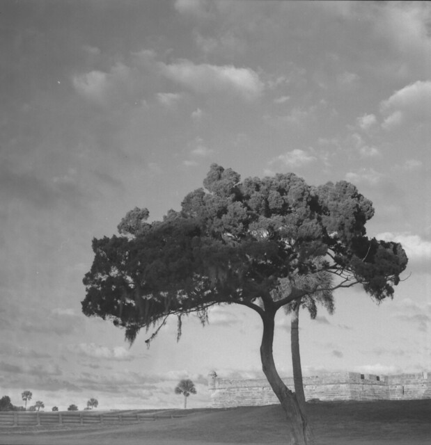
Inspired by the awesome graveyard tree shot earlier, here is a shot of my daughter by Castillo De San Marcos, taken with my Hasselblad 500C and some Adox 25 black and white film with a red filter. Developed in Rodinal [emoji1]

Sent from my LG-E980 using Tapatalk
 
Kinda like the idea but something (or some things) bothers me although I'm not sure quite what.

Maybe the band of lighter space around your daughter from (and including) the wall to the bottom. Can't tell if it's natural or not but it looks like a bad dodging job.

Also, maybe again, too much sky on top.
Thanks! I'll see what I can do. I'm personally a fan of big skies, not sure how to crop that without having to crop a lot of other areas to keep the square format. Also, the lighting is natural. It was cloudy and the sun was setting behind me so there were patches of light. I will play around with that

Sent from my LG-E980 using Tapatalk
 
If it's natural, leave it alone. Unless everybody else reacts the way I do, that is, then yes, it's a problem.

As for cropping, take a bit off the left and a bit more off the right. But, true, it's, as is usually the case with critiques, a matter of personal taste.
 
I see what you are both saying. Ultimately I think it comes down to is what will make the girl stand out a little more while still keeping the feeling of solitude - one small girl in an expanse of space.

Perhaps a slightly wider tonal range? I find myself wanting her to be a bit brighter. Though the tonal range and detail in the tree and sky are lovely, the lawn seems just a tad muddy and I think she needs a bit more light on her (some minor dodging?) to counter that. I also wonder how it would look to crop just a sliver from the left (which would mean a sliver from the top as well to maintain the square). At first I thought I just wanted that tiny little bit of tree in the lower left to be removed, but then I thought it might be interesting to crop right up to the building to create the illusion that the building continues beyond the frame. Seems contradictory, but cropping that bit of sky on the left might make the expanse seem even larger: a huge tree, huge sky, huge building, one small girl.

Mind you, these are very minor tweaks. The composition is lovely and it's a solid picture, imo.
 
"Perhaps a slightly wider tonal range?"

That may be it. She is a bit muddy, a little too gray and gray. But I don't think dodging is the answer since she is, as it is, in the area that seems to have been dodged.

It took me a couple back-and-forth to understand your crop suggestion but, yes, I do like it. Better than mine actually. It would also take out some of the detail-less part of the tree which would be a good thing, I think.
 
Yeah, maybe not dodging but perhaps a slight contrast boost? Or just bringing up the highlights a bit.
 
Yeah, maybe not dodging but perhaps a slight contrast boost? Or just bringing up the highlights a bit.

It was probably my use of the red filter that caused the grass to seem muddy :-/ I was experimenting with it for the first time. I'm taking both of your ideas and tweaking it a little and I'll show you and see what you both think @limr and @TheUniverse :)
 
@limr and @TheUniverse - let me know what you think of these! I re-scanned the negative and posted an unedited version of the tree itself to get an idea of the lighting that was there, then re-scanned the one with my daughter and applied the edits that you both were mentioning. Any more insight is great!

Unedited by Aimee Lower, on Flickr

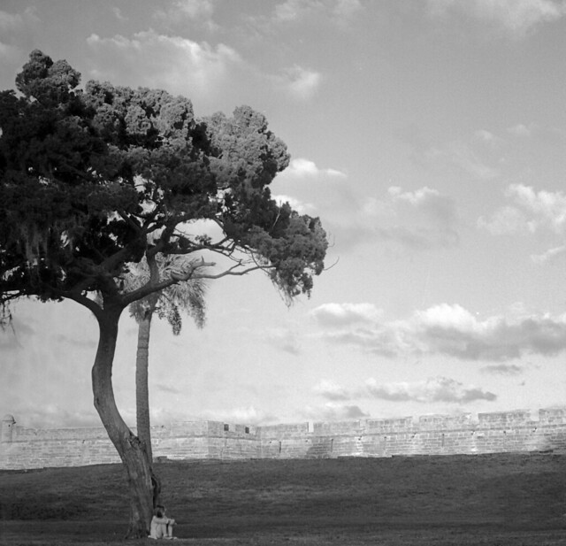
Little Child, Big World by Aimee Lower, on Flickr

I also messed up on the film. It was actually Ilford Delta 100 in Rodinal, not Adox. I was shooting a roll of Adox at the same time.
 
Yeah, I think overall, the combo of the Delta and Rodinal created fairly low contrast images, though that's easily corrected for (and not always a bad thing ;) ) I think the contrast boost works well. I like the new crop on the left side and top, though the original had more room on the bottom that worked better.
 
Yeah, I think overall, the combo of the Delta and Rodinal created fairly low contrast images, though that's easily corrected for (and not always a bad thing ;) ) I think the contrast boost works well. I like the new crop on the left side and top, though the original had more room on the bottom that worked better.

I am sure you are right. I am still new to developing my own stuff and I am not a fan of contrast *yet*, mostly because I haven't learned how to combine it to use it the proper way I think. I love even tones over the whole image and I don't think it really did this photo justice because it needed that contrast more. Perhaps next time I will use a different filter and a lower dilution rate like 1:25 to help increase the contrast. What do you think?
 
I agree an orange or yellow filter might have been better - it would still get good texture and tones in the sky while not being so harsh on the greenery. As for developing, it's hard for me to say because I don't use traditional developers so I'm not sure how they react other than what I've seen from others. I use Caffenol, a homemade developer, and it tends towards more rather than less contrast anyway. I like both higher and lower contrast images - like you said, it just depends on which suits the particular image better.

But one thing I'll say is that when I want to get more even but wide-ranging tones from certain films (I do this with Fomapan, for example) I'll do a stand or semi-stand developing. It helps bring up the shadows without blowing out the highlights.

I have wanted to try Caffenol. I've seen beautiful results with it. I love Rodinal because it's super flexible with the dilution times. I can't wait to experiment with other developers, although it's hard when you get comfortable with a developer to experiment without getting disappointed if the results don't come out the way I want them to and I always get so excited about whatever pictures I'm taking, even if I try not to lol. I love stand development with Rodinal.
 

Most reactions

Back
Top