The comments have died down, so it’s time for me to contribute my own thoughts.
The main thing I got from the thread was some clarity on why I might some of these where others don’t. It’s mainly because I understand what I was trying to do and everyone else is left guessing. Had I, for example, created 20 photos in a particular style, you might have understood where I was coming from.
Shouldn’t a single photo be able to stand on its own? Well, if it’s a single photo in a particular tradition, such as the typical beautiful landscape, you have an existing context in which to judge an image. When someone tries something different, it’s another story.
Let’s just talk about the images:
Image 1, Reed College Great Lawn, Winter, was an attempt to create an image reminiscent of some of the romantic images that emerged in the early days of photography, when people started thinking about photography as art—thus the sepia toning and somewhat dreamy atmosphere. For whatever reason, the rightmost tree doesn’t bother me, but the photo might be better framed with a matching tree on the left. I could have made the shadows more constrasty, but I deliberately reduced the contrast for the effect I was trying to achieve. The image does fall somewhat into the landscape tradition, so I think it’s an easy one to digest.
Image 2, Trees with Crow. Ansel Adams has a ton of fantastic images, but I was at the library, flipping through a book that he wrote, and I was surprised at some of the rather mundane images there. Perhaps it was an early book. I may have seen or imagined seeing an image somewhat like this one, but without the crow. OK, he wouldn’t have used a sepia tone. Anyway, I like crows, and I deliberately put this crow right at the edge of the image. It’s supposed to be playful—you have a classically beautiful tree/sky image, with a crow positioned to distract you from all that classical beauty. If I had created 20 of these, with crows photo-bombing otherwise pretty scenes, the idea might have gone from irritating to amusing. With a single photo, it’s easy to assume it’s a beginner’s mistake. I’d like to do 20 of these, but have no idea how I could arrange to have a crow show up in just the right place.
 Image 3, Leeks for Sale.
 This one is a pretty straight-forward attempt at creating a nice image. I was perhaps attempting to combine a Mondrian composition with a Edward Weston vegetable still life. As someone noted, the photo would do better with higher contrast, but I could never get that to work with the leeks. The upper-right was a mistake I didn’t see—it’s too bright and pulls my eye out of the photo. Anyway, it’s one of those photos that I have to admit will never work well, even if the ideas are interesting.
Some people thought a color version would be better. I think you need a color version before you can make a judgment, otherwise you are just comparing this picture to some imaginary photo that may not exist. I didn’t care for this image in color—I thought it was pretty dull.
Image 4, Pioneer Courthouse Square, Portland, OR. This is one the one that most excites me and that probably most illustrates the very personal context from which I view this. In my youth, I saw a number of Fellini films (along with a lot of other Italian cinema). This is not Fellini, but it reminds me of scenes in which he was various characters doing strange things in the background. I tend to view this photo cinematically. A woman walks into the scene and turns her head right. I look where she’s looking (the awning helps direct my eye as well) and see the food cart. There are a bunch of diagonals there leading my eye back to the left and down the steps, where I start seeing other characters engaged in various activities.
This is pretty much what one experiences when entering the square in real life. It’s a big area, and the more you look, the more you see. Anyway, it’s how I see it and it always makes me smile, but again, without context, it could be a dull, cluttered image.
Referencing classic photographers, I had Henri Cartier-Bresson in mind when I took this photo. Actually, if I wanted to do a Cartier-Bresson, I probably need more contrast, a shorter depth of field and maybe a slower shutter speed. Anyway, it's not at all a Cartier-Bresson.
To sum up: these were all experiments. This thread helped me understand better on why the ones I like aren’t going to work for others. (I knew they wouldn't work for others, but I wasn't able to explain exactly why). I do have plenty of the pretty, straight-forward shots, but sometimes I want to do something different. My philosophy is that if you aren’t failing, you aren’t learning.
My background: I have a Bachelor in Fine Arts from the 70s, where I started photography in the film and darkroom era. My career was a software engineer, but I also worked as a graphic designer. I was happy to leave enter the digital age of cameras—I waited a long time for the quality to reach acceptable levels. I retired a few years ago and just now I have my first photo exhibit through a gallery.
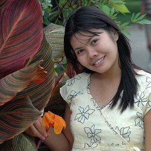
Here’s a photo of my wife admiring one of the landscape shots in my first show:
I mention this just to emphasize that I didn't start doing this yesterday. I know the photos I put up might leave some doubt.
Once more, I appreciate all the time you folks took in commenting on my experiments. Some of you went above and beyond—thanks!



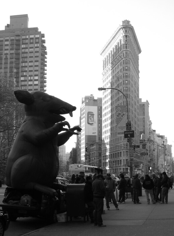 Flatiron District under attack.


![[No title]](/data/xfmg/thumbnail/38/38263-ad5e4c9e677626ddb5b1e7cdf9ebe40e.jpg?1734172152)

![[No title]](/data/xfmg/thumbnail/36/36657-3774cdd7ebbafa5ccac2741386b9949a.jpg?1734169171)