Compaq
Been spending a lot of time on here!
- Joined
- Aug 29, 2010
- Messages
- 3,400
- Reaction score
- 657
- Location
- Norway
- Can others edit my Photos
- Photos OK to edit
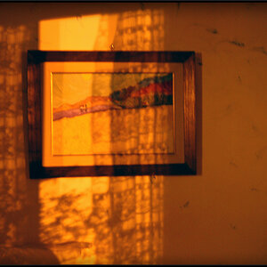
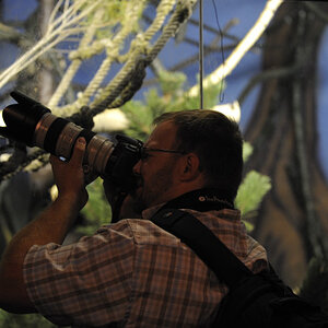
In #1 I find the tree at the right edge very distracting. I wish it was not there. The shadows of the trees drag you nicely toward the trees, but perhaps you could have made the shadows darker to make the effect stronger.
")
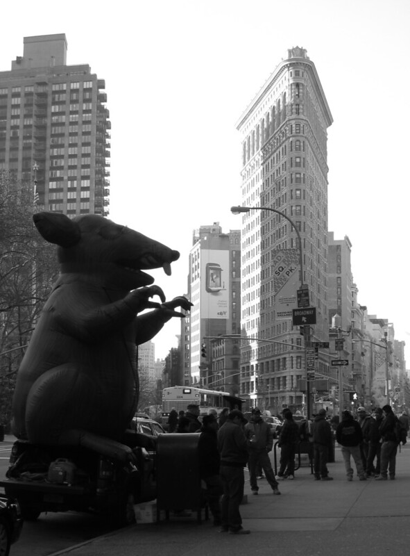 Flatiron District under attack.