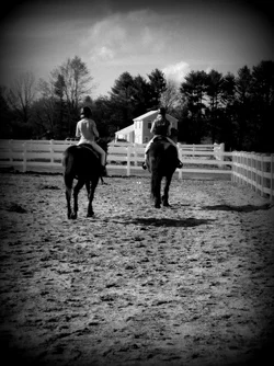
The first one looks like a kind of a snapshot, a photograph that means something to you but nothing to anyone else. The fact that the one rider overlaps the building is a problem, somehow, but I am at a loss as to how to articulate it. The juxtaposition of fences, riders, trees and cloud is definitely trying to be something, but I don't feel that it's quite there. The vignette is way too much, it feels like you're trying to force drama into an image that you know lacks it. Trying to save an image that you know isn't much is usually a lost cause. There's a good idea in here somewhere, but I don't think this photograph got it.
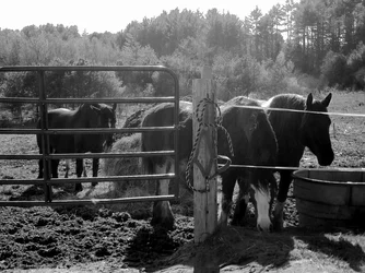
I quite like the second one. The rope is a nice surprise when you dig in. I wish it were more off center, I think. Extending the frame a little outward in either direction would, I think, strengthen the image. The light is quite appealing. The thing's a bit of a cliche, but so what? Placing the post and the rope right there as a nice visual center pushes this one up a little past the "horses in the mist" sort of thing we see from time to time. The centering thing is a quibble, it's basically quite a good image.
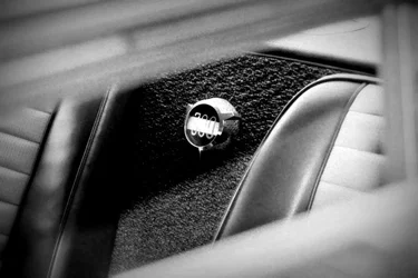
The third is, I think, clearly the best. It's pretty abstract, but I'm pretty sure it's a photograph of a Chrysler 300, somehow. It's asbtract, and yet somehow unabashedly automotive. The composition works, even with the visual center actually centered, there's enough sense of motion and tension in the frame to carry it, I think. The out of focus material, at a diagonal, acting as a frame really helps that out -- I think the centering of the... object... would fail without this stuff. I quite like this photo.
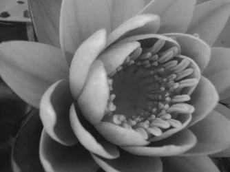
The flower is basically nothing. Sorry. No visual drama, and it's right in an uninteresting no man's land between close up for vaguely erotic detail, and far enough out to be a proper portrait of a flower. The tones are also quite flat.
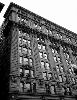
The building is also pretty thin. It's got visual drama, but I find the lamp and the bit of the other building intruding in the frame to be distracting, the sky is completely flat and dull, and I think you've pushed the contrast a little far, it doesn't feel real -- the light looks diffuse and overcast, so the deep dark shadows and white whites doesn't sell. Anyways, this is a cliche, and doesn't even feel like a great example of that cliche -- it looks like you saw a photograph of the Flatiron Building and tries that visual trope out on the best looking building you could find on your street. Eh.





![[No title]](/data/xfmg/thumbnail/31/31037-35b917d9eb4d044981e83ac234757e09.jpg?1734159136)
![[No title]](/data/xfmg/thumbnail/31/31035-96228fec87f6f8e8b5f3db4e93e99189.jpg?1734159134)
![[No title]](/data/xfmg/thumbnail/31/31038-84f0b9d14b7ced20e61bc19a9d4dfcc2.jpg?1734159138)