What's new

Some C&C if you may

Mach0

TPF Supporters
Joined
Oct 16, 2011
Messages
2,616
Reaction score
432
Location
203
Can others edit my Photos
Photos OK to edit
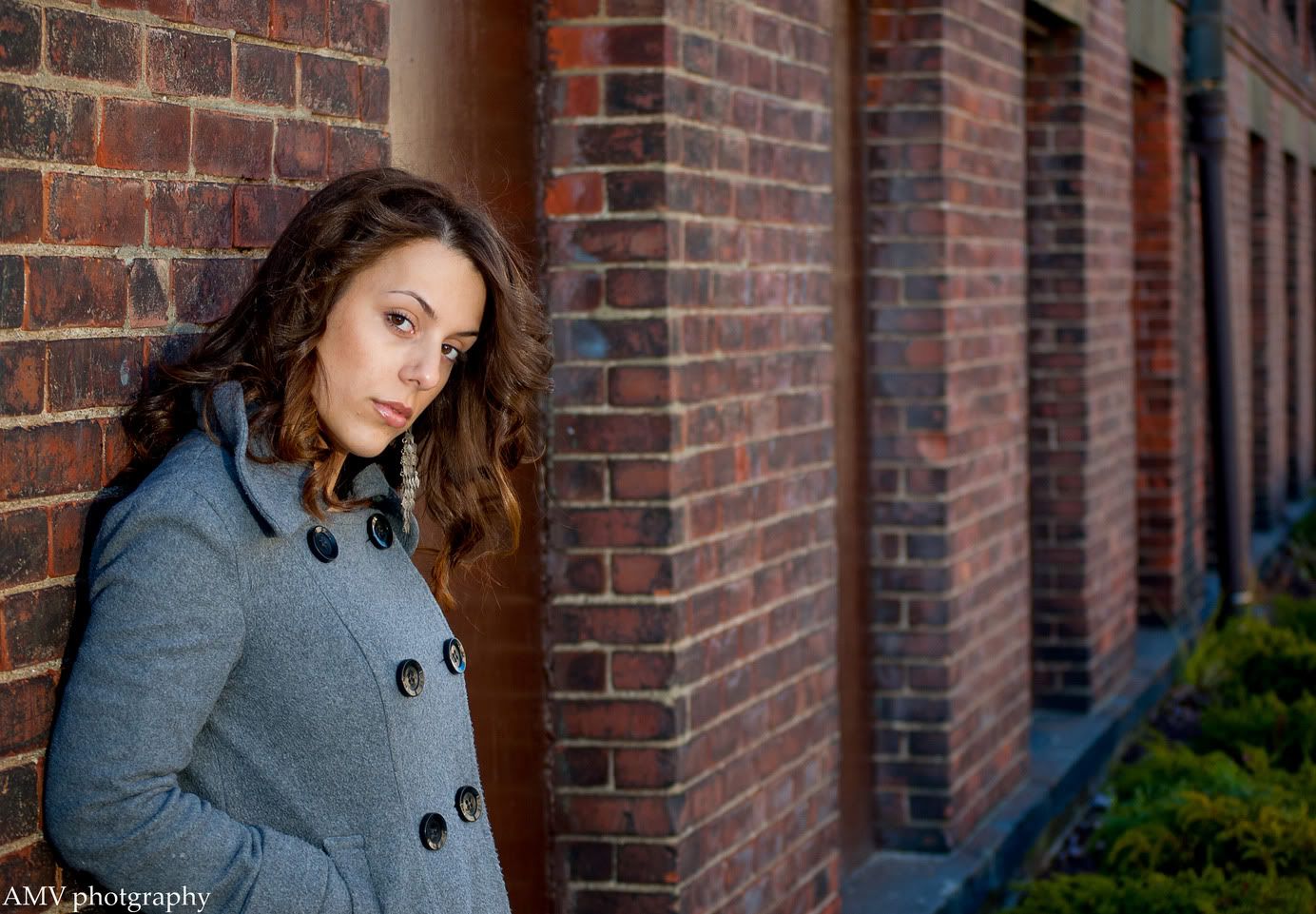
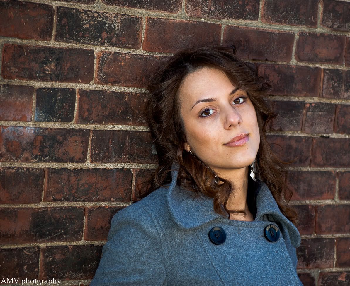
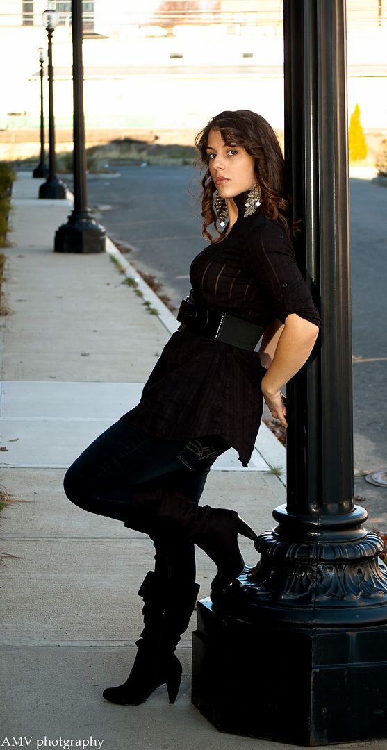
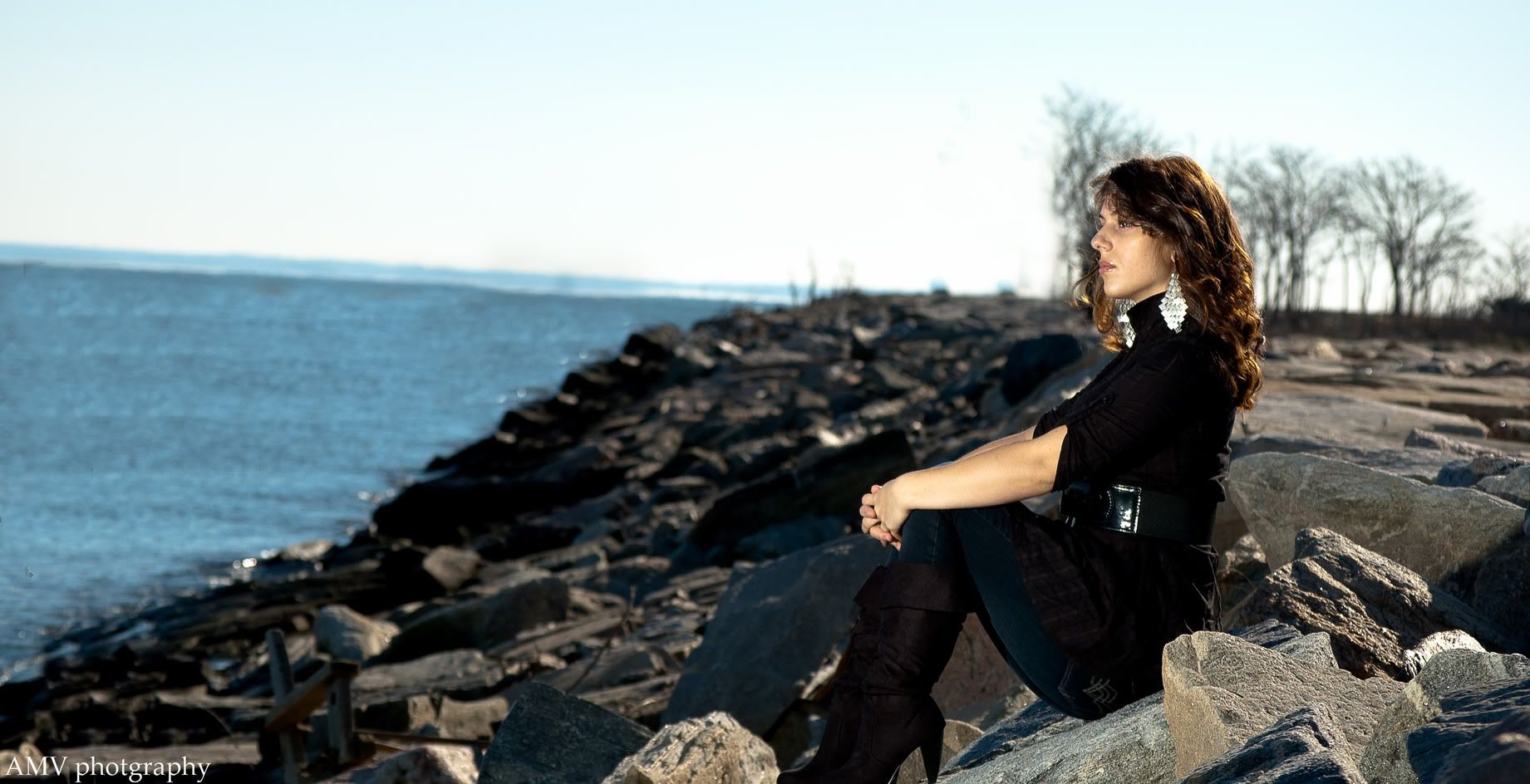
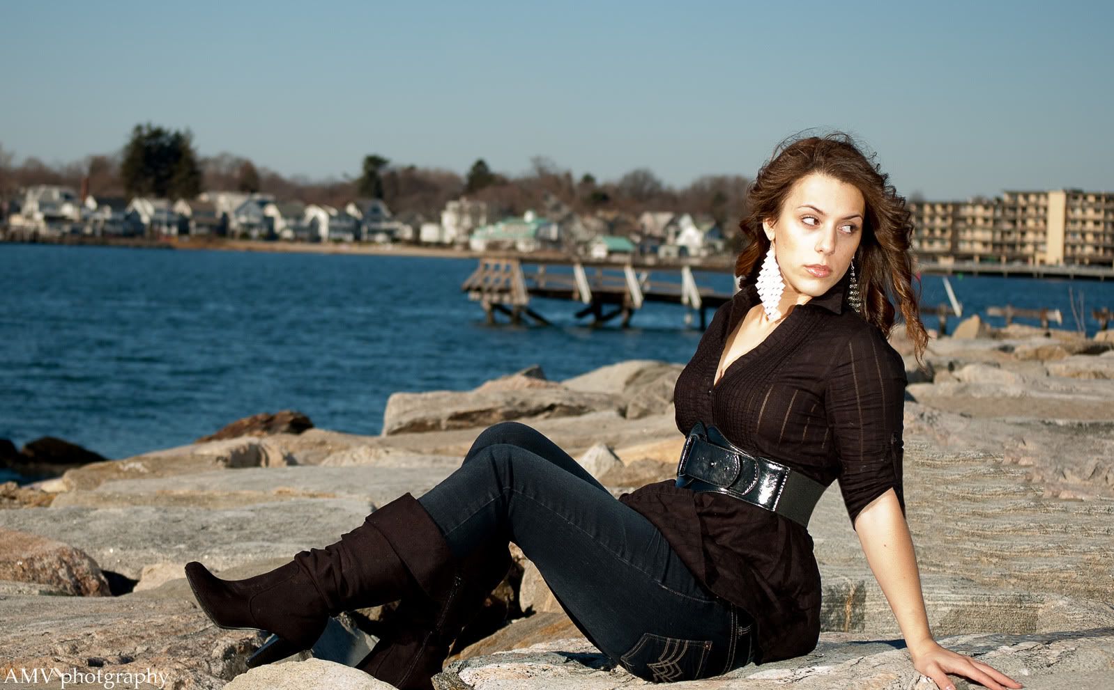
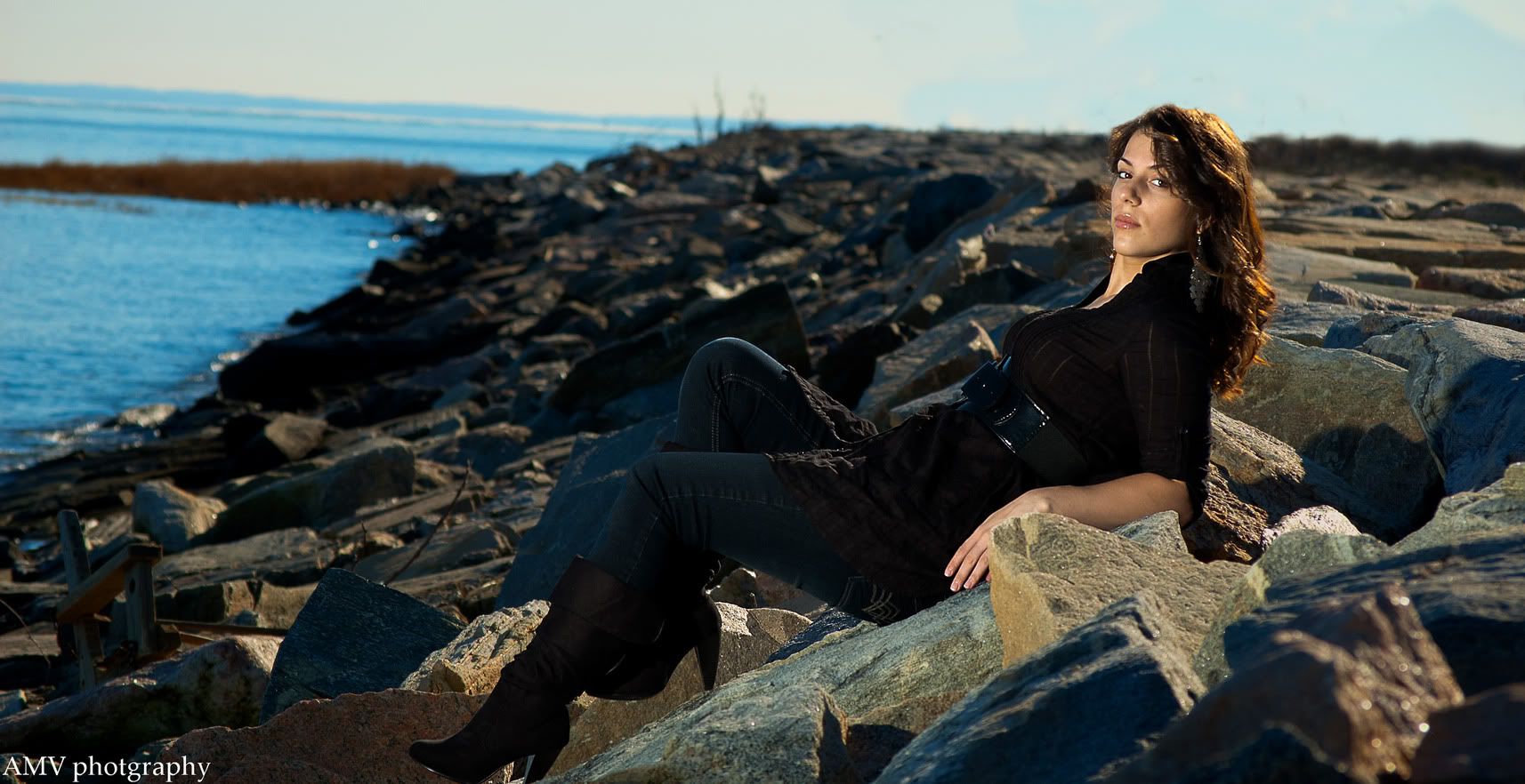
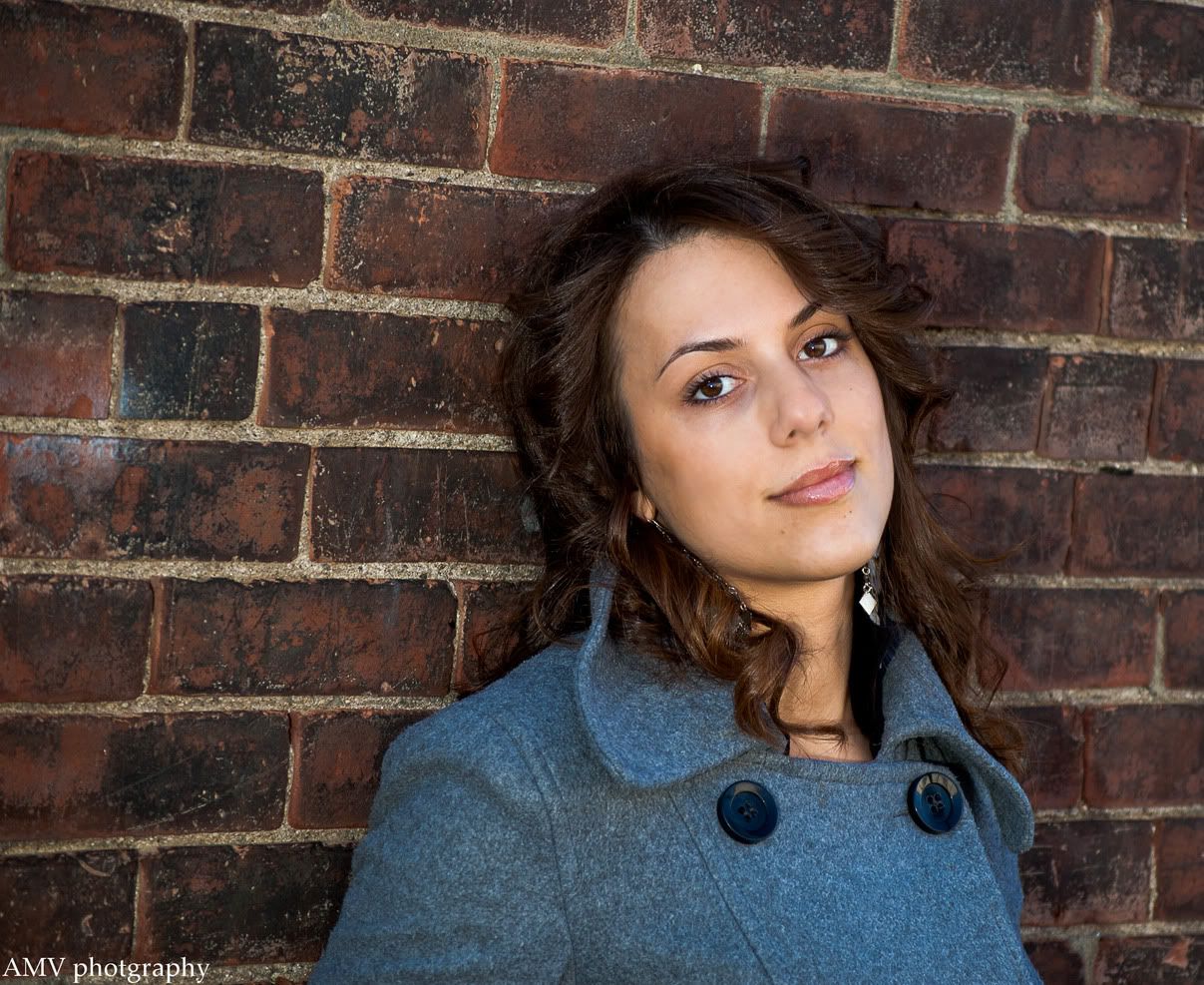
I decided to head out with my fiancé to snap some pics. She was a good sport. It was 41 degrees out. Some of these I did warm up some and some have went through split toning. Let me know on anything you think I can work on. Thanks
1
10.jpg

2
15.jpg


3
13.jpg


5
16.jpg


6

9.jpg


7
5.jpg


8
3.jpg
Give a second....Have to use photobucket instead of flickr
 
Last edited:
You should number your photos. I like # 1 and #6. I see a common error in your photos, your horizons are tilted upwards in almost all of your photos. Your horizontals should be straight.
 
I like the first one. Good color and composition. Her face might be a tad too bright though. That's more of a personal taste thing though.

#3 almost seems....too sharp...for a portrait...if that makes sense. The lighting is good. It's just that it seems so sharp that it accentuates the blemishes in the model's face.

#5 I like too, except for the distracting line where the shadow ends in the background, because it goes from dark to blindingly white, and the line runs through the middle of her face.

#6 is O.K. in my eyes. Maybe a bit more contrast if anything at all?

#7 The highlights in her face are really blown out. It's also obvious that a flash was used for this portrait, and there's nothing wrong with that for fill flash. The only thing is that it has the potential to totally destroy the shadows in a photograph, and I think that is the case here. Yes, you can see her entire face when the flash is used, but in my opinion it makes it look unnatural, and it causes the hair to sheen and gives the appearance of looking oily. Her skin also has a yellow cast in this photograph.

#8 Same at #7

#9 I like the light in this one. Although you can tell that flash was used like in the previous photos, there are still shadows that follow the contours of her face very tastefully. And the backlighting from the sun is AWESOME. Very nice use of light. If I had to criticize one thing, it would be that she looks kind of uncomfortable. :P
 
they look pretty good! One thing I noticed, I think it's your 5th one down - there's a really big shadow from the earring on her neck. You could all but remove that with some touch up though. I'm definitely no professional, and yours are way better than anything I have ever done - but maybe a different angle would have eliminated that shadow? overall looks good. I see now (and probably never would have if someone didn't point it out, the Horizon thing mentioned previously).

Nice Work! :thumbup:
 
You should number your photos. I like # 1 and #6. I see a common error in your photos, your horizons are tilted upwards in almost all of your photos. Your horizontals should be straight.
They are numbered.Thank you for the heads up on the horizon.
they look pretty good! One thing I noticed, I think it's your 5th one down - there's a really big shadow from the earring on her neck. You could all but remove that with some touch up though. I'm definitely no professional, and yours are way better than anything I have ever done - but maybe a different angle would have eliminated that shadow? overall looks good. I see now (and probably never would have if someone didn't point it out, the Horizon thing mentioned previously).Nice Work! :thumbup:
Thanks
I like the first one. Good color and composition. Her face might be a tad too bright though. That's more of a personal taste thing though.#3 almost seems....too sharp...for a portrait...if that makes sense. The lighting is good. It's just that it seems so sharp that it accentuates the blemishes in the model's face.#5 I like too, except for the distracting line where the shadow ends in the background, because it goes from dark to blindingly white, and the line runs through the middle of her face.#6 is O.K. in my eyes. Maybe a bit more contrast if anything at all?#7 The highlights in her face are really blown out. It's also obvious that a flash was used for this portrait, and there's nothing wrong with that for fill flash. The only thing is that it has the potential to totally destroy the shadows in a photograph, and I think that is the case here. Yes, you can see her entire face when the flash is used, but in my opinion it makes it look unnatural, and it causes the hair to sheen and gives the appearance of looking oily. Her skin also has a yellow cast in this photograph.#8 Same at #7#9 I like the light in this one. Although you can tell that flash was used like in the previous photos, there are still shadows that follow the contours of her face very tastefully. And the backlighting from the sun is AWESOME. Very nice use of light. If I had to criticize one thing, it would be that she looks kind of uncomfortable. :P

Thank you. Actually, number 7 had the flash camera right. It was about 1 In the afternoon and that bright light is the sun. I might have messed up the highlights in lightroom. Thanks for the heads up. I'm gonna mess with it. Let's see what can be salvaged. This was her first time taking pics like this and some people were staring and I noticed she started getting uncomfortable. Thanks for your time :-)

Ps ---- lets just say after 25 mins of driving, I realized I left the freaking soft box at home. Bare flashed it lol.
 
Last edited:
1 seems fine, I guess... the brick wall though... so cliche.

2 has some alarming issues with her facial tones... may want to airbrush that.

3 seems a bit too far away and impersonal... and the black detail is totally lost.

6 and 7 face washed out, issues with skin tones.

8 black lost again.

Poses seem a little awkward in some cases. Think about some lighting to overwhelm the sun and such. Do some research on posing.
 
1 seems fine, I guess... the brick wall though... so cliche.

2 has some alarming issues with her facial tones... may want to airbrush that.

3 seems a bit too far away and impersonal... and the black detail is totally lost.

6 and 7 face washed out, issues with skin tones.

8 black lost again.

Poses seem a little awkward in some cases. Think about some lighting to overwhelm the sun and such. Do some research on posing.

Thanks. I changed them up some. See the post right above. Thanks for your reply
 
My comments actually included your changes.
 
My comments actually included your changes.

Sorry, I thought I might have been a bit slow in the refresh/respond rate. Any suggestions on lighting to overwelm the sunlight? Or perhaps, choose a time of the day when it isnt so strong?
 
I think your photos are fine. Not all horizons are perfect. Sometimes it depends on how a person stands. Good Work
 
I think your photos are fine. Not all horizons are perfect. Sometimes it depends on how a person stands. Good Work
Thanks
They are nice, however, I think you should do some minor skin smoothing to rid the blemishes.
I did some more work in cs5 and it looks much better. I just have not posted it here. Thank you.
 
My comments actually included your changes.

Sorry, I thought I might have been a bit slow in the refresh/respond rate. Any suggestions on lighting to overwelm the sunlight? Or perhaps, choose a time of the day when it isnt so strong?

Yes. I'd go for a try when it's closer to dusk. Your flash was probably on full power trying to illuminate your fiancee. I also think it was a bit to hot to expose her skin properly. You probably could have turned it down 2/3 a stop just to fill in shadows.

What exactly is your flash setup? Do you have a light stand for it, or do you place it on the ground? Or was it on camera hotshoe flash that you were using? It looks to me like it was off camera, but I don't want to assume. Also, did you shoot these in Raw?

I disagree with Photo Guy, as I think with portraits of someone that are posed and you cared enough to use flash, the horizons should be straight. It would make for a less distracting element. As a matter of fact, I shot a 5K race yesterday (first time doing so). I got a lot of good shots, but I noticed after I edited them and posted them to facebook, that I didn't fix all of the horizons. There were some where my verticals were leaning to the right. Seeing them now, it really bothers me, and I want to go back and fix them.
 

Create an account or login to comment

You must be a member in order to leave a comment

Create account

Create an account on our community. It's easy!

Log in

Already have an account? Log in here.

New Topics

Back
Top Bottom