What's new

Some C&C please

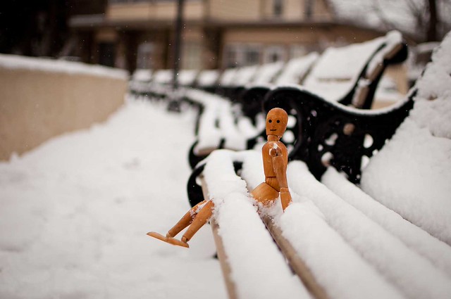
these are all good. I love the figure on the bench! Well done :)
 
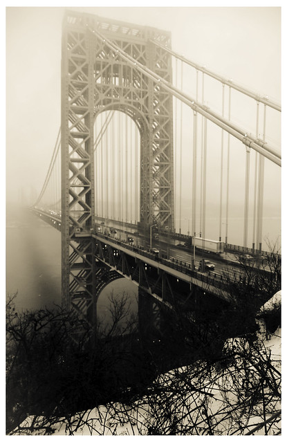
Great shots!, i love the classy look of the second one, gives me the feel like its in the early 90's . The third one on the other hand i can't agree with because of all the branches in the way of the bridge. o think it would have came out much better without the branches
 
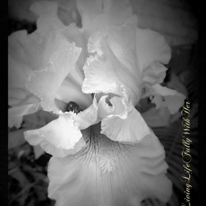
very nice intersting. love the last one

I would maybe used a longer shutter speed to blur the cars it might have complemented the foggy look...
 
I like number 2 - nothing technical from me though
The figure is a cool idea
 
i think the trees make #3 a little busy. I love #2, it has that old b&w photo feel to it. well done!
 
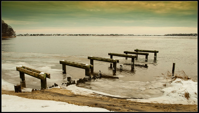
1 Has the right idea, I just think it could of been executed better. Maybe a different angle?
2 love it!!
3 too many branches in the foreground....very distracting. It takes away from the subject....the bridge.
4 is a pretty fun shot!! I wouldn't mind a little more DoF to see more definition in the arm rests of the benches.

Nice set of shots!! Keep shooting!!
 
You better make a medium to large print of pic #1 and start selling it!
 
I actually love all of these. My favorite is the one of the GW Bridge. I absolutely love going over that bridge at night.

On a side note, how do you get your images from flickr to be embedded on this forum? I've been trying and I can't seem to do it.
 
1) Really a good shot. If I had to nitpick, I might crop just a little sky out, but not really. I wouldn't mind hanging this on my wall.
2) Great shot but you might crop a little more of the foreground out. For some reason, it drew my eye. Again a very small nitpick.
3) Agree with the others. The branches ruin the shot for me.
4) A little more DOF and lose the figure.

Just my 2 cents.
 
I think 1st one is way to messy and blury , bridge looks ok nothing to special also not to sharp mistakes being covered with the filter if it come to bridge way to busy I do not like composition at all. Bench shot is ok composition not very good. Why did you cut first bench? I think you should work on your composition. Shot are ok didn't wow me . I also confused with colors which you picked for second bridge ...
 
I'm not generally a fan of "bits of wood sticking out of the sea" shots, but this is well executed - the subject is just not to my personal taste.

I adore the 2nd pic! The sepia is just perfect!

Agree with everyone else about the 2nd bridge, the branches are a little cluttered.

I love the idea with the figure, but I may have sat him at your end of the bench and cropped some of the empty space on the right out.

All pretty good though!
 
Love them all! Number 2 is my favorite.
 

Create an account or login to comment

You must be a member in order to leave a comment

Create account

Create an account on our community. It's easy!

Log in

Already have an account? Log in here.

New Topics

Back
Top Bottom