What's new

Some C&C please...

JAC526

TPF Noob!
Joined
Sep 19, 2011
Messages
1,329
Reaction score
237
Location
Cincinnati OH
Can others edit my Photos
Photos OK to edit
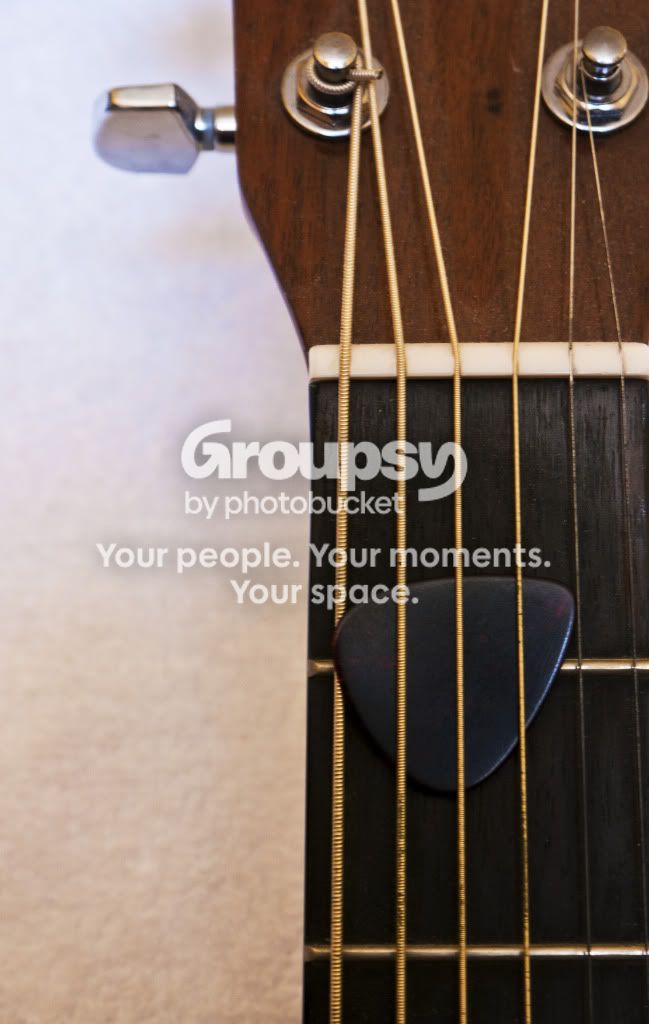
I was trying to really accentuate the pick and make it the subject of the shot.

Let me know what you think and how to improve.

1.

The_Pick_1.jpg


2.

The_Pick_2.jpg


Thanks guys,

Joe

 
I like the first one not sure about the second,, the pick just doesn't really grab my attention.
 
I need a different colored pick for the second. Maybe red?
 
Was the first one hand held ? 1/15 is too slow that's probably why it's soft, second is not very interesting
 
Yeah they were both hand held. I agree the first one is more interesting.

I'll have to retry it with a tripod. Really the only thing I wanted sharp was the pick.
 
Yeah a different colored pick would be better.
 
Do you even need a guitar pick for these shots? In my opinion, no. It just makes the pictures more distracting.

Nice depth of field and background blur on #1.
I don't know what to say about #2, but it's surely less appealing.
 
A primary subject has to pretty much dominate the image frame to have sufficient visual weight to be the primary image element.

Shallow depth-of-field is more often over done, rather than used effectively.
Then again, most entry-level cameras don't have a DoF preview button, many who do have a DoF preview button don't know they have it because they never bothered to read their user's manual comprehensively, many who know they have it, never use it.

IMO #1 is a total failure if the pick is supposed to be the primary image element. The pick has almost no visual weight (it's even in the background, under the strings) in the photo.

In #2 the guitar looks to be to close to the background. Consider only having 1 string was on top of the middle of the pick, and using a pick of a color that contrasts more with the fingerboard (another way to achive visual weight).

Composition and the Elements of Visual Design
 
IMO #1 is a total failure if the pick is supposed to be the primary image element. The pick has almost no visual weight (it's even in the background, under the strings) in the photo.

This is a very common way to stow a pick when you're not playing. That's why I wanted to show the pick as the subject. I was trying to convey that the guitar is just sitting there waiting to be picked up and played.

However, I do understand where you're coming from. With the strings on top it doesn't showcase the pick as much as it should. Next time I'll try just one string on top.

Thanks for the honest feedback.
 
Everyone is different and I am going to disagree here. I prefer the lines and geometric minimalism of the second photo. I like the much more graphic look.

I do agree, however, that the pick should be another color.
 
I didnt even notice the pick until I read what you wrote (I tend to look at the pics first, then read the post)
agree, a brightly colored pick would work better. I dont mind so much that its under the strings, my dd stores hers that way too.
 
I didnt even notice the pick until I read what you wrote (I tend to look at the pics first, then read the post)
agree, a brightly colored pick would work better. I dont mind so much that its under the strings, my dd stores hers that way too.

That is a strong argument for Keith's (I think that's KmH's name) point that I did not do a good job of highlighting my subject.
 

Create an account or login to comment

You must be a member in order to leave a comment

Create account

Create an account on our community. It's easy!

Log in

Already have an account? Log in here.

Back
Top Bottom